


Guide to Color Photography: History + 10 Tips
Learn how to use color in your photography to create more powerful images. This in-depth guide also includes a short history lesson of color photography.
Learn | Photography Guides | By Andy Day
Color has a massive bearing on how a photograph is perceived and from photography’s earliest existence, the medium’s pioneers were trying to figure out ways to convey the vibrance and saturation of the world around us.
Color can transform an image, evoking emotion and bringing alive a world that is full of depth and intensity, whether it’s the subtle shades of an ocean shortly after the sun has dropped below the horizon, or the gaudy hues found on the sunkissed streets of Havana at midday.
As photographers, we can’t always control the colors that we are capturing, but having a good understanding of color and how they can be made to work together can be crucial in the development of our work.
This article runs you through a brief history of color photography, explores how we understand color, and then digs into how color theory works.
We also investigate how you can make the most of color photography, and what role this knowledge can play when you come to capture and process your images.
A Short History of Color Photography
From the earliest days of photography, almost 200 years ago when the likes of Louis Daguerre and William Fox Talbot were playing with complex chemical processes like the wet-plate collodion process, means of capturing color were being sought.
Black and white imagery was revolutionary but an accurate portrayal of the world was still lacking; adding color proved to be so challenging that it wasn’t until halfway through the 20th century that black and white photography began to lose its dominance.
Even when color photography become commercially viable, it was often easier to create a black and white image and have it colored by hand.

State Library of New South Wales from Australia – The Carandini ladies, one of Australia’s first opera performing families, ca. 1875. Photographer Charles Hewitt
As will become clearer when we explore further how light works, capturing more than just black and white depended on the realisation — based on the research of James Clerk Maxwell in 1861 — that every color of light can be recreated by mixing red, green and blue.
You might already be aware that every pixel in the screen that you’re staring at right now is made up of three parts — red, green, and blue — which vary in intensity to create every possible color.
Using the same principles the pioneers of color photography such as Gabriel Lippmann and later Louis Ducos Du Hauron used multiple exposures captured through different colored filters which were then combined to create a single, color image.
Building on these developments, French brothers Auguste and Louis Lumière developed a method that used a single exposure.
Microscopic grains of potato starch were dyed red, green, or blue before being spread onto a glass plate and held in place using varnish.
This formed the basis of the Lumiere brothers’ Autochrome, the world’s first commercially available color photography process that was patented in 1903 before going on sale in 1907.
The biggest drawback was that this thickly layered filter meant that not a lot of light passed through entailing very long exposure times.

A Nieuport aircraft photographed in 1917 using the Auotochrome process
Other techniques emerged. Rather than mixing colors together through an additive process, Ducos du Hauron developed another idea that used cyan, yellow, and magenta filters that mixed colors based on what was removed rather than what was allowed through — a subtractive process.
This paved the way for the arrival of the legendary Kodachrome film which first went on sale in 1935.
Originally musicians, Leopold Mannes and Leopold Godowky experimented with processes before Kodak began funding their research, culminating in a film with several layers of emulsion all of which are essentially black and white until colored dyes are added during the processing.
The biggest drawback of Kodachrome is that the processing involved 28 stages and was so complex that photographers were had to send it to Kodak rather than develop it in their own labs.
Despite this, Kodak in the U.S.A. — and Agfa in Germany — produced film that brought usable, accessible color photography to the world.

This photograph was edited using a Lightroom preset that replicates the look of Kodachrome from 1935. © Andy Day
Despite this evolution, around 100 years after the first photographs were created, many photographers clung to black and white imagery and felt that color photography was not true to the medium’s essence as an art form.
How Much Do You REALLY Know About Photography?! 🤔
Test your photography knowledge with this quick quiz!
See how much you really know about photography...

Over time, attitudes shifted, helped by the likes of renowned photographers such as Ernst Haas, William Eggleston, and Saul Leiter and color photography came to the fore.
By the 1970s and 1980s, color came to dominate photography with a huge variety of different film stocks giving images a distinctive feel or offering increasingly accurate color reproduction for the advent of film photography.
With the arrival of digital, color reproduction became even more precise and gave photographers vast potential for playing with colors long after the image had been taken.
10 Tips for Using Color in Photography
Chemistry aside, color photography is a fascinating collision between physics and psychology.
Light — as discovered by Isaac Newton in 16661 — splits up into different colors, with different wavelengths being reflected into our eyes by the world around us.
This reception of light — by the 130 million rods and 5-7 million cones in our eyes — is then processed by our brains which are not only notoriously unreliable but are culturally conditioned to respond to certain colors or color combinations in certain ways.
We don’t always have control over the colors that we’re photographing, but having an understanding of the roles that color plays and how we can manage it within our images is an important part of every photographer’s development.
1. Understand Primary Colors and the Color Wheel
For centuries, both scientists and artists have created different methods for understanding how colors relate to one another, and how that relationship can be conveyed visually.
Various models have emerged, with one of the earliest being the Farbenkugel — color sphere — created by artist Philipp Otto Runge in the early 19th century.
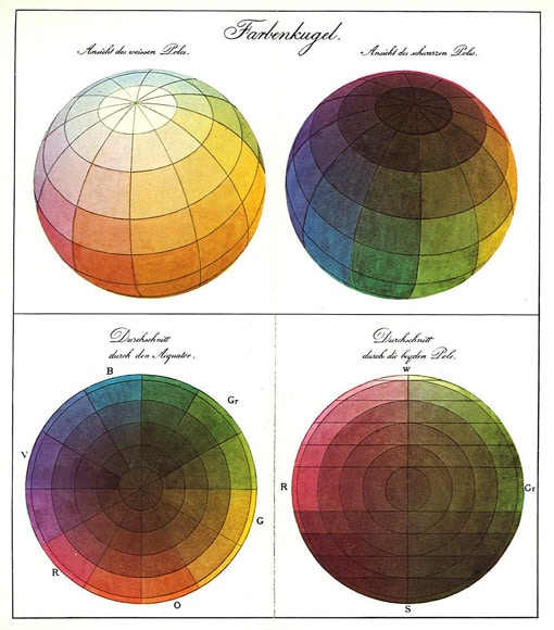
Runge’s work was based on the assumption that every color is made up of three primary colors: red, blue, and yellow. Notice how these three colors sit evenly apart in the color wheel in the diagram above (bottom left).
For artists who create colors from mixing paints, red blue, and yellow as the primary colors is largely true and you may have been taught this at school, depending on how old you are.
As soon as light is projected rather than smeared onto a canvas, this no longer holds true, however. Instead, the primary colors are red, blue, and green, which, as you will recall, work together as a trio in every pixel inside every computer screen – RGB in photography.
To get an insight into how this works, consider what happens when you play with dyed water. An even amount of red water mixed with an even amount of green water will create a very dark, purply, inky color.
By contrast, if you shine a light so that it passes through both glasses of water and project it onto a wall, the result will be yellow.
With that in mind, while there are numerous different ways of modelling colors, the color wheel you’ll often find today will look like this:

RGB color wheel. Used under Creative Commons, courtesy of Crossover1370.
This will almost certainly look familiar as many software applications use this color wheel to help users make selections.
As part of that use, hues on this color wheel are divided like the degrees on a compass and given a number from 0 to 360. 0 is red, 180 is cyan, and 360 is almost the same red as 0:

Note how on this wheel that red, blue, and green sit evenly apart from each other, instead of blue and green being right next to each other as seen in the color sphere created by Runge.
Note also that there are two new colors: cyan sitting in between green and blue, and magenta that sits in between blue and red.
2. Understand Primary, Secondary, and Tertiary Colors
Within these hues, there are our primary colors: red, blue and green. If you mix any two of those colors together, you will create a series of secondary colors: yellow, magenta and cyan.
Mixing a primary with a secondary starts to give more subtle changes, as shown in this diagram:

Note that the definition of secondary and primary colors will change if you use a model where your primary colors are red, blue, and yellow!
3. Familiarise Yourself With the Lingo
There are lots of different models for visualising our understanding of color and Photoshop alone uses 9 different methods for showing colors in its color panel, from “Hue Cube” through to “Web Color Sliders”.
This might sound confusing and while you definitely don’t need to learn about these different models, it’s useful to know a few crucial terms so that you can learn more about how colors work.
Here are a few to get you started:
- Hue
Hue is our classic idea of what a color is — red, blue, green, yellow, orange, cyan, magenta, etc — and is any color without any black or white added to it.
You’ll find hues on the edge of the RGB color wheel above and they are allocated a number between 0 and 360, as described above.
- Saturation
Saturation is the purity or intensity of a color. You can reduce the saturation of a hue by adding grey (known as toning) or white (known as tinting).
- Luminance
Luminance describes the brightness of a color. Adding black (known as shading) to a hue will reduce its luminosity.
You might be familiar with these terms from the sliders that you’ll find in editing software such as Lightroom or Luminar AI.
Photo editing tends to keep color relatively simple whereas Photoshop requires lots of different models such as the Hue Cube mentioned above to cater for designers creating materials for printing or for the web, for example.
4. Get to Grips With Color Theory — and then Forget It

Mike Dorner
Color theory deals with how we respond to certain colors and their combinations.
Over the years, painters and designers have developed a number of models that attempt to explain and formalise how and why certain color combinations just feel like they work together while others seem to clash.
Many of these theories derive their rules and names from the color wheel described above which is why it’s useful to familiarise yourself with it and see where the colors sit.
Below is a list of some of the more commonly used color and presented using a handy tool provided by Adobe.
- Complementary
This is the theory you’ll encounter most frequently. In short, it works on the principle that colors that sit opposite one another on the color wheel.
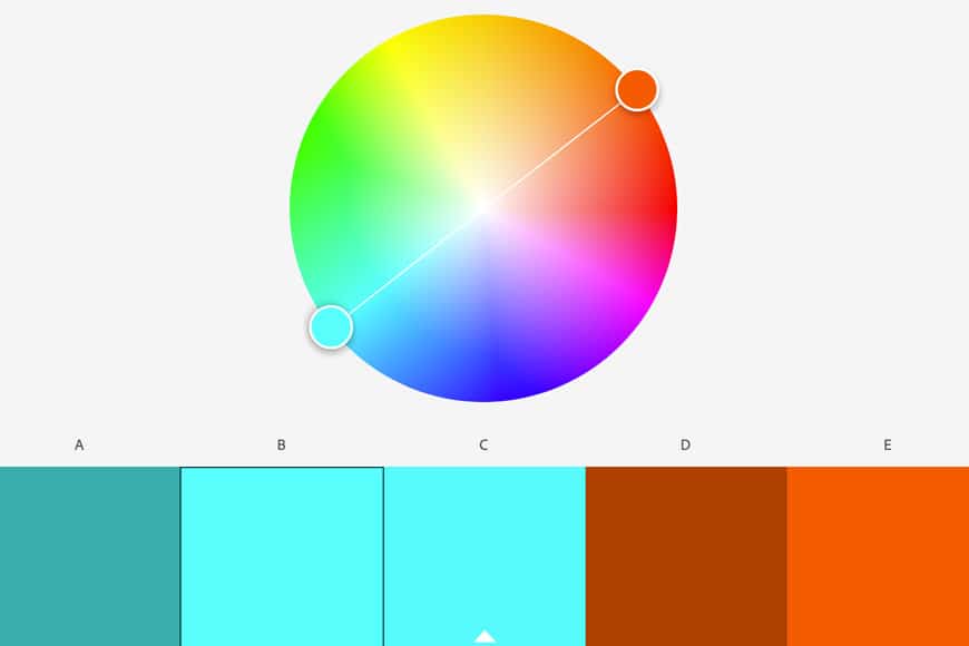
Hopefully, you’ll agree that these colors work well together.
Notice how orange and teal, a classic pairing of complementary colors that has risen in popularity thanks to Hollywood and Instagram, are on opposite sides of the wheel. This is why you’ll also often see orange and blue, since blue is the opposite of orange.
- Analogous
Analogous colors sit next to one another in the color wheel. You might think of the varying versions of green that you see amongst dense foliage.

- Split Complementary
Split complementary is a subtle variation on the classic complementary scheme described above. It uses a single color in one half of the color wheel and balances it out with two colors that are slightly off from opposite.
If you were photographing a rocky desert against a blue sky, you might find that the varying shades of orange cover a large range:

- Monochromatic
When we hear the word monochromatic, we often think of black and white images, but a monochromatic image is any image that uses only varying shades of a single color.

As you will note, there are plenty of other theories listed on the Adobe website that help you to understand which colors might work well together, including triadic, square, and compound.
(See our guide: how to use triadic colors in photography.)
Given the number, you might be forgiven for thinking that there’s a theory to match any combination of colors, and to a degree, you’re right.
This is part of where the limitations of color theory kick in: they’re just theories.
A color theory can be a useful starting point if you’re choreographing a fashion shoot in a studio, perhaps choosing a backdrop to match a model’s clothes. You might want to choose something complementary, or perhaps deliberately opt for something that will clash.
However, out on the streets or in nature, we don’t necessarily get to choose which colors appear in front of our camera, but having an understanding of color theory — however basic — can help us to make choices when we come to edit our work.
Ultimately, color theory is just a guide. Photographer Ernst Haas was one of the most famous photographers of the 20th century to begin exploring the potential of color photography and it’s worth keeping in mind that he once said this:
“Beware of color theories. Theories in color photography are dangerous. The plain fact that there are so many of them proves my point. A color philosophy comes much closer to the truth.”
5. Learn the Basics of Color Psychology
Just as the models above can give us an idea of what colors tend to sit well together, it’s worth gaining a few insights into how color psychology works.
The German poet Johann Wolfgang von Goethe wrote extensively about how we are affected by colors, publishing his Theory of Colors in 1810 and while it might not be scientific, it gives an insight into how we can be culturally conditioned to respond in certain ways to certain colors.
Goethe’s thoughts on yellow, for instance, are fascinating. For him, yellow brought “the nature of brightness, and has a serene, gay, softly exciting character” but this purity was easily undermined: “the color of sulphur, which inclines to green, has a something unpleasant in it.”
The accuracy of Goethe’s opinions on color isn’t too important, but it’s useful to have some understanding of how colors can impact a viewer.
Hues with the highest intensity will grab the viewer’s attention first, and juxtaposing them with other vibrant colors will create drama.
By contrast, pastel hues, particularly when placed alongside complementary and equally washed out colors tend to be calming.
There are broad assumptions about how different colors can invoke different emotional response — blue can be tranquil, cold, or even sad; green can conjure thoughts of nature; red is thought to be intense, passionate, or even angry and strong.
Some colors and color combinations have associations. For example, notice how websites for physiotherapists or dentists tend to use a combination of blue and white, or how we associate yellow and black with danger thanks to wasps and other creatures that might cause us harm.
This doesn’t mean that colors will always evoke a certain type of reaction, but it can be worth considering in your photography, particularly when you come to edit your photographs and want to give your viewer a subtle psychological nudge.
6. The Human Brain Is Easily Fooled
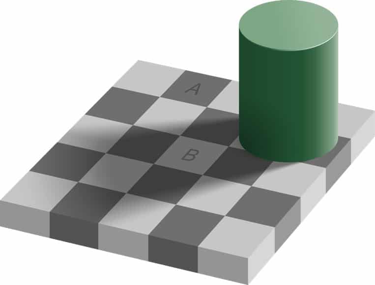
Our eyes are incredible and our brain’s capacity to process visual information is still far from being understood. However, the way that we perceive light and color is easily skewed.
Consider the image above. While tile A looks far darker than tile B, they are actually the exact same shade of grey.
It’s worth remembering that our perception of color depends massively on how we are seeing it and even then, it’s not always that simple.
You might recall how in 2015 a photograph of a dress went viral. Some saw it as blue with black lace while others were sure that it was white and gold.
Our brains can change colors, even without us realising it and it’s a reminder that perception can be very subjective.
7. Shoot in Raw
Shooting in raw as opposed to jpeg offers some significant advantages when it comes to processing your images. Raw files contain far more data than jpegs, giving you more flexibility in software such as Lightroom or Luminar AI.
Perhaps most important is that with a raw file you retain the option to control the white balance, also known as the color temperature.
8. Learn About Color Temperature

If you’ve ever photographed under artificial lights, you’ll know that they can do strange things to your images. You might go to edit your files later on and discover that the colors are nothing like how you experienced them when you were shooting.
Light has a temperature: the moments before sunrise can feel cold, sunset can give everything a warm glow, and tungsten lights can have a very orange feel. Our brains are able to normalise different color temperatures so that colors are consistent, but cameras don’t have this advantage.
When set to auto (or shooting raw — see above), a camera can make a good guess at the color temperature of a scene but it can often need correcting, particularly if there’s a dominant color in front of the lens that’s throwing its decision making.
Alternatively, you might choose to change the white balance as a creative choice. You can make an image feel warm or cold, but keep in mind that skin tones can quickly begin to look strange if you push things too far.
If you’re intent on making sure that your color temperature is accurate when you come to edit, most software will allow you to use something grey or white in your scene to use as its base.
Some photographers use a completely neutral white or grey card to ensure that colors are true to life.
9. Develop an Eye for Color

Just as we can develop an awareness of compositional elements such as leading lines or geometric shapes, we can also acquire an awareness for color.
You can make a conscious effort to be more attentive to color and start to use it to shape your image-making.
Next time you’re out and about, take notice of which colours stand out in the natural environment to you, and why this is. Use what you learn as a guide to creating something special with your photography.
You should also read this article on using the color red to create better photos.
10. Take All of This Knowledge Into Your Editing

Unless you’re planning carefully choreographed photoshoots, the chances are that you won’t have much control over the colors that you encounter when you’re out photographing.
Instead, much of your control will come when you are processing your images, and being able to manipulate color temperature or individual parts of the image can give you methods for making a photograph work together and create an impact.
It can be as simple as removing distracting colors from an image by desaturating or making areas darker.
Alternatively, you might develop a style that uses a certain color scheme that gives your work a distinctive look and feel.
Experiment with all the color grading tools at your disposal in your favourite photo editor, and see what effects you can make by selectively tweaking the midtones, shadows or highlights of your color photos.
Final Words
Color plays a huge role in how we create, process and present our photographs and color photography is a complex subject that, like many parts of photography, brings together physics and psychology.
While you don’t need to have an in-depth understanding of every detail when it comes to things like complementary schemes or how the brain perceives color, it’s useful to have an idea of how it all fits together as a foundation for your progression as a photographer.
Hopefully this article on color photography has given you some points of departure for further research and get you started for producing photographs that use color to make an impact.

Check out these 8 essential tools to help you succeed as a professional photographer.
Includes limited-time discounts.


Andy Day is a British photographer and writing, living and working in France, specialising in adventure, travel, architectural and landscape photography.


.svg)