


Color Theory for Photographers
Color theory for photographers is a powerful tool to take your photos to the next level. Find out how you can use colour to improve your photography.
Have you ever wondered why a certain image looks strikingly magical and appealing to you?
In the beginning, when you first start analysing what makes an image great, it might seem a bit overwhelming.
But the truth is this mesmerizing look almost always boils down to just two things – colour and composition.
In this article, we’re going to focus on colour theory as one of the most powerful tools you can use to take your photographs to the next level!
What Is a Colour Wheel?

The colour wheel – a useful tool in learning colour theory for photography.
The colour wheel plays a key role in helping you to master all types of colour harmonies.
To understand the nature of colours better we need to take a detailed look at it. This is basically a visual model of all colours arranged in a circle where the primary colours are situated on three equally distanced points of the wheel.
Now, you’ve probably studied in school that the primary colours are red, blue and yellow: the RYB model.
But that’s just one set of primary colours which happens to be the oldest one. It was used by painters to create pigments and to mix colours in order to achieve new ones or just slightly different shades and tints.
Nowadays the primary set of colours, which is more applicable to our digital age, is the so-called RGB model which takes red, green and blue for a starting point.
We’re living in a time when mixing pigments is no longer a daily task for artists. Instead, our images, whether they’re photographs, graphics or digital paintings, mostly live on the screen.
That’s why we have shifted a bit from the RYB to the sRGB model which has become increasingly popular.
You should also check out our guide: sRGB vs Adobe RBG
Complementary Harmony
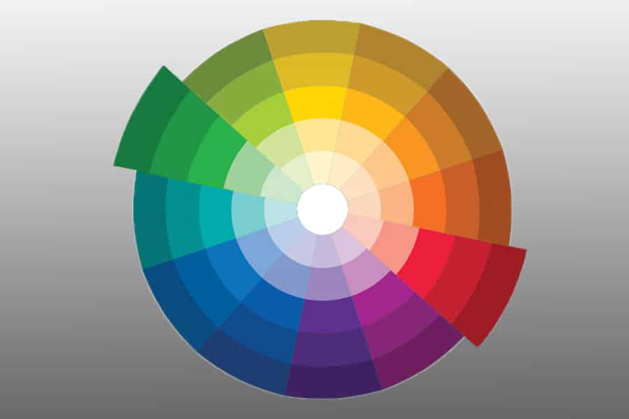
An example of complementary harmony with red & green.
Complementary harmony is also called direct colour harmony and it’s the most simple way of creating colour schemes.
To construct such a harmony you need to choose a colour from the wheel and then find the colour that lies directly opposite to it. If you pick red, for example, you’ll find that its complementary colour is green (it lies on the opposite side of the circle).
We usually perceive those pairs as classical colour schemes as they’re widespread and very often used in photography, advertising and many other forms of visual communication.
Think about Christmas, for example – aren’t red and green the colours which we see most often when that time of the year comes? In fact, it’s such a stable colour combo that sometimes when you see the two of them together you subconsciously make associations with festive moods or an approaching holiday season.
In the visual world we live in, this type of harmony is a bold decision to go with. The two chosen colours are equally strong opponents and neither of them is submissive to the other. This builds a feeling of intensity in the viewer which is sometimes not intended by the author.
These kind of colour schemes can seem attractive to use, but you need to be careful when using them because the colour contrast between the complementary colours can be a bit over-the-top in some cases.
However if this effect is desired, it’s a great idea to try them out!
I can’t refrain from giving one more example here, especially when talking about creating an unsettling effect which is well thought-out beforehand.
A vibrant purple blazer and bold green hair – does this ring a bell to you? These two complementary colours put together are enough to evoke the image of a favourite super-villain, The Joker – which proves once again how powerful colour harmonies can be.
How Much Do You REALLY Know About Photography?! 🤔
Test your photography knowledge with this quick quiz!
See how much you really know about photography...

Split Complementary Harmony
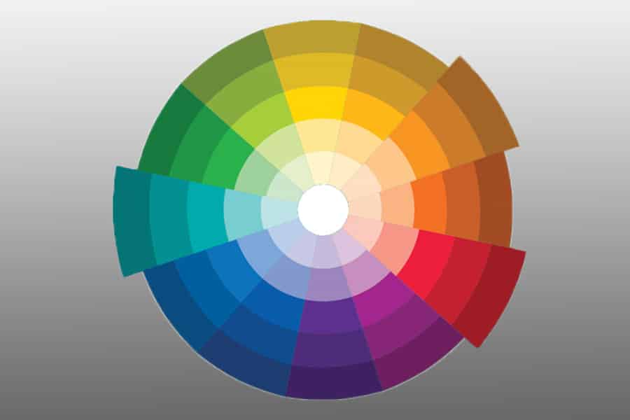
An example of split complementary colour harmony.
Split complementary is a variation on direct harmony, but it has a less intense nature and it’s very pleasing to the eye.
Imagine you’ve chosen a colour from the wheel and this colour is aqua blue.
On the opposite side of the wheel you’ll be able to see orange, but to create split complementary harmony you need to pick the colours which lie directly on the left and on the right side of the orange colour itself.
These are warm yellowish-orange and red. Combine them with aqua blue and what you get will be a classic split complementary harmony, which is very often found in nature.
This type of harmony is also very widespread and it’s a lifesaver when you aim at creating an image which is harmonious and balanced without coming across as unimaginative.
It’s basically a safe ground for any kind of visuals: photography, illustration, graphic design and many more.
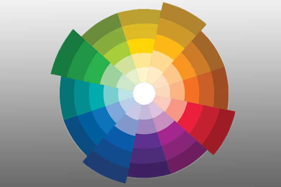
Triadic Harmony

An example of Triadic colour harmony.
The idea of triadic harmony is to use three colours that are evenly spaced from one another on the colour wheel. This type of colour scheme can be tricky to use because the end image is usually quite vibrant as a whole.
To be able to apply this harmony successfully, the best option you have is to choose a dominant colour and let the other two be submissive to it. In this way, the whole composition will have a more balanced look and it won’t seem like a random mixture of colours put together.
This harmony is similar to the split complementary concept but it’s more aggressive visually – see more triadic color schemes to get a better understanding.
That could sometimes be a desired effect: think about superhero movies for example and about the costume of Captain Marvel in particular.
Her costume is predominantly blue, but it also has a few splashes of deep red and golden yellow which act as really nice accents and complement her outfit perfectly well.
Tetradic Harmony
Tetradic colour harmony visualized.
Tetradic harmony, which you can sometimes see referred to as a square colour scheme, can prove to be a tough cookie, especially for beginners.
Its idea is to use four colours that are equally distanced on the colour wheel.
If you think about it from another perspective it’s basically using two sets of complementary colours – which is again a variation of the first harmony we had a look at.
This one is a great choice if you have a number of elements to compose, especially if you want each one of them to carry its own signature and not to be submissive to the others.
In terms of photography, this can translate into a scenario where you have four different people in one image that need to be represented in a unique way – it could be a movie poster or a theatre play, for example.
In these situations, tetradic harmony can be the way to stand out with your imagery and to really be creative!
Analogous Harmony

Analogous colour harmony with blue & purple.
Analogous colours are any that are found next to one another on the colour wheel.
Orange and red, yellow and green, and purple and blue are just a few examples – but there is a nearly infinite number of variations when you take into consideration all possible hues.
Analogous colours are definitely a safe choice and very aesthetically pleasing to the eye because they’re also quite often found in nature all around us.
Imagine, for instance, a field of bright yellow daffodils with their green stems or an autumn leaf that’s changing colours, going from orange to red (see fall photography).
Although it’s truly hard to go wrong with the palette, keep in mind that there’s one caveat involved. Those pairs are harmonious because the colours are quite close to one another – not only literally, but as a general vibe as well.
This creates a lack of contrast which can lead to an unexciting or even a dull image. In order to avoid it, you can play with tints, tones and shades to increase the contrast and breathe life into your photograph.
Not sure what the difference is between tints, tones and shades and how this knowledge can improve your images? Then the next section will bring you some clarity, so keep on reading!
Tints, Tones & Shades – The Basics

How you can get a new tint, shade or tone from a basic colour (hue).
Tints, tones and shades are three variables of a colour and are created when you add respectively white, grey or black to the original hue (the pure colour).
If you need to lighten your base colour you can add white to it and you’ll get a tinted colour.
For example, pink is a tinted red colour and baby blue is a tinted deep blue. These kinds of colours are considered to be calmer and more gentle.
They’re also sometimes called pastel colours and have come to be associated with newborns or children in general as they lack intensity and aggression.
We’ll stop here for a slight detour just to explain that tint is a different thing when we talk about colour and when we talk about light.
The best example to illustrate this point is the Tint slider in Lightroom – it ranges within the green/magenta spectrum. The more you pull the slider to the left, the more greenish your image becomes. The more you shift it towards the right end, the more magenta it gets.
(See this post on Lightroom Tips for more info on this.)
When the photo is taken in daylight such adjustments are very rarely needed, but if you use artificial light sources such as tungsten, LED, fluorescent or mercury vapour lights you will find this slider to be quite useful. In these cases, light often deviates either to the green spectrum or to the magenta one and needs a slight correction which can be effortlessly achieved with the Tint slider.
Now to understand tones. If you add both white and black (which we know as grey) to your original hue, you’ll get a new tone.
Tones are basically desaturated or dialled-down colours. Tones are not always darker than the base hue; they can also appear lighter depending on the proportions of black and white that you add.
As a rule, tones are more subtle than hues and in this way they’re easier to combine with one another in an aesthetic way.
So it’s already clear what the outcome is if you add white or grey to a hue that you’ve chosen, but what happens if you add black? Here come the shades.
Shades are formed when you add black and darken your base colour. Shades can have a pretty wide range – from a slightly darkened hue to deep almost dark colour which can even seem to be pure black unless you sample with the sampler tool in Photoshop.
This kind of “almost black” is very often associated with creating a cinematic feel and the magic of film photography. It can give a delicate vintage atmosphere to your digital images.
Hue, Saturation & Luminance in Photo Editing Software
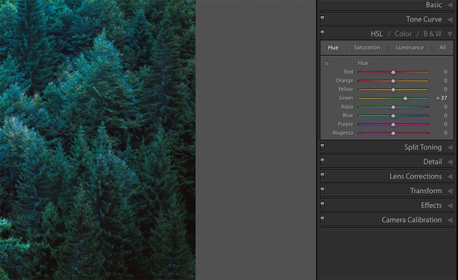
If you pick Green under the Hue adjustment and move the slider to the right, it becomes bluer.
Once you’ve taken your image, it’s time to bring it into your photo editing software for minor (or major!) adjustments.
One of the most important things you need to master when it comes to editing is colour. Let’s have a look at the three fundamental elements which describe its physical characteristic. They’re all listed in the HSL panel:
Hue is the pure colour itself, and the Hue slider represents a shift in this colour. For example, if you pick Green under the Hue adjustment and move the slider to the left, it becomes more yellow. If you move it to the right, it becomes bluer.
Saturation refers to the intensity of colour or, in other words, the purity of the hue. The Saturation slider is a tricky one to play with because adding too much intensity can kill the complexity of the image and make it look jarring, but plain.
The best thing you can do here is to stay away from the extremes unless it’s a kind of effect that you’re specifically looking for.
Lightness refers to the brightness of a colour. Using the Lightness slider you can make a particular colour in your photo look brighter and make it stand out. Or you can also take the attention away from a colour by making it darker.
Conclusion
Colours are all around us. They exist in nature in countless combinations – sometimes classic, sometimes more edgy and overwhelming.
In order to become a master of colour yourself, you need to be a great observer first. Learn to actively pay attention, even when you’re not taking photos. Be on a constant mission to explore: notice red berries hiding amongst the deep green leaves or the colour of the sky when the sun is rising, and remember the colour harmonies that feel appealing to you.
You can even start a digital “colour diary” where you can keep track of particular colour combos that take your breath away.
Can you recall which was the last colour combination that genuinely impressed you, and does it fit into any of the colour harmonies described above? Please share in the comments below!

Check out these 8 essential tools to help you succeed as a professional photographer.
Includes limited-time discounts.


Hi there! I’m Polina, a freelance photographer, always on the look out for creating simple images with powerful impact.


