


sRGB vs Adobe RGB: Which Color Space to Use?
Explore the differences between sRGB and Adobe RGB color spaces to determine which is best suited for your photography and design needs.
Learn | Photography Guides | By Andy Day
Color spaces can be confusing: RGB vs sRGB, sRGB vs Adobe RGB 1998 vs ProPhoto RGB — which one should you use? And when?
Having a good grasp of color spaces is important for photographers as it ensures that our photos are seen as we intend them to be.
By the end of this guide you’ll know which color space to use for the web and which to use when post processing, printing and archiving your work.
You’ll also learn about Adobe RGB color, sRGB color, color range science and a few other topics… but we’ll try to keep everything simple and easy to understand.
(You may also want to read our article on color theory too.)
Let’s dive right in.
What Are Color Spaces?
© Tamanna Rumee
Color space describes the range of colors that can be perceived or displayed by a camera sensor, a JPEG file, a monitor, or a printer — pretty much anything that collects, creates, or displays color.
The human eye can see around 10 million colors which means that it has a very large color space. Your home printer, by contrast, attempts to replicate what the 6 million cones in your eye’s retina can perceive by mixing ink together from a couple of ink cartridges.
The range of reproducible colors within the printer’s color space — known as a color gamut — is far more limited, and there will be colors that it simply won’t be able to create. Instead, it will improvise as best it can.
It’s useful to convey color spaces and how they compare using a graph. The colors in the graph below represent all visible light, and you’ll see that the four color spaces sit within it (just about).
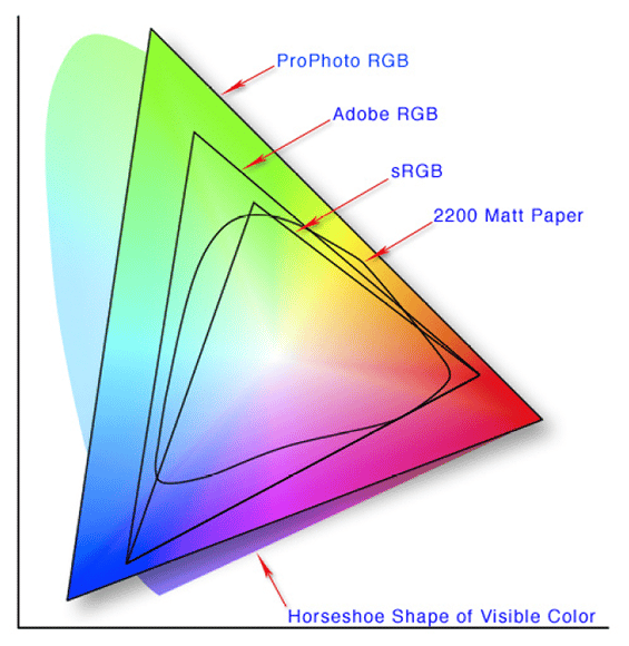
Created by aboalbiss, via Wikipedia.
Note that the color space labelled Matt Paper — similar to your home printer — covers a much smaller area than the three other color spaces that we will go on to discuss.
At every step of the photographic process, we are gradually reducing the number of colors that we are dealing with. Camera sensors capture almost everything, and then our editing software trims out some visible and some invisible colors.
Finally, printing reduces the colors even further. Every step is a compromise.
The History
All visible light is a mixture of red, blue and green, and as technology began to create more and more devices that display colors, it became useful to create certain standards in order to try and achieve some consistency.
The baseline — created by the International Commission on Illumination and dating all the way back to 1931 — is called CIE 1931 XYZ. It’s based on human color perception, and as mentioned, all of the following color spaces are a compromise.
There are many different color spaces but today, three color spaces dominate our devices. As photographers, it’s important for us to understand why they exist, how they relate to one another, and when and why they should be used.
We often save or export our work as JPEG or TIFF files. Every JPEG and TIFF has a color space — called a color profile — embedded inside it, and this determines how many different colors that individual file can contain.
(See this article if you need to choose a color profile for a MacBook Pro.)
RAW files do not have a color space as such, and they capture a very broad color range.
It’s worth noting that Lightroom edits a RAW file in a color space that is much wider than the monitor can display, but intelligently converts the file so that it’s visible while we’re editing. It’s not until you come to export a file that you assign its color space — usually sRGB or Adobe RGB 1998, and sometimes ProPhoto RGB.
Every monitor has a color space (referred to as a profile) and if you’re using an older device, it’s worth checking the breadth of its gamut — i.e., its range of possible colors — to see if what you are seeing is accurate. If color is particularly important to you, you may wish to calibrate your monitor.
If you’re asking yourself the difference between RGB, sRGB, Adobe RGB 1998, and ProPhoto RGB, keep reading.
How Much Do You REALLY Know About Photography?! 🤔
Test your photography knowledge with this quick quiz!
See how much you really know about photography...

What is RGB?

© Joyce McCown
RGB is not a color space; it simply describes the three colors that make up all visible light — red, green, and blue.
Every individual pixel in a monitor is made up of three bars: one red, one blue, and one green. These combine together to create the colors that we see, and this process is called additive color mixing.
You may have been taught that the three primary colors are red, yellow, and blue, and this relates back to pigments and painting. While we mix varying amounts of red, blue, and green to make colored light, painters mix varying amounts of red, blue and yellow to create colored paint.
Similarly, you might have come across CMYK which stands for Cyan, Magenta, Yellow, and blacK which is used in high-end printing.
Because inks and pigments reflect light instead of projecting it, combining them together is called subtractive color mixing.
Here’s why you should use CMYK over RGB for printing.
What is sRGB?

© Sharon Pittaway
- The most commonly used color space
- Accepted by most print labs
- Perfect for general use
- Closely resembles the vast majority of monitors
- Designed for viewing online and on screens
- Not as broad a gamut as Adobe RGB 1998 or ProPhoto RGB
- Less vibrant than Adobe RGB 1998 and ProPhoto RGB
- Files might appear differently when viewed on an expensive monitor
- Unexpected color shifts might occur when printed through a professional lab
sRGB is a color space first created in 1996 through a collaboration between Microsoft and HP.
These two huge corporations needed to standardize how color was being displayed across lots of different devices and, given that it went on to become the standard used by every Web browser, it’s now by far the most commonly used color space.
Being one of the earliest color spaces, it is not as broad as others that were invented later on.
Adobe RGB 1998 has a wider gamut and therefore contains more possible colors. However, because it’s not the basis for images on the web, it’s not used as often.
If you go back to the graph shown above, you’ll see that sRGB covers a smaller area as it cannot contain as many colors when compared to Adobe RGB 1998 and ProPhoto RGB.
If you’re converting an image to sRGB from a color space that has more colors, your software will attempt to approximate anything that sRGB isn’t capable of displaying and convert it to something that it can.
This might cause images to look slightly different as a result of the color values being compressed so that they fit into the new space.
However, when it comes to sRGB v Adobe RGB 1998, it’s not simply that bigger is better. It depends on how your file is being used.
What is Adobe RGB 1998?
© Robert Katzki
- Much broader gamut, meaning more possible colors
- More accurate prints — assuming the lab is capable
- More vibrant than sRGB, especially in terms of greens and blues
- Cannot be seen on the average display
- Not suited for use on the web
- Converting to sRGB might cause strange results
Adobe RGB 1998 gets its name from the year that it was created. Driven by Adobe, it was a response by digital imaging professionals who needed greater accuracy than that offered by sRGB.
You will have noted from the graph above that Adobe RGB 1998 shares the same basic shape as sRGB but its corners extend much further into the blue and green tones.
In a battle of sRGB vs Adobe RGB 1998, Adobe RGB 1998’s gamut is broader and therefore capable of containing more colors. This means it can be more accurate when replicating what was in front of your camera.
Converting an image from Adobe RGB 1998 to sRGB might cause some strange effects as the conversion software will be forced to tweak blues and greens to make them fit into the smaller color gamut.
If you’re printing at home or through a regular lab, Adobe RGB 1998 might be overkill and you may never notice the difference.
It tends to become important for those producing high-end prints where color accuracy is extremely important, or for when you know that you’ll be converting your images to CMYK later so that they can be printed.
It can also be useful for those creating finely toned black and white prints that have very subtle gradations.
What is ProPhoto RGB?
If Adobe RGB 1998 seems like overkill, ProPhoto RGB takes it even further. Invented by Kodak, this color space is massive, and is very close to what a camera sensor is able to capture.
You might even be able to include colors that you cannot see and are impossible to reproduce.
Lightroom uses ProPhoto RGB to display images when using the Display module as, according to Adobe, it contains all of the colors that a camera is capable of capturing.
Which to use? sRGB vs Adobe RGB 1998 vs Something Else?
Within your photographic workflow, it’s good to have an awareness of when you are converting a digital file from one color space to another.
This is because if you downgrade an image to sRGB, you’ll lose some of the colors and won’t be able to recover them simply by upgrading them again to Adobe RGB 1998 or ProPhoto RGB.
If you’re photographing in JPEG, you’ve probably already made a decision to use sRGB from the outset as this is how most cameras are set up — but don’t worry. If you’ve not yet encountered problems where your colors have felt limited, this isn’t something to be too concerned about.
Every image online uses sRGB and it’s ideal for the vast majority of cases. This includes most digital printers.
For most people who are editing their files and exporting as JPEGs, sRGB is often the best option as this is what web browsers are able to display.
If you upload a file for use online using Adobe RGB 1998, it might look strange when you come to view it through your browser and there’s a clear choice here when it comes to sRGB vs Adobe RGB 1998.
Most regular print labs will be happy with sRGB and you don’t need to worry.
However, anyone who is particular about their colors should be shooting in RAW. You might also want to double-check that your editing software isn’t converting your files without you noticing.
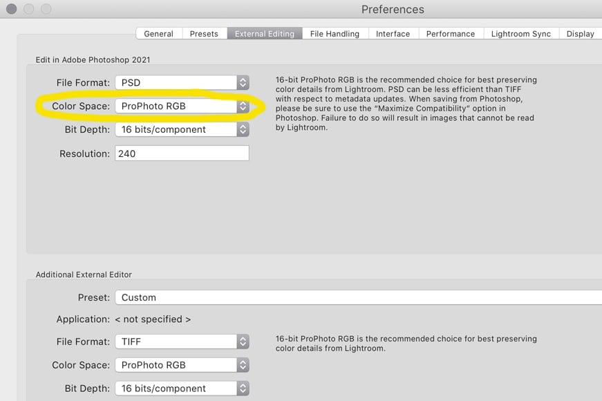
For example, if you decide to take a RAW file in Lightroom and open it in Photoshop, Photoshop has to convert the file and create an image that has a color space. By default, so that you don’t lose any color information, this is set to ProPhoto RGB, the best color space available.
You can check this in Lightroom by clicking on Preferences and then External Editing.
When you come to export your RAW files from Lightroom, you have a choice: it’s best to use sRGB if you are putting those images online or sending them to a regular printer.
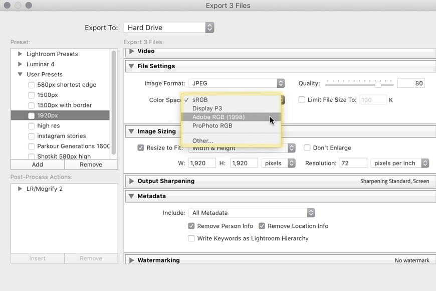
Some high-end print labs may ask for Adobe RGB 1998 to ensure that they receive more color information and give a more accurate reproduction.
More likely is that a professional print lab will have various print profiles for you to download from their website that you could then install on your computer.
You would then export a file using a color space — a.k.a., a profile — that has been designed for a specific printer and paper type.
This also applies when preparing files in Photoshop. Choose Edit and Convert To Profile and then choose the desired profile from the list.
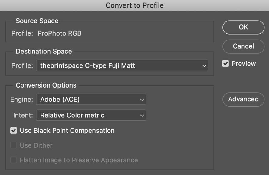
(Pro tip: the other menu item next to Convert to Profile is Assign to Profile — this may change your colors, so it’s best to avoid it unless you know what you’re doing!)
Ideally, you should be converting from your RAW file, or from ProPhoto RGB or Adobe RGB 1998 to the printer lab’s color profile as it means you won’t have lost any colors over the course of your workflow by having first “downgraded” your image files to sRGB.
These are all things to keep in mind if you’re archiving your work or delivering images to clients. If a client doesn’t specify a color space, sRGB will almost certainly be fine but it’s always good to check.
As a general rule, it’s best to go through as few steps as possible when it comes to changing your color space. Ideally, whatever final color spaces you require, create them by exporting what you need from your RAW file.
Summary of Color Space Comaprisons
Adobe RGB vs sRGB
Adobe RGB and sRGB are distinct color spaces used in digital imaging:
- Adobe RGB offers a broader color gamut, making it ideal for professionals needing extensive color ranges, especially for high-end printing. However, it’s not universally supported, so images can sometimes appear off on standard devices.
- sRGB is designed for general use and is the default for most devices, software, and online platforms. It ensures consistent color display across various mediums but has a narrower color range than Adobe RGB.
In essence, Adobe RGB is suitable for specialized professional work, while sRGB is the go-to for everyday use and online sharing.
sRGB vs RGB
sRGB is a specific color space within the broader RGB color model.
While “RGB” (Red Green Blue) represents a general method used to display colors on electronic devices, “sRGB” is a standardized subset of RGB designed for consistent color display across various devices.
Essentially, all sRGB colors are RGB, but not all RGB colors fall within the sRGB range.
Prophoto RGB vs sRGB
ChatGPT
ProPhoto RGB and sRGB are both color spaces within the RGB model. ProPhoto RGB offers a much wider color gamut, capturing a vast range of colors suitable for professional editing and high-end printing.
In contrast, sRGB is a standardized, narrower color space designed for consistent display across common devices and online platforms.
While all sRGB colors are RGB, not all RGB colors, especially those in ProPhoto RGB, fall within the sRGB range.
Final Words
Color spaces are complex, but they don’t need to be.
There are advantages and disadvantages to each color space depending on what you’re doing with your files.
Whether it’s sRGB or Adobe RGB 1998 — or ProPhoto RGB or a profile specific to a high-end print lab — having a workflow where you understand where compromises are being made is important.
Hopefully, you found this post useful; if you have any questions, be sure to leave them in the comments below.

Check out these 8 essential tools to help you succeed as a professional photographer.
Includes limited-time discounts.


Andy Day is a British photographer and writing, living and working in France, specialising in adventure, travel, architectural and landscape photography.


