


How to Use Triadic Colors in Photography
Using a triadic color scheme in your photography is a great technique. When you understand triadic colors, you'll notice them everywhere. Learn more here!
Learn | Photography Guides | By Andy Day
Shotkit may earn a commission on affiliate links. Learn more.
Triadic colors are pleasing to the eye and can help your images to create an impact and grab a viewer's attention.
Along with light and composition, every photographer should have a good understanding of color and how different hues and tones work together.
Some color combinations work better than others, and if you're planning a photoshoot where you can control some of the colors — perhaps by choosing someone's jacket while you're out exploring, or creating a backdrop for some product photography — knowing some color theory will help you to create great images.
The triadic color scheme might sound complicated but they're actually easy to understand as there's only a couple of combinations that follow the rules.
Let's take a closer look.
What are Triadic Colors?

Triadic colors are combinations of three colors that work well together, as suggested by the way that they are evenly spread out around the color wheel.
To find three colors that fit together, simply draw a triangle with sides of equal length onto the color wheel. The three points of the triangle point to three triadic colors.
Notice how the each color is an equal distance from the other two on the color wheel.
The most obvious triadic color combination is red, yellow, and blue:

In terms of the basic colors, you might have realised already that there are not that many color combinations that fit this formula.
Along with red, yellow, and blue, there are a total of four possible combinations. The three others are:
Red/orange, yellow/green, blue/violet:

Orange, green, and violet:

Yellow/orange, blue/green, and red/violet:

Of course, there are lots of colors in between on the color wheel and it's not necessary that the different hues are exactly spot on for the colors to work together, particularly if your image combines tones that are less vibrant.
In general, if one or more colors are lower in saturation, it means that colors are less likely to clash.
Depending on how they are used, some people find bold, heavily saturated triadic colors a bit too intense and jarring. You might find that they work better for you if you use less vibrant versions of the three colors, moving towards hues that are more pastel.
For example, high saturations of the primary colors red, blue, and yellow are quickly associated with toys for toddlers (or perhaps Superman!) and can be quite intense, giving them a slightly childlike feel.
By contrast, a less saturated combination of all three colors from the triadic color scheme can feel refreshing or even soothing:

If you are planning a photoshoot where you can control the colors that you are photographing — perhaps in a studio — you could choose your first color and then see which other two colors go with it.
Simply imagine a triangle with equal sides extending from your first color. The two other corners will give you your two other colors.
Depending on how they are used, a triadic color scheme can often be uplifting and vibrant, giving a pleasant contrast that can be energetic.
Because of how they are spread around the color wheel, triadic colors do not always sit together harmoniously if they are highly saturated and used in equal amounts.
You may prefer to use one dominant color that is complemented by subtle use of the two other colors.
Alternatively, keep in mind that the colors don't have to be the same intensity or brightness, as suggested by the triadic color schemes above.
You could match one light color with two colors that are darker shades — i.e., they contain more black. For example, bright yellow could sit alongside dark red and dark blue:

Alternatively, you could pair one vibrant color with two other shades that are more muted.
For example, you could take the orange shown in the triadic color schemes above, and easily link it with pastel hues of violet and green.
(Orange, purple and green are known as secondary colors.)

Vibrant colors can be energetic, while pastel colors can be soothing, and blending the two can bring a gentle balance between them, with one intense color that is offset by two other tones that are soothing.
It's rare that you will find examples of triadic colors when you are out photographing, particularly if you are in nature. You might find orange and purple flowers framed against the green of their stems, but otherwise these color combinations are more likely to be found where humans are involved — in street photography, for example.
The rules here are not too strict: color theory isn't about sticking rigidly to a list of prescribed ideals where doing something different will mean that your colors don't work.
Instead, it's about giving thought to how you want your colors to work together, perhaps giving you some ideas of how to add to a scene that already contains two of the colors listed above.
You might be planning a photoshoot where you get to choose the clothing that your models are wearing, perhaps adding a pair of yellow trainers to go with a model's blue jeans and red sweater – a classic triadic combination in fashion.
Otherwise, knowing about the triadic color scheme might guide you when you are editing your photographs.
For example, if you have an image of someone hiking through green hills with the sunset creating an orange sky, you might decide to change the color of the dress that your subject is wearing so that it is closer to violet.
This will help the model to stand out as much as possible but without creating a clash of colors.
In photography, you should also try and incorporate the color blue as the opposite of orange.
Another system that is very closely related to the triadic color scheme is the split complementary scheme.
You might be aware of how complementary colors work: very simply, from one color, you go to the direct opposite side of the color wheel to find your second.
Split complementary colors work by going opposite, but branching out slightly to find two colors that are close to each other, instead of just one.
Like triadic colors, a split complementary color scheme has three colors. Instead of it being a triangle with sides of equal length, there are two long sides and one short. Here's an example:

As you can see, there are multiple variations of triadic color schemes that can be experimented with, so let's take a look now at some tips and tricks to help you use them in your next photoshoot.
6 Tips for Using Triadic Color Schemes in Photography
Photographs which use a triadic color scheme be uplifting when vibrant, and soothing when pastel, but what other tips are there when figuring out a color scheme for your work?
- A bright combination of primary colors (red, yellow, and blue) can conjure thoughts of children's toys, so keep this in mind when putting them together!
- Try using one dominant color that is complemented by two other colors that are used as accents
- The primary color red complemented by blue and yellow can be intense, invoking energy, passion, love, or anger
- Yellow that is complemented by blue and red can be intimate, suggesting warmth
- Blue complemented by yellow and red can feel lower in energy, more tranquil and serene, giving a sense of softness
- Try using one vibrant color that is complemented by subtler hues of the two other colors
In short, decide on your complementary color schemes based on the feeling you're trying to evoke in the viewer. Make the most of your color photography, whether in-camera or in post-production.
6 Triadic Color Scheme Examples
Here are six examples of photographs that feature a triadic color scheme.
Notice how bold and striking these colors are because of the way that they are presented alongside one another.

Triadic color schemes in the wild | Credit: Melissa Askew

Triadic color schemes on the street | Credit: matthaeus
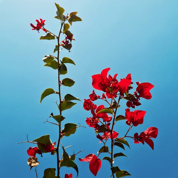
Triadic color schemes in flower photography | Credit: Defne Kucukmustafa

Triadic color schemes underwater | Credit: Ludovic Migneault
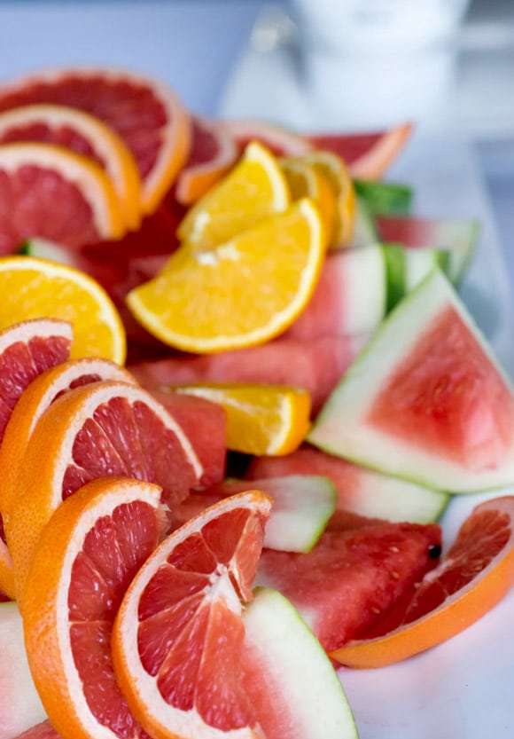
Triadic color schemes with food photography | Credit: Scott Webb

Triadic color schemes in nature | Credit: James Chou
While it takes a trained eye to spot examples of the triadic color scheme in nature, you're much more likely to find them in graphic design and interior design.
Pay attention the next time you're browsing through magazines to try and understand the reason for the colors chosen by designers and make a note of any color palette that takes your fancy.
Color Scheme FAQs
What is an analogous color?
Analogous colors are groups of three colors that are next to each other on the color wheel, and a tertiary. Red, orange, and red-orange are examples.
What is a tetradic color?
Tetradic color schemes have an equal distance between all 4 colors, distributed evenly around the color wheel, with no clear dominance of one color.
What is a tertiary color?
Tertiary colors are created by mixing equal parts of a secondary color and a primary color together. There are six tertiary colors – red-purple, red-orange, blue-green, yellow-green, blue-purple, and yellow-orange.
What is a color palette?
Color palettes are selections of different colors. They are used predominantly by designers and artists, but also by photographers when planning work, often in an attempt to create harmony between different colors or to highlight a particular color.
Final Words
Understanding triadic color schemes is a useful addition to your knowledge of how colors can work together, helping you to make creative decisions when planning or shoot, or when you come to edit your images on your computer.
If you have any questions about color combination theory, different color schemes, or anything to do with triadic color themes in general, don't hesitate to get in touch via the comments below!
Check out these 8 essential tools to help you succeed as a professional photographer.
Includes limited-time discounts.

Andy Day is a British photographer and writing, living and working in France, specialising in adventure, travel, architectural and landscape photography.
1 Comment
Leave a Comment
👋 WELCOME TO SHOTKIT!
🔥 Popular NOW:

Thanks for reading! Let me know if you have any questions. 😊