


Hue, Shade, Tone & Tint: What are the Differences?
Explore the nuances of color theory with our detailed guide on the differences between hue, shade, tone, and tint, perfect for enhancing your artistic skills.
Learn | By Dana Dekis
Shotkit may earn a commission on affiliate links. Learn more.
In everyday life, most of us are guilty of using hue, shade, tint, and tone interchangeably.
However, there’s a technical difference between all four, and the definition of each is extremely important in the realm of color theory.
In this guide, I’ll discuss the definitions of hue, shade, tone, and tint and what makes each of them different from the others.
The Difference Between Hue vs. Shade

What is Hue?
Color terminology matters because of technical definitions in color psychology.
According to the experts at Pantone, a pure Hue is a color without any modification.
Hue refers to the 12 colors listed on the color wheel.
What is Shade?
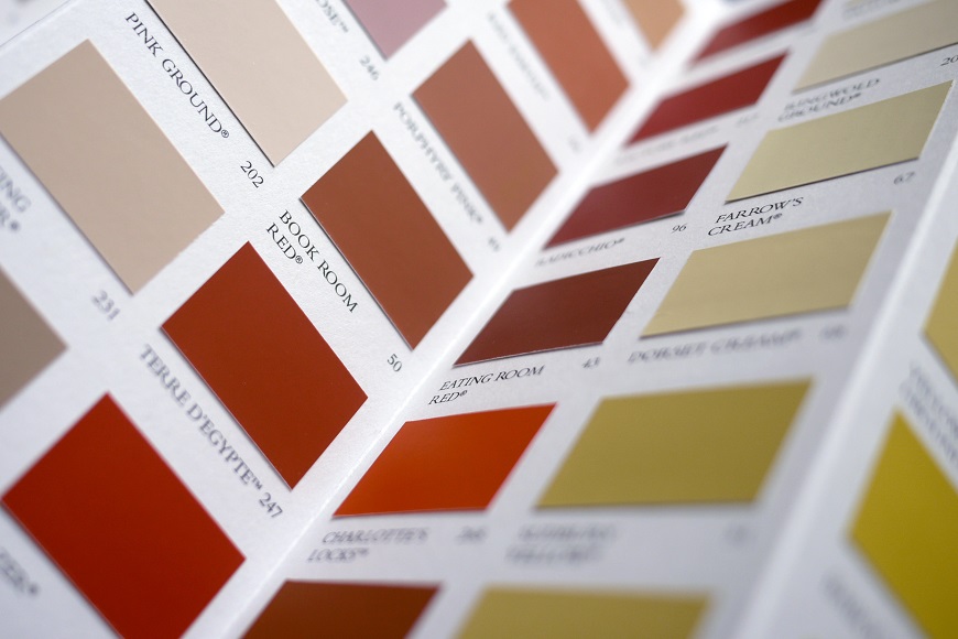
Shade can be defined as a pure color with black added, making it darker.
Dark-colored paint samples are classic examples of shades with black added for depth and dimension.
What Is the Difference Between Hue, Shade, Tint, and Tone?
There are subtle differences between hue, shade, tint, and tone, so here’s a quick summary:
- Hue refers to pure colors without any alterations. While you might think only primary colors and secondary colors are hues, tertiary colors count as well – think of the classic color wheel to find a pure hue.
- Shade refers to a pure color with black added for depth. No white or gray is added, just black.
- Tint refers to a pure color with pure white added for a softer look – think pastel colors like light blue when you imagine tinted colors.
- Tone refers to a pure color with black and white (gray) added for a slightly duller look without losing brilliance. In design language, tone can sometimes be used to represent the value (see below) since both black and white are added.
- Value is another term you’ll come across in the art dealer world that can be defined as how light or dark a color is. For example, fiber artists rely heavily on value when deciding between darker shades or lighter versions of the general color palette they’re interested in.
Pro tip: If you’re unsure what colors you want for a knitting or crocheting project, add a black-and-white filter to each color to reveal their relative brightness.
What is Hue in Color?

How you can get a new tint, shade or tone from a basic colour (hue).
Hues can be found on the color wheel. They also can be found in a rainbow, which shows one hue blending into another.
As noted above, hues are primary colors as well as secondary and tertiary colors, according to textbook definitions.
Pro tip: When an artist or art instructor is discussing the word hue, they’re referencing the pure colors found on the color wheel, meaning it hasn’t been mixed with white, black, or gray.
What people consider to be colors (which are typically actually shades, tints, and tones) can vary. As such, hues help eliminate any confusion by only referencing the ones that make up the color wheel.
Examples of Hue
Classic hue examples include all the basic ones you learn as a kid: green, blue, and yellow, as well as some more complex examples such as blue-violet.
Pro tip: In the outside world, my go-to example for true red is Target’s bullseye logo, which is an excellent example of branding thanks to its clean, memorable red symbol.

Why Does Hue Matter in Color Theory?
From the lens of color theory, hue matters for a variety of fundamental reasons, such as:
- Color identification: Pure colors, or hues, allow us to both identify colors and differentiate them without the subjective nature of shades, tints, and tones. The color wheel is an ideal symbol for identifying and distinguishing colors that make life easier and more accessible for designers, artists, stylists, and more.
- Significant associations: Whether we’re referencing emotional or cultural symbolism, hues are tied to how we perceive things around us. For example, when we see a warm hue like an intense red, we tend to link it to energy, boldness, and vitality. On the opposite end of the spectrum, cooler hues like blue tend to have a calming effect.
- Safety symbolism: Hues can also play a crucial role in matters of danger and safety. For example, red lights and stop signs are red to get your attention and notify you to stop, thus avoiding car accidents. Yellow traffic lights and signage also encourage pedestrians and drivers to slow down or yield.
- Complementary colors: When it comes to interior design and branding, the relationship between colors is massively important. Using complementary colors, or even just enough contrast between two hues, allows us to achieve a harmonious mood in a space. On the color wheel, blue and orange are two examples of complementary colors that are visually pleasing to the human eye.
Pro tip: A quick point of reference for complementary colors in use is the FedEx logo shown below.
- Read more: Guide to Complementary Colors in Photography

What Is Shade in Color?
In the world of color, a shade is produced when black is added to pure colors. This adds depth and darkness while reducing the color’s lightness.
Shades are often relied upon for their depth and contrast across design realms.
Examples of Shade

Navy is one of the best examples of a shade and is a popular brand color due to some color theory and color psychology associations such as:
- Elegance
- Serenity
- Reliability
- Professionalism
Pro tip: With associations like the ones above, it’s no wonder major brands have navy as a primary brand color across their logos, product designs, and more. The Lowe’s Home Improvement logo below is the perfect example.

Navy is also often associated with nautical themes, so you’ll always spot it around decorated beach houses and seafood restaurants.
Why Does Shade Matter in Color Theory?
We already know that shades are pure colors mixed with black, but why is that important?
Shades matter because they can add artistic depth and that coveted cinematic feel to films, ads, and beyond.
Mixed colors that create shades are also important because they help promote realistic representations in design and art by demonstrating how light and shadows come into play with different objects.
Shade mixtures can also help you add more depth to a paint sample if you want to elevate a room in your home.
From a broader lens, the darker version of these colors helps to:
- Add mystery
- Set a tone of seriousness
- Direct attention to key elements (think of light lettering with a dark outline)
- Create hierarchy
You can create shades by gradually adding pure black to colors to achieve a darker overall value.
- Read more: Guide to Triadic Colors in Photography
What Is Tint in Color?
When you mix pure colors with white, you create a tint.
Tints are typically used to produce pastels, which are beloved for their soft aesthetic.
Examples of Tint
I always think of Lacoste’s collection of luxurious pastel sweaters when I think of what tint refers to.
An excellent example of a true tint is pink, which is a combination of a pure color wheel hue like red with white mixed in.
Other stellar examples of tints and a paler version of hues include:
- Lighter shades like yellow-orange
- Periwinkle
- Seafoam green
Why Does Tint Matter in Color Theory?
Tints matter for the same reasons shades do – they can impact how we perceive a brand or product.
More specifically, tints can help:
- Create contrast in design
- Balance out darker shades of a color palette
- Convey an airy or soft mood
- Highlight interior design or architectural accents that complement darker colors
Pro tip: If you’re having trouble envisioning what a tint is, think of all the different tints showcased in candy.

What Is Tone in Color?
You can achieve a tone when you mix a color with a beautiful blend of black and white.
Combining black and white, you’ll get tones that are less vibrant than the original color.
Though initially a foundation to build upon for most color palettes, tones are a vital component of color palettes as they represent warmth and comfort.
In advertising and everyday life, most of the colors you’re engaging with have been toned down to be less vivid and more sophisticated.
- Read more: Guide to Split Toning in Lightroom
Examples of Tone

Terracotta is an ideal example of a tone in color theory.
With variable gray undertones, terracotta can range from more burnt orange or brown, like burnt sienna, all the way to a color combination, such as pinker peaches.
Let’s recap what we’ve learned so far to make everything easier to remember:
- When a hue is mixed with white, it becomes a pure tint.
- When a hue is mixed with black, it becomes a pure shade.
- Once black+white (gray) are added to a color, it becomes a tone.
Why Does Tone Matter in Color Theory?
In color psychology, toned colors, or color mixtures with gray, serve an important role in how we interact with things around us.
Because tones are mixed with black and white, they can:
- Enhance the effects of shadows and light in design and photography
- Bridge the gap between light and dark components
- Elevate visual interest by adding dimension and breaking up broad sections of color
How Does Pantone Fit Into All of This?
Even if you’ve only dabbled in the color theory realm, you’re undoubtedly familiar with Pantone.
Personally, I live for hearing the Color of the Year announced every December, which ultimately gets confusing because it’s never a true hue!
Peach Fuzz was named the Color of the Year, with Pantone’s Executive Director explaining its intention to symbolize closeness and collection.
Pro tip: I highly recommend reviewing Pantone’s website to get a crash course on color theory while getting a feel for the most in-demand tones, tints, and shades while learning more about the variations between each. You’ll become truly mesmerized by discovering how each term plays a role in pop culture, fashion, interior design, advertising, and more.
Adobe Color is another useful tool you can check out for creating color palettes and themes.
FAQ
Is the shade the light value of hue?
No, conversely, a shade is considered the dark value of a hue since black is mixed in.
What is value vs. tint vs. shade?
We use value to refer to a color’s overall lightness or darkness. Tint should be used when referencing lighter colors that have reduced darkness from white being mixed in, while shade has been darkened by adding black.
What is an example of a hue?
Pure dominant colors like the kind found on the traditional color wheel are all examples of hues.
What is the difference between shade and value?
You achieve a shade when mixing a color with black, whereas value speaks to the overall lightness or darkness of a color.
Final Words
Ultimately, the nuanced differences between hue, shade, tint, and tone are important beyond just the art industry because they help consumers make more intentional color choices.
Shades, tints, and tones are all variations of hues found on the color wheel. When we work to understand them all individually, we can have more accurate conversations when discussing color.
Trying to keep all these terms in order can be a little confusing when the world around us tends to use them all interchangeably, but thankfully, several pro tips in this article can help you keep them all straight!

Check out these 8 essential tools to help you succeed as a professional photographer.
Includes limited-time discounts.

Dana is a passionate lifestyle photographer and professional writer. When she isn’t working with designers and creative directors at photoshoots, she can be found using her Fujifilm or Nikon cameras out in the wild, capturing elements of fashion and nature.

👋 WELCOME TO SHOTKIT!
🔥 Popular NOW:
