


22 Essential Photography Composition Techniques for Better Photos
Improving your composition in photography is the number one way to getting better photos. Learn 22 rules, techniques and tips to amazing compositions.
Learn | Photography Guides | By Andy Day
Shotkit may earn a commission on affiliate links. Learn more.
We’ve all heard photographs as having been “well” composed or having “strong composition,” but what does that actually mean?
There is a subtle interplay between what is in your frame and the frame itself. This positioning taps into the human psychology of how we read images.
Our guide explains composition in photography for beginners and will give you a detailed, easy-to-follow understanding of essential techniques which you can use to create images that grab a viewer’s attention.

The guaranteed best way to get a clear understanding of composition fundamentals in just 2hrs of reading.
This series of mini photography composition tutorials will give you a solid foundation on which to build, as well as some practical exercises to start getting your eye in!
We’ve included various standard composition techniques, as well as composition guidelines for more experienced photographers who want to experiment a little more.
Composition in photography is an important topic and technique, so let’s dive right in.
What is Composition in Photography?
Along with light, color, and subject, composition in photography is a fundamental part of how a photograph tells its story, determining its visual impact and establishing a connection with the viewer.
Composition is how the various elements in your photograph are placed within your frame, how they each relate to one another, and also how they relate to the frame itself.
The composition of a photograph is shaped by your position as the photographer, your angle of view, your lens, and even by how much of your image is in focus.
Learning how to make strong, effective compositions will have a huge bearing on how people perceive your photographs, helping your images connect with a viewer at an emotional level.
- What is good photography composition?
Of course, what qualifies as “good” in any art form is completely subjective, but we can probably say that good photography composition tends to use a few conventions that draw on how our brains read an image, and how we are constantly conditioned to understand how images work as a result of seeing them around us in our everyday lives.
A good composition might give a sense of balance but equally, it might create drama by being deliberately unbalanced.
22 Photography Composition Rules, Principles & Elements
The word “rules” isn’t always useful when learning about composition because you might read this article and then discover that your favourite photographers never seem to use them!
Like any set of rules, these rules for composition can be broken, but more than that, they should be regarded as gentle guidance on your progression as a photographer rather than a definitive list that needs to be ticked off every time you take out your camera.
While it can be a useful exercise for finding new ways of working, no photographer looks at a scene and thinks “Right, I think I should use the rule of thirds for this photo” before raising the camera to their eye.
Even when looking through the viewfinder, rules are rarely given deliberate thought during the process of taking a photograph.
As a result, the rules of composition in photography listed below should be taken as points of departure — much better than being seen as a rigid set of ideals that might then risk stifling your creativity.
Read them, absorb them, and rather than always taking photographs with these rules in mind, reflect on them when you come to edit your images so that you can see where they work and where they might fall short.
1. Rule of Thirds
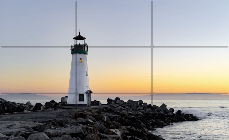
© Paulius Dragunas
The rule of thirds is always the first photo composition rule on every teacher’s list, and even lots of non-photographers will have heard it mentioned.
Because it’s so well known, you’d be forgiven for thinking that it offers some magical formula for turning any failed composition into something more successful — so much so that if your camera gives you the option of overlaying a grid on your viewfinder, the first option will almost certainly be for the rule of thirds.
The rule of thirds draws imaginary lines on your image: two vertical and two horizontal, equally spaced and dividing your frame into 9 boxes of equal sizes.
The theory says that the main points of interest in your photograph should sit at the points where these lines intersect, or fairly close to them.
The idea comes from the writing of John Thomas Smith, an English painter, just before the turn of the 18th century and was part of his explanation on how to compose paintings of the countryside.
He suggested that the sky should consume either one third or two-thirds of a scene, and that painters should avoid placing the horizon in the middle as this was less visually satisfying.
From there it evolved and has become a mainstay of not just landscape images, but photography and visual arts more generally.
As one of the fundamental rules of composition, the rule of thirds can help beginner photographers escape from the idea of always putting their subject in the middle of the frame, and help to give you a better idea of how to create a balanced image.
This isn’t just in terms of placing subjects at the intersecting points, but coming to understand balance more generally, such as not automatically putting the horizon across the middle of an image.
How to create this balance can feel like a mystery but fortunately, we have centuries’ worth of artists such as John Thomas Smith that have already put the work in.
You can spend time looking at their art and start to subconsciously absorb what it is that they are doing that somehow just seems to work.
Rather than sticking to the rule of thirds as a fixed device that tells you where to position your subjects, treat it as a reminder towards finding a composition that feels balanced.
Consider also that the rule of thirds can be quite restrictive as it might prevent you from playing with more complex compositions such as using repeating patterns, leading lines, symmetry, and making use of large areas of negative space.
Like all of the rules for composition in photography on this list, give it a go but don’t assume that just because it’s so well known that the rule of thirds is always going to give you a successful composition.
And remember: if the rule of thirds were as important as it first seems, every painting by Piet Mondrian would look pretty much the same!
2. Centering Your Subject

© Kate Hliznitsova
All of us picking up a camera for the first time will place our main subject slap bang in the center of the frame as it’s the obvious thing to do: ‘This thing in front of me that I’m photographing is important so it goes in the middle.’
Once we start to give our compositions more thought, we tend to avoid centering our subject (aka center composition) and start deploying other compositional techniques such as the rule of thirds described above.
However, centering an element isn’t always the wrong thing to do. It can convey the importance of a certain subject, can give a sense of balance if there are other subjects or points of interest positioned around it, or might create a feeling of symmetry.
Some might argue that you should center your subject in order to create symmetry, but remember that disrupting a sense of balance can be equally effective, deliberately unsettling the equilibrium to bring energy and drama to a scene.
Similarly, the proportions of your frame can also come into play. The rule of thirds described above is often useful when thinking about non-square image, especially those shot on the classic 35mm proportions of 3:2.
However, a photograph can be any proportion, and perfectly square frames can lend themselves particularly well to subjects placed in the center.
This is a good reminder that these rules of composition in photography are not fixed and can be affected by a huge variety of factors.
3. Symmetry
© Leandra Rieger
The human eye loves finding patterns, and symmetry can be particularly satisfying, like slotting in the last piece of a jigsaw puzzle.
As mentioned above, centering your subject can be one means of introducing a sense of symmetry to a scene, dividing the frame vertically down the middle so that a pattern or shape is mirrored on either side.
Manmade structures often lend themselves well to creating symmetry, and architects have been using it for centuries to give a sense of stability, refinement, and balance.
Symmetry can be found in nature also, perhaps with small imperfections, such as a leaf that curves very slightly to one side at its tip.
Despite this, as long as the symmetry is strongly suggested, it can inspire a sense of tranquillity and completion in the viewer.
4. Dynamic Symmetry
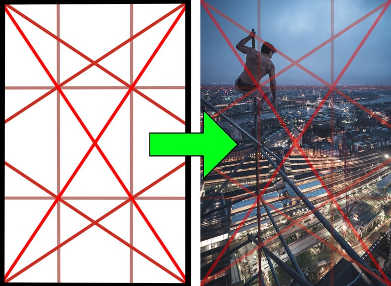
We usually think that the word symmetry means a line that divides something into two mirrored parts, or perhaps some sort of repeating pattern as a result of other reflections or rotations.
However, symmetry can also mean a beauty that comes from having balanced proportions, and it’s from this understanding that we get the term dynamic symmetry.
It stems from an understanding of proportions that can be found in nature and has its roots in the golden ratio (also known as phi and sometimes written as φ) which has influenced our understanding of beauty and balance for centuries.
The golden ratio in photography makes pictures more attractive and alluring, possibly since the balance represents proportions in nature.
It’s said that one of the most famous photographers of all time, Henri Cartier Bresson — originally a painter — used dynamic symmetry extensively in his work.
Just as the rule of thirds gives you means of dividing your frame, dynamic symmetry draws lines which can help as a guide for your composition, perhaps by finding ways to imitate these lines in your scene, or by placing certain subjects or points of interest where these lines intersect.
The foundation of dynamic symmetry is a pair of diagonal lines that run from opposite corners of your rectangular frame. You then draw another line from a corner that crosses the other diagonal line at precisely 90 degrees.
This is interesting mathematically as, whatever the portions of your rectangle, the same ratios will emerge in how these lines intersect.
You can then add additional lines that connect these intersections, creating vertical and horizontal lines that, by no coincidence, resemble the rule of thirds.
You can almost think of dynamic symmetry as being a more sophisticated and mathematically satisfying version of the rule of thirds.
While some photographers might use these lines to plan a shot — perhaps working in a studio or creating a still life — it’s more likely that you will find that you can apply these lines to photographs you’ve already taken. You can then slowly absorb how these images were effective in terms of their composition.
Dynamic symmetry can be effective because our eyes like to find certain patterns in what we see, giving us a subconscious sense of satisfaction when we encounter them.
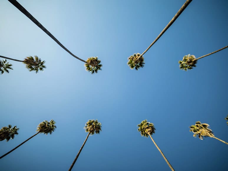
5. Geometric Shapes
© DesignClass
Our brains love being able to simplify visual data into strong geometric shapes, with circles, rectangles and triangles playing a strong role in how we take appreciation from a photograph.
A shape might be well-defined, perhaps framing a subject, or it might simply be implied, perhaps by how a couple of similar elements within the frame have been arranged.
If you have an empty frame with two dots, our brains will instinctively draw a line between the two, judging their relation to one another. Placed correctly, a third dot will prompt the brain to draw a triangle, and a fourth dot will suggest a square.
Geometrically simple shapes can help to create strong compositions, but remember that they become weaker as they become more complex, and become lost when other parts of the scene interrupt them.
6. Horizontal Lines

© Ben Ram
Horizontal lines connect with our understanding of the horizon and giving us a sense of stability and, as a result, calmness.
Unless you’re doing it for a particular reason, it’s best to make sure that your horizon is perfectly horizontal otherwise it will jar with your viewer’s perception of what is normal and potentially make the photograph feel slightly uncomfortable or unsettling.
Another reason for your horizon to be perfectly horizontal is so that it creates a parallel with the top and bottom edges of your frame. Just as the brain seeks out strong shapes, it appreciates it when these lines reflect one another.
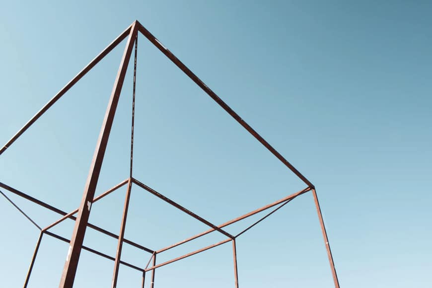
7. Vertical Lines

© Mauri Karlin
Vertical lines imply strength and solidity. As with the horizontal lines above, vertical lines often have their best impact when they are parallel with the left and right-hand edges of the frame.
Architectural photographers often work hard to ensure that their vertical lines are perfectly vertical as it helps to give a sense of presence, permanence, and precision.
8. Diagonal Lines
© Joseph Ngabo
While horizontal and vertical lines tend to conjure calmness and stability, diagonal lines create drama.
In the photo above, the photographer chose to use a worm’s eye view to create intrigue with the trees shown at an unusual perspective.
Notice that the starting point for the dynamic symmetry described above is the two diagonal lines that go from corner to corner.
This pair has so much importance that they’re each given a name: the Baroque, leading from the bottom right to the top left, and the Sinister, leading from the bottom left to the top right.
Diagonal lines leading in from the bottom corners of an image give us a sense of perspective — think of a photograph looking down a road or a railway track and leading towards the horizon.
9. Parallel Lines

© Modern Affliction
Just like the geometrically pleasing shapes mentioned above, parallel lines stand out to the viewer.
Just like the shapes, they don’t need to be obvious; instead, they can be implied, perhaps through a cluster of similar elements.
10. Converging Lines

© Paulius Dragunas
Converging lines means diagonal lines, and the more pronounced this convergence, the more energy will be felt in an image.
Lines that come together bring the viewer with them and telling them where to go.
11. Curved Lines

© Steve Wiesner
Because they appear so frequently in nature, curved lines can often give an image a softer, more organic feel.
You can take this one step further by attempting to incorporate curves that reflect the golden spiral, drawing again on mathematical patterns that are found in nature.
The S curve is one example of using curved lines as a reference for composition in photography.
12. Leading Lines

Credit: Evi T.
Photographers use leading lines as psychological nudges that guide a viewer through a photograph, pushing their attention to the focal point, and emphasising the importance of a particular part of a scene. No wonder this has been a staple image composition technique in a photographer’s arsenal.
All of the lines described above can be leading lines. They often create the most impact when they bring the viewer in from the edge of the frame, perhaps leading to one of the intersecting points outlined in the rule of thirds or dynamic symmetry.
One tip to using leading lines in your as a reference for composition in photography is to get down low or hold the camera closer to the ground to accentuate the effect, as in the image above.
13. Fill the Frame

Credit: Luke Tanis
This is a compositional technique that can ignore every other technique on the list: take your subject, get close or zoom in, and include nothing else in your image.
If the subject of your photograph has a strong enough presence, you can create a very impactful composition by using it to completely fill your frame.
It might sound like something a child might do, but this can be a very effective and direct way of composing an image.
It removes any distractions and ensures that your viewer’s attention is completely consumed by one element. There’s no need for leading lines or creating a sense of balance as your subject has completely taken over the frame.
If you have a zoom lens, this technique is simple to implement. Without one, you can try using a wide-angle lens with a short minimum focusing distance, and just get up close to your subject.
What does filling out your frame mean?
14. Negative Space

Credit: Morten Hornum
At the other extreme is negative space which uses large chunks of nothingness to create a sense of balance within an image.
Negative space is any area of blankness that is not the subject of a photograph. It’s a bit like the gap between notes that gives a piece of music its structure.
You can almost think of it being like a dramatic pause when someone is speaking. If it’s too long, it becomes distracting but if you get it just right, it adds emphasis and helps to convey the emotion of the words.
Using negative space as one of your composition techniques often means simplifying the number of elements within your frame and perhaps using a blank section of the sky or a wall to take up a large part of your frame.
Negative space gives greater prominence to the subject of your photograph, emphasising its importance and removing any intrusive elements that might be distracting.
15. Minimalism and Simplicity
© Glen Carrie
Closely tied with negative space is making use of minimalism. The human brain loves simplicity, part of why some of the most successful brand logos in the world — think of Nike or Apple — are little more than a basic shape in a single color.
In terms of composing a photograph, removing clutter and isolating your subject removes distractions and means that the visual impact of your image won’t be compromised.
Pay particular attention to unwanted elements at the edge of the frame as these tend to carry more visual weight and can be even more distracting.
If you can’t frame them out, consider eliminating them when you come to edit your photographs using software such as Lightroom or Luminar AI.
16. Frames Within Frames

© Andy Day
Frames within frames — also called subframes — are where a geometric shape (implied or otherwise) contains another element.
Someone standing at a window or in a doorway are obvious examples, but the possibilities to use this as a tool for composition in photography are endless.
You can construct a frame using out-of-focus foreground objects, use props, find natural elements such as trees, or even by positioning yourself or your subject so that they appear in between other people.
Frames within frames typically contain negative space that then help to isolate your subject and guide your viewer’s eye.
You can read more about how to use frames in our guide to foreground, middleground and background in photography.
17. Isolate Your Subject

© Andy Day
This ties in and overlaps with a few of the rules of composition described above. It quickly becomes a way of seeing the world when you pick up your camera: position yourself or your subject so that its shape is not interrupted by anything else.
We know from this list that the human eye likes distinct shapes and having your subject shown cleanly in your image gives them a stronger presence within the frame.
This is because the eye is able to absorb their visual form more quickly and the brain gets a sense of satisfaction from their isolation.
To isolate a subject, you could present them within a subframe or surrounded by lots of negative space, or use a very shallow depth of field so that all of the background elements are blurred.
After familiarising yourself with this list of techniques, you’ll start to see how they are used by your favourite photographers, but none more so than this trick of isolating a subject.
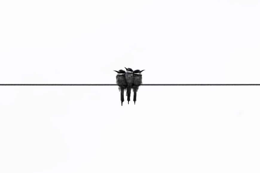
18. Rule of Odds

Credit: Holly Mindrup
For some reason, the brain seems to prefer odd numbers over even when it comes to visual elements within a frame.
The number three is particularly effective and you will notice that it gets used frequently in product and food photography. Because of the repeating elements, it will either create a line or a triangle, both of which the brain appreciates.
19. Rule of Space

© Coen van de Broek
If an image shows that an element is moving — perhaps a vehicle, an animal, or simply someone walking — there are different energies created by the photograph depending on whether there is space shown in front of the subject for it to move into, or behind it which it has clearly just left.
Positioning the subject so that it feels like it is moving towards the centre of the frame rather than about to escape it can be more satisfying as the viewer has a sense of where the subject is going.
Having the subject about to leave the frame can invoke a feeling of drama as the viewer will have a subconscious urge to see where the subject is headed.
For animals and people, the direction of gaze can also have a large impact on the energy that a photograph conveys. Most television interviews will position a subject slightly towards one side and angled so that they’re looking towards the centre of the frame as it feels the most natural.
In a photograph that uses this setup, the viewer’s eyes will go straight to those of the animal or person, and then follow their gaze towards the middle of the image, giving a sense of balance.
If a person is looking away from the centre of the frame, it can be unsettling, or the subject might seem aloof or mysterious.
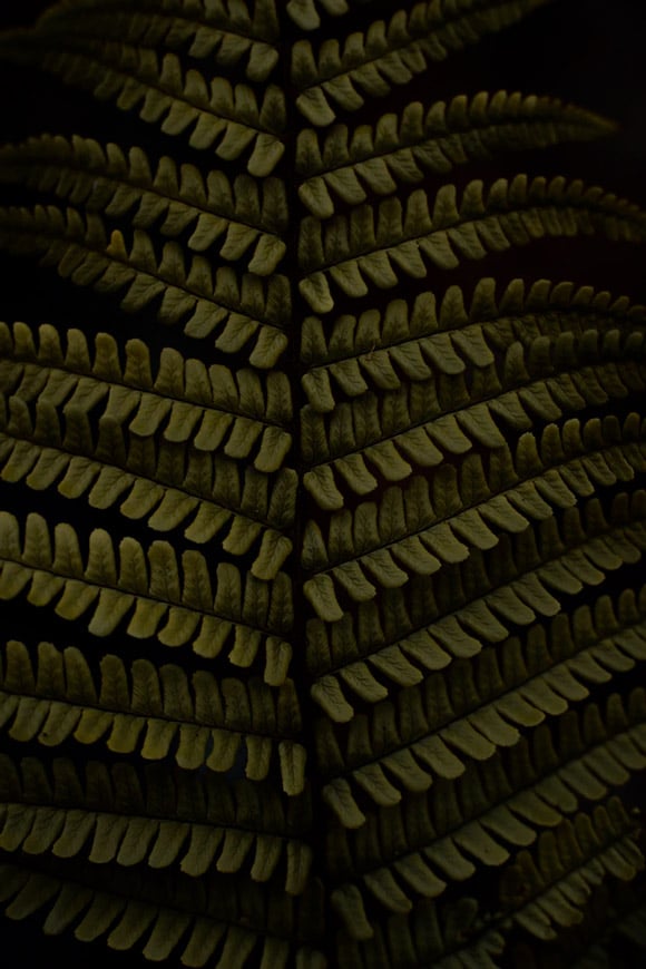
20. Similarity and Patterns

© John T
This is perhaps the one technique that attracts the eye more than the other photography techniques.
The human eye often likes to convert similar objects into patterns and finding simple repeating elements in your image can trigger connections, help the viewer to construct satisfying geometric shapes, and find a way of navigating the frame.
These elements don’t need to be identical and the similarities can be implied rather than exact.
21. Creating (or Disrupting) Balance

© Ruedi Häberli
Different parts of a photograph have different visual weight which can be determined by a number of factors such as brightness and darkness, the intensity of color, the simplicity of its geometric shape, how much of the frame it consumes, and more.
Balance can be achieved through simple techniques such as the symmetry described above. It’s also possible to create asymmetrical balance by pairing a subject with something that complements it simply by varying in size, shape, brightness, etc, or even an area of negative space
While many photographers are seeking to create a sense of balance and create a harmonious composition, you might equally try to disrupt this balance deliberately in order to bring energy to your image.
22. Color

© Chris Lawton
Many of the rules for composition in photography listed here connect in some way to geometry but color is a little different. Despite this, it still has a large bearing on how a composition sits together.
Color theory is a bit of a rabbit hole but it’s worth having some understanding of how colors can work together, such as complementary colors that sit opposite one another on the color wheel.
Colors can have an impact on the sense of balance conveyed by a photograph depending on how different colors work together, and their brightness and saturation.
You can dive deeper into color theory here and in my guide to color photography here.
6 Photography Composition Practice Ideas
Knowing how to create a strong composition comes with a lot of practice and knowledge of the techniques in photography. Here are a few exercises to try to give yourself a head start in learning what works and what doesn’t.
- Use a fixed lens for a month – Zooming with your feet instead of your lens will get you accustomed to changing your position and finding new angles.
- Crop your existing photos – Go through your archive and see if there are any images that could be improved by cropping, perhaps shifting the horizon away from the center, or moving the subject so that they’re on one of the lines created by the rule of thirds grid.
- Crop someone else’s photos – We sometimes become a bit blinded by our own photos and cropping images taken by someone else can be a fun exercise in escaping certain patterns of thinking.
- Shoot centered and then rule of thirds – try shooting subjects by first positioning them in the middle and then one of the rule of thirds gridlines. When editing your images, reflect on which framing worked and why.
- Switch on an overlay when editing – when you are editing you images, switch on the cropping overlays that’s available in software such as Lightroom. There are usually several options available and these might help you discover new ways of seeing your images.
- Get high and low – Shifting your perspective can reveal leading lines that might otherwise have been invisible. New points of view can also conjure more creative compositions.
If you want more ways to perfect your composition in photography, the Photzy ebook ‘Understanding Composition’ is an excellent reference and one of the quickest way to getting a grasp on the topic.
It’s usually available for a massive discount – check today’s pricing here.
Final Words
Understanding how to compose a photograph develops over time, and while these rules can be useful, they can also be overwhelming and restrictive.
They offer a loose guide of what may work so it’s best to let them sink in slowly, play with a few of them when you’re out photographing, and take some time to figure out where you might have applied the rules — deliberately or otherwise — when you sit down to edit your work.
And don’t forget: there are plenty of excellent photographers out there who might have never heard of half of these rules for composition in photography, so don’t let them become something that limits your creativity.
If you have any questions, feel free to get in touch via the comments below. Good luck!
The guaranteed best way to get a clear understanding of composition fundamentals in just 2hrs of reading.
Check out these 8 essential tools to help you succeed as a professional photographer.
Includes limited-time discounts.

Andy Day is a British photographer and writing, living and working in France, specialising in adventure, travel, architectural and landscape photography.
4 Comments
Leave a Comment

👋 WELCOME TO SHOTKIT!
🔥 Popular NOW:

Loved this article! Understanding composition can truly elevate a photo, and your explanations make it so much easier to apply. Super helpful!
Thank you for reminding us these basic concepts :)
If you start looking further into dynamic symmetry, make sure to do some reading about Gestalt psychology also. I warn you: it’s a bit of a rabbit hole..!
best concise overview of dynamic symmetry that i have seen. Nicely done.