


How to Use the Principles of Art & Design in Photography
Master the art of photography by integrating timeless principles of art and design, enhancing composition, storytelling, and visual impact in every shot.
Learn | By India Mantle
Shotkit may earn a commission on affiliate links. Learn more.
This guide on how to use the principles of art and design in photography will help you gain a better understanding of the world around you.
Photographers use different photography principles, techniques and elements to capture different moods or scenes.
Knowing these is essential to the success of your composition as a photographer.
It also helps convey the meaning behind each photograph for maximum effect.
Interested in finding the best way to apply photography in art and design? Let’s dive in.
Understanding the Role of Composition in Art & Design Photography
In photography, there are rules and guidelines that help beginners and professionals achieve perfection with their photographs.
The roadmap to these rules is what’s known as ‘composition.’
Photo composition dictates the way our eyes view the details in an image. It defines how objects in that image are relative to each other.
Not only that, but it also determines how these objects—or lack of—are used to convey a certain message in the hope of making the viewer experience something amazing.
Used correctly, a photography composition can transform a prosaic, mundane image into one that will take your breath away.
Yet, photo composition is an umbrella term that refers to a wide variety of principles and elements. Photographers need to be aware of the fundamental building blocks of composition in order to improve how their photographs look and how they can be used to portray certain emotions.
After understanding how each of these principles and elements works and how to apply them, don’t be afraid to experiment. Try combining two or more, then adapting and refining them until you’re able to take control of your photography.
Once you find what works best for you, you can produce unique compositions that capture your viewer’s attention.
7 Elements of Photography
Each time you look at an image, you should be able to separate it into different elements. These aspects work together to give the photograph a significant visual impact
Check out the seven basic elements of photography in art and design.
1. Line

Credit: Dids
Lines are 1-dimensional representations of objects, but they’re considered to be one of the most powerful elements in the world of photography.
They make up everything around you starting with the shapes you see. Then, these shapes make up forms, which are made up of textures, tones, colors, and patterns.
In addition, lines are what help guide the viewer’s focus through the images to hone in on key focal points. They also play a role in conveying mood and emotion.
To make the most of lines and grab the viewer’s attention, you need to see the world in terms of lines, forms, textures, and patterns. Then, you can decide what goes with what, and which ones can be brought to the forefront of your photograph.
2. Shape

Credit: Alanna Gibson
Shapes materialize when two or more lines converge. They’re used to build a feeling of depth and substance in a photograph.
The great thing about shapes is that they can be used in a myriad of ways, depending on the message you want to convey.
In art and design principles, shapes are often used to frame objects as a way of bringing the viewer’s attention to a certain part of the image. They can also be used to create a certain mood through silhouettes and different lighting techniques.
3. Form
Credit: Bestbe Models
When you add any type of thickness to a shape, a form emerges. Forms are the element responsible for making objects appear to be life-like as if they’re almost 3-dimensional.
Even though photographers are limited by their 2-dimensional plane, there are several approaches they can use to create the illusion of depth and thickness to a certain degree.
One popular artistic technique is through the use of light. Controlling the harshness and angle of lights onto a subject adds shadows and highlights, giving the object a 3-dimensional feel.
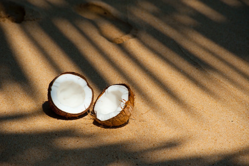
4. Texture

Credit: Texture
Texture represents how the details on the surface of an object appear. Like many elements in the world of 2-dimensional photography, texture can be a challenge to capture.
Yet, the trick is in the careful use of highlights and shadows. Once you master the use of light and dark, you can create designs that look more dynamic and appealing.
5. Space
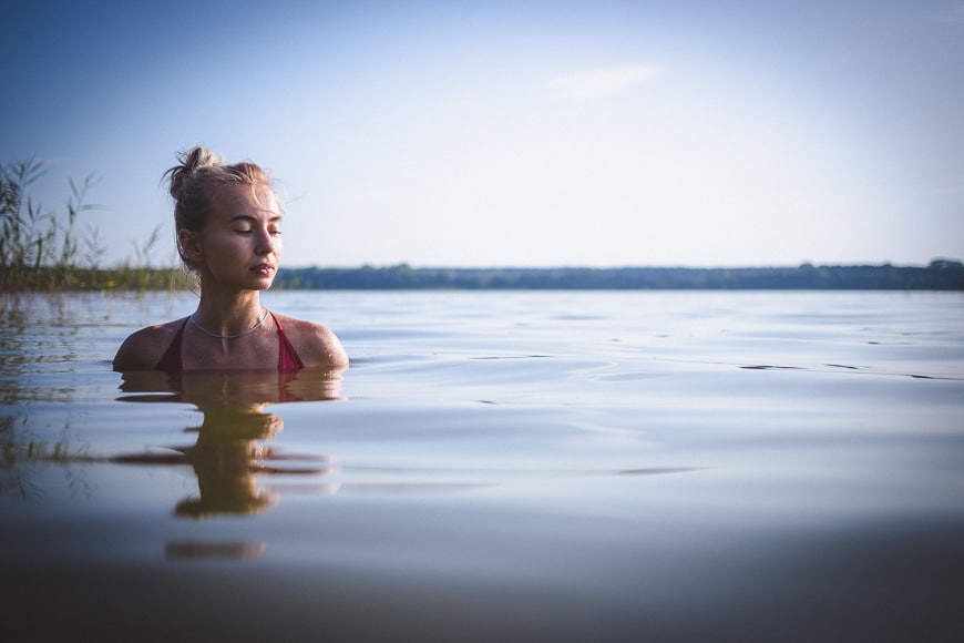
Andy Day
Similar to form, space is another element used to give the feeling of life-like depth. Photographers do this by suggesting to the viewer the relative distance between the various objects and perspectives in the image.
In the worlds of photography and artistic design, there are two types of space: positive and negative.
Positive space is the space taken up by the central subject in the image. Alternatively, negative space is the background that surrounds the subject and creates that sense of depth and 3-dimensional perspective.
6. Tone
Credit: Oleksandr P
Tone refers to the degree of light and dark in various sections of the image.
A photograph taken in low-light conditions will generally have a dark tone, whereas one taken during the day will have a more light tone with varying degrees throughout.
By increasing the lightness of a tone, you can emphasize particular details in an image or design, and vice versa. Tone can also be used to reveal form, disrupt balance, or showcase certain textures.
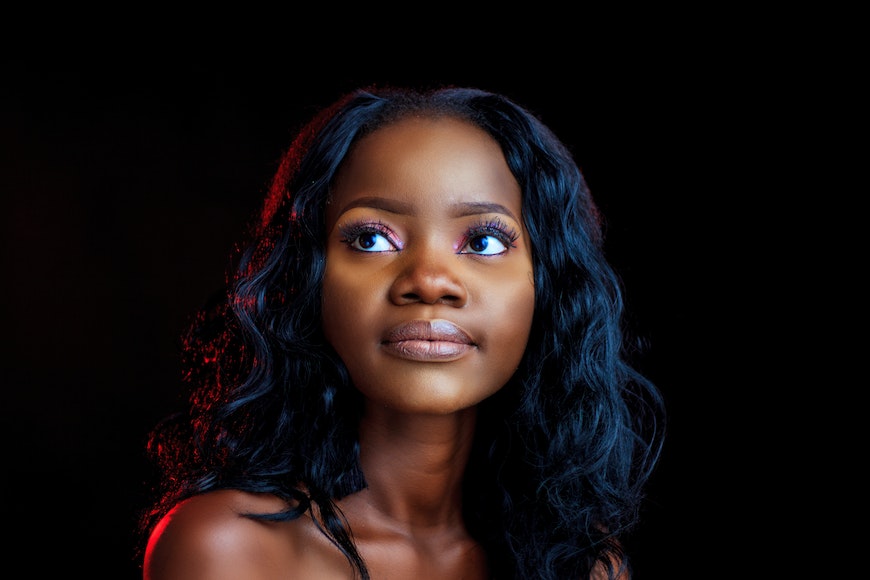
7. Color
Credit: Helena Lopes
Color is often described in terms of lightness, saturation, and hue. It’s how we see the world around us and differentiate between objects.
Classified as either warm or cool, color is so powerful that it can set the mood of an entire scene. It can be cheerful and energetic or dark and somber, depending on the mood you want to convey to your viewers.
Think about it: Why can’t we get enough stunning sunset photographs? Because that warm, orange glow of the setting sun makes us feel happy, hopeful, and at ease.
We should also mention that the absence of color in art and design can be just as powerful. For example, black and white photographs, old and new, are more dramatic and have a quality of timelessness to them that’s hard to capture with color.
10 Photography Principles & How to Use Them in Art and Design
The principles of photography allow us to arrange the different elements to create visually pleasing and poignant images.
Take a look at some of the most important photography principles you need to familiarize yourself with.
1. Perspective

Credit: Lerkrat Tangsri
Most of our photographs are taken from a standing position. This typical level vantage point is the most practical and comfortable and is often used to represent neutrality and objectivity.
However, it’s not ideal for conveying an authentic viewpoint.
Consequently, taking a photograph from above or below gives you different ways of looking at the world that many people wouldn’t ordinarily see.
Besides making an image appear exciting and new, giving it a unique vantage point can also change its mood.
For example, shooting from below can make objects appear more dominant, making the viewer feel weak and powerless. On the flip side, shooting from above makes the subject appear inadequate and small, giving the viewer a sense of being more assertive.
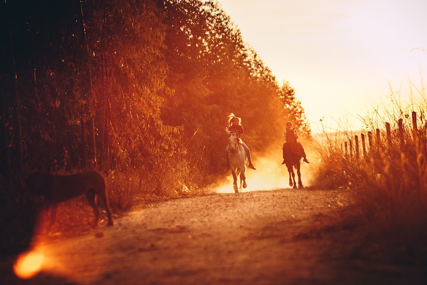
2. Movement
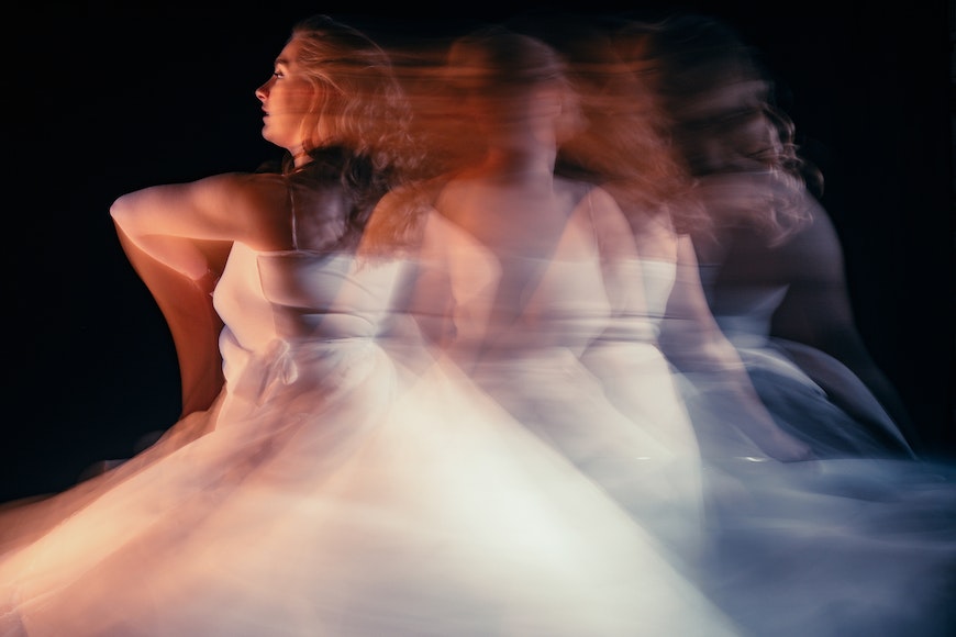
Credit: Lisa Fotios
Simply stated, movement, sometimes called rhythm or flow, refers to a moving subject in an image.
You can capture movement by photographing a car driving down the street, kids playing on the playground, or a dolphin jumping gracefully out of the water.
There are three ways to show movement in an image:
- Visual flow
- Suspended movement
- Motion blur
3. Contrast
Credit: Neosiam
As you can probably guess, contrast is including two or more elements in an image to allow one to overpower the others.
One of the easiest ways to achieve this is through the use of shadows and highlights. Another basic principle of design is to play with different textures of complementary colors that blend well and produce a dynamic and striking image.
4. Pattern
Credit: Toni Clavel
The basic definition of patterns, or repetitions, is ‘repeated forms or designs.’ In other words, anytime you create shapes and textures and then repeat them several times, you’re creating a pattern.
It’s amazing when you think about it because patterns can be found everywhere around us. Our eyes are naturally drawn to them.
Because patterns are practically everywhere, emphasizing them through your photographs won’t be difficult.
You can do it by having several subjects appear at different points in the image. It can also be done by repeating a series of lines, shapes, or forms to make a pattern and create some truly memorable shots.
Furthermore, many consider patterns in photography to be similar to the beats in a song.
To help you introduce a certain style of pattern to your artistic designs, try to picture musical notes drawn on a staff. Imagine the correlations, spaces, and differences between subjects in an image. Now, compare them to the organized, or sometimes disorganized, distribution of notes on a music sheet
5. Balance

Credit: Jessica Nunes
Balance illustrates a photo’s visual weight, which is what determines the most prominent part of an image that our eyes see and the amount of time we spend looking at it. In other words, a subject with substantial visual impact, or pull, has more visual weight than other items in the image.
To achieve this, you need balance. Through the use of balance, an image can evoke a sense of stability and harmony or it can convey feelings of unrest and division.
There are three ways to produce a balanced image:
- Radial balance: when the elements are set around and radiate from a central focal point
- Symmetrical balance: known as the ‘perfect balance,’ it refers to creating similar elements on both sides of an image
- Asymmetrical balance: can be achieved by combining subjects with different shapes, textures, and colors without having to place similar elements on both sides of the image
6. Depth of Field

Credit: Richard Fletcher
Depth of field (DOF) refers to the level of sharpness of an image’s background. It implies that very little if anything at all, will appear blurry and out of focus.
There are two types of DOF: shallow and large.
A shallow depth of field highlights the main subject of your photograph to make it stand out. It works to eliminate any distractions present in either the background or foreground.
On the other hand, a large, or wide, depth of field means that a considerable area both in front and behind the main subject will appear sharp and in focus. This element helps lead the viewer’s eye throughout the full image.
7. Emphasis

Credit: Pixabay
Emphasis is used to draw the viewer’s attention to one significant part of the image to tell a story or evoke a certain mood. It can be achieved by using different colors, sizes, or depths.
For instance, if you want to put more emphasis on the span of the sky, you can give the grass and skyline a smaller area in the image.
Achieving emphasis through depth in art and design means bringing one or two subjects into focus. At the same, you increase the depth of field of whatever lies in the background.
8. Proportion

Credit: Pixabay
Proportion, or scaling, is another way to bring the focus on certain elements of an image while pushing everything else deep into the background.
The first type is called ‘perfect’ proportion. It’s when an object appears as it would in real life.
The second type of proportion consists of making a typically small object, like a butterfly, look greater than life. One way a photographer does that is by making the object take up the most space in the image.
This is known as ‘distorted’ proportion. It relies on scaling an image to make things super-detailed and within reach or small and far away.
9. Light
Credit: Nixon Johnson
We can’t talk about photography without discussing light. After all, the word ‘photography’ is derived from the Greek word for ‘light.’
Just as we can’t see without light, we also can’t have good photography without light. There are various tools and techniques that you can utilize to control how much—or how little—light enters your lens.
Just like in art, light in photography can be used to create illusions of depth, forms, and balance. One example is the artistic rendering of silhouettes, which can only be created with the skilful use of light.
In addition, by controlling light, you can avoid having either over- or under-exposed photographs.
10. Unity

Credit: Ion Ceban Ionelceban
As the name implies, images can have a sense of unity, also known as harmony, only when the elements in the photograph are in agreement.
It doesn’t matter how many you use. The important thing is that you can make out each one individually.
At the same time, they still need to come together in the end to create a unified image or design.
Check out these 8 essential tools to help you succeed as a professional photographer.
Includes limited-time discounts.

As the General Manager of Shotkit, India Mantle brings with her a lifelong love for photography that she developed during her childhood, watching her father document their family moments with his Nikon EM. In her free time, you find her enjoying the awe-inspiring natural beauty of her home, Northern Rivers, Australia.

👋 WELCOME TO SHOTKIT!
🔥 Popular NOW:
