


How to Use The Golden Ratio in Photography
By using the centuries old Golden Ratio in your photography, your compositions will become more enticing and attractive. Here's how.
Learn | By Ana Mireles
Shotkit may earn a commission on affiliate links. Learn more.
Whether you have heard of the golden ratio in photography or not, it's something you should explore as it can help you to make stunning photos.
The golden ratio has become very popular lately, thanks to apps and software that help you with overlays.
However, it's a concept that artists have used for centuries.
In this article, I'll explain how you can use the Golden Ratio in photography to guide the viewers to the focal point of your image.
I'll also show you how it applies to different composition rules and differs from others – such as the rule of thirds.
Lastly, I've included some examples that use the Golden Ratio to clarify the concept and inspire you to get started.
Let's get started!
What is the Golden Ratio Rule in Photography?
The Golden Ratio is a mathematical concept. Since we're photographers and not mathematicians, it's easier to understand the idea visually – at least, it's always been the case for me. So, I'll try to explain it as visually as possible.
Imagine that you divide a line into two segments of different lengths. If the ratio between the original line and the longer segment is the same ratio as the one between the longer and shorter parts – then you have a golden ratio. This can also be applied to rectangles or triangles.
The Golden Ratio is the irrational number 1.618:1, also known as the divine proportion. It's often denoted with the Greek letter Phi.
Now that we've grasped the concept thanks to the aid of shapes, let's get back to the numbers momentarily. The Golden Ratio can be applied to a sequence of numbers called the Fibonacci sequence.
In the Fibonacci sequence, each number is the sum of the two that came before starting with zero. It goes like this – 0, 1, 1, 2, 3, 5, 8, 13, 21,… infinitely.
Visually speaking, this sequence translates into a spiral known as the Fibonacci spiral or the Golden Spiral. Now, we have many shapes that we can identify with the Golden Ratio.
We can talk about lines, triangles, rectangles, a spiral, etc. All these shapes can be used in photography. So, let's answer the original question, what is the Golden Ratio rule in photography?
The Golden Ratio in photography composition means you're using the 1.618 proportion in one of its manifestations. You can do this by using one of the following composition techniques.
- Fibonacci Spiral (AKA Golden Spiral)
- Phi Grid (AKA Golden Grid)
- Golden Triangle
- Golden Rectangle
I'll explain these guidelines in detail further in the article, where I'll also show you some examples of how to apply them.
In short, the Golden Ratio helps you to achieve a more balanced image.
Please note that you can dive much deeper into the mathematical side of this – there are many great sources for this.
You can also find it applied to music, architecture, and even financial market studies. Here, I'll continue with how the Golden Ratio works in photography and the visual arts.
Is the Golden Ratio the same as the Rule of Thirds?
No, the Golden Ratio the same as the Rule of Thirds are both composition guidelines, but they are different.
Let me anticipate the answer to the next obvious question – no, one is not better than the other. Let's break it down and see where they are different.
The Golden Ratio was discovered and studied in Ancient Greece. Mathematicians also studied it during the Islamic Golden Age, and artists have picked it up ever since.
The Rule of Thirds, on the other hand, was written in 1797 by John Thomas Smith. He was talking about painting – rural landscapes, to be precise.
This rule was used in painting and was later absorbed by photographers. Nowadays is the most widespread composition rule as most cameras have a rule of thirds grid overlay.
Credit: Francesco Ungaro
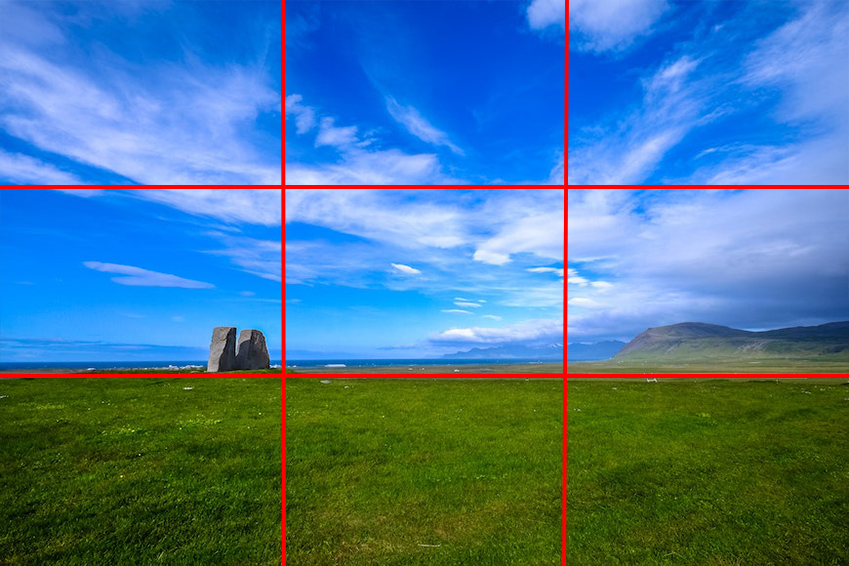
That's why you probably know that the rule of thirds divides the frame into nine equal segments. You can do this by tracing two vertical lines and two horizontal lines at the same distance.
The intersections of the lines are the focal points of the image. You should place your subjects along these lines.
The Phi grid is the closest Golden Ratio composition to the rule of thirds. It also divides the frame into nine segments that are not the same size.
When you use the Phi grid, you'll notice that the main subject is more centered than the rule of thirds grid.
Unlike the rule of thirds grid overlay, the Phi grid is not available on most cameras or camera apps. However, you can find these and other grid overlays in the Crop tool of Photoshop and Lightroom.

Credit: Lukas Hartmann
Once you activate the tool, click on the picture to enable the Crop box. Here, you'll see the overlay.
You can toggle between overlay grids using the O key. It's possible to flip the grids by holding the Shift key while you press O.
This way, you can analyze both rules and understand which is better for each situation.
Most people prefer to use the Phi grid for landscape photography. This way, the entire photo looks more balanced.
Why is the Golden Ratio so beautiful?

Credit: Pixabay
There are a lot of theories as to why we find the Golden Ratio so beautiful. The most common and broadly accepted one says it's because it's a proportion we find in nature.
As such, we are unconsciously accustomed to it and associate it with beautiful things such as flowers and seashells. The most common examples are the sunflower seeds or the nautilus shell.
Another theory comes from a mechanical engineering professor at Duke University – Adrian Bejan. He claims we find it beautiful because “this is the best flowing configuration for images from plain to brain.”
In other words, the human eye quickly detects the Golden Ratio, and the brain can interpret it faster than other proportions.
Another more controversial theory has to do with the Golden Ratio in the human body.
At the end of the 15th century, Leonardo Da Vinci drew the Vitruvian Man. He was inspired by the writing of the architect Vitruvius but heavily influenced by the drawings of his contemporaries and the Renaissance ideas.
The drawing represents what Da Vinci considered to be the perfect body proportions. Facial cosmetic surgeon Dr. Julian De Silva brought this idea into our days.
She used an algorithm to measure the face of celebrities to find out which one had the facial ratios closest to the Phi number 1.618.
According to her measurements, Jodie Comer, the star from Killing Eve, matched the golden ratio with an average of 94.52%. This result went viral and branded Comer as “the most beautiful woman according to science.”
I'm sure that most people didn't need math to agree that she's beautiful. Also, the numbers fit the proportion – no doubt about that.
Whether that makes her the most beautiful woman that's open for debate. Beauty standards change from one culture to another across time periods and are subject to personal taste.
In fact, the concept of beauty is so complex that a branch of philosophy is especially dedicated to it called Aesthetics.
Also, applying an algorithm to measure women's beauty feels quite unethical. Not only does it perpetuate the objectification of women – but it can also lead many women to mental health problems derived from low self-esteem and depression.
Let's not forget that humans are not works of art – we're not supposed to be perfect. So, let's leave the Golden Ratio as a compositional guideline that creates visually appealing photographs and paintings.
What are some examples of the Golden Ratio in the arts?
As I mentioned in the previous section, the Vitruvian Man by Leonardo Da Vinci uses the Golden Ratio. However, this isn't the only one of his artworks that follows the perfect proportions.
Da Vinci also used the Golden Ratio to paint the Mona Lisa. No, she doesn't have nearly perfect facial proportions in the same sense as Jodie Comer.
Instead, he used the Fibonacci Spiral to compose the painting. You can see how the curve of the spiral follows up her arm, guiding us towards the face, and ends in the intriguing smile of the Mona Lisa.
Also, the proportions between the size of her head and her torso correspond to the Golden Ratio of 1.618. Combined, they create the Golden Rectangle.
He also used the Golden Ratio to create the Last Supper and the Annunciation. The Museum of Science in Boston has an interactive tool on its website where you can apply overlays to Da Vinci's paintings to see where and how he used the Golden Ratio.
Other great masters in art history have also used the Golden Ratio. Another famous example is Vermeer's Girl with the Pearl Earring.
If you apply the Golden Spiral starting at the bottom left of her torso, you'll see how the viewer's eye travels through her arm, around the face, and towards her eyes.

Credit: Great Wave off Kanagawa, Hokusai, via Wikimedia Commons
The Great Wave off Kanagawa by Hokusai is the perfect example of the Golden Spiral. The wave follows precisely the same proportions as the Fibonacci spiral.
How to Use the Golden Ratio in Photography Compositions
So far, I've given you a lot of information that might sound difficult to apply to your photography practice. So, I figured giving you some Golden Ratio Photography examples is best.
Here are some Golden Ratio pictures with explanations.

Credit: Kelsey Wilkerson
As you remember, the Golden ratio means that you can split a line into two parts – one bigger than the other.
The ratio between the whole and the larger part should be the same as the one between the bigger and the smaller pieces.
Here, the photographer used this Golden Section to achieve a pleasing composition. She placed the subjects on the larger side and left the smaller portion empty to give it some breathing room.
The image still looks balanced because both sides maintain the rule of the Golden Ratio.

Credit: Johannes Plenio
Before, I already discussed how to use the Phi Grid, but let's see another example, as it's the most common way to apply the Golden Ratio in photography.
Here, you can see how the author placed the horizon line according to the Phi Grid instead of using the rule of thirds.
Then, for an aesthetically pleasing composition, the focal point is in the central segment, and the two trees are placed roughly on the grid's vertical lines.

Credit: Bllack Artist (left) / Nina Hill (right)
A more advanced version of the Golden Ratio in photography is using the Golden triangle. You can see how the images above divide the frame with a series of leading lines to create triangles for a pleasing and dynamic composition.
To divide a rectangular frame with golden triangles, start by connecting two opposite corners. Then, draw a line from each of the remaining corners that connect with the first diagonal. Use the golden ratio to find the location of the intersecting lines.
If you're having trouble with this one, use the cropping tool in Photoshop and enable the overlay options. The Golden Triangles are one of the crop overlays available.
You can use the lines and intersections to place elements and create a good composition.

Credit: Alexander Paul (left) / Ella Olsson (right)
Lastly, here are a couple of examples of the Fibonacci spiral. In one, the Golden Spiral is applied to the main subject regardless of its position within the frame.
In the other one, the Golden Spiral guides your eye through the frame in a natural way toward the most important subject.
In both cases, the result is aesthetically pleasing. As you can see, you don't have to place elements following the line of the spiral throughout the frame – that would look forced.
Is there a photo editing app that shows the Golden Ratio?
Yes, you can download apps that help you to apply the Golden Ratio in photography. Most of them include an overlay of the Golden Spiral (you might also find it as the Fibonacci spiral) or the Phi grid.
Wise Photos – this app has many composition overlays to choose from. Some are based on the golden ratio, such as the Fibonacci Spiral and the Phi Grid. You can also check each composition rule's explanation, tips, and tricks.
Golden Ratio Camera – this app has a golden spiral overlay that lets you see the composition on the preview before saving the photo.
Photo Extension Composition – This app lets you see composition overlays in the photos stored on your Apple Photos app. You can also see guides and advice on improving as a photographer. Note that this app is only available for iPhone and iPad and is not free.
PhiShot – this app helps you to find the golden spiral in everyday objects and better compose your photos.

Check out these 8 essential tools to help you succeed as a professional photographer.
Includes limited-time discounts.

Ana Mireles is a Mexican researcher that specializes in photography and communications for the arts and culture sector.

👋 WELCOME TO SHOTKIT!
🔥 Popular NOW:
