


How to Add a Realistic Drop Shadow To Images in Photoshop
Learn how to add realistic drop shadows on images or text Photoshop by using a Drop Shadow Layer Style effect.
Photoshop | Software | By Judyth Satyn
Shotkit may earn a commission on affiliate links. Learn more.
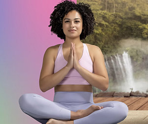
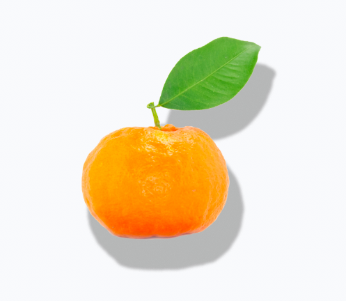
Drop shadows are an important Photoshop effect to add under an image when you want to make a subject look realistic in a new backdrop or setting.
Without a drop shadow, a subject will look unnatural, like it’s floating over the backdrop.
Drop shadows can also be used to define a subject or to create surreal effects.
You can also use them to make text stand out in graphic designs.
In this tutorial, you’ll learn how to add a drop shadow in Photoshop by using the Photoshop Drop Shadows effect.
Download the latest version of Adobe Photoshop to follow along with this simple tutorial.
Start a free 7-day trial today
How to Add a Drop Shadow On Images in Photoshop
Step 1 – Open your image
Select the image you wish to add a drop shadow to and open it in Photoshop.
You won’t be able to add a drop shadow to a subject that is not cut out – the subject will need to be in a separate layer in the layers panel.
(Use this Photoshop Tutorial if you need to remove a subject from its background.)
Step 2 – Open Drop Shadows Effect
At the bottom of the Layers Panel, click the FX Icon and select Drop Shadow, or navigate to the top menu bar and select Layers > Layer Style > Drop Shadow.
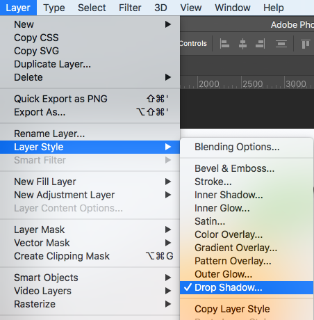
When selected, the Layer Style window will appear containing the Drop Shadows box.
Move the Layer Style window so you can view the image in the canvas window and the Drop Shadow effect box at the same time.
The Drop Shadow box gives you options to select different drop shadow effects.
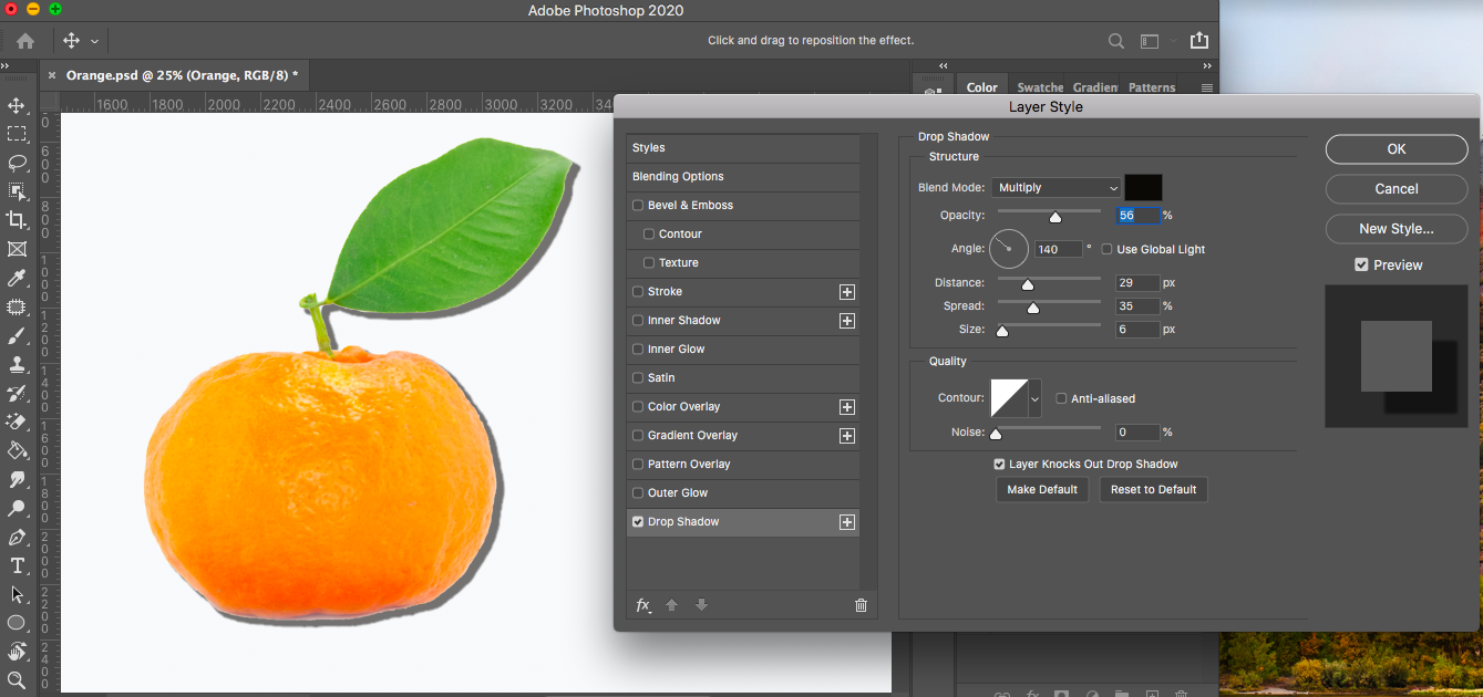
Step 3 – Customize the Drop Shadow
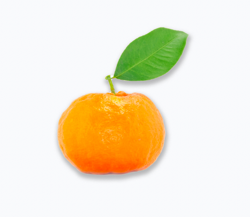
For this tutorial, we are going to create a realistic drop shadow under the orange. You can use the Drop Shadow Dialog Box to create real or surreal shadows.
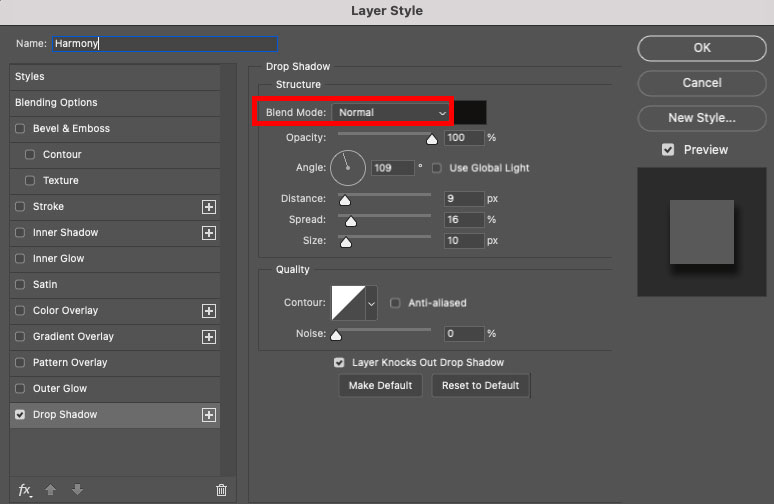
In the Drop Shadow box, set the Blend Mode to Normal.
Click the Color box and select a dark color. Dark brown or black works well.
Set the Opacity of the drop shadow by adjusting the slide bar or adding a percentage in the box beside it.
When you set the opacity high, you’ll have a darker shadow – this is useful if the background behind the drop shadow is dark or if you want to simulate an intensely bright light.
When the background behind the image layer and drop shadow is light, the opacity will need to be set lower.
Change the angle of the drop shadow depending on where the light source is coming from.
For example, if the light source is coming from below, manoeuvre the Angle dial to mirror this.
If the light source for the drop shadow is coming from above the subject, move the dial or enter a number in the Angle box to simulate the angle of the light source.
You can use Photoshop’s default Use Global Light setting: this will help you achieve a consistent look if you need to add the same drop shadow to other layers.
Set the Distance of the drop shadow by adjusting the slider.
The distance setting will detach the drop shadow from its subject. This is useful if you want the subject to look like it’s free-floating or slightly removed from the background.
To create the appearance that the subject is sitting on its background, add a drop shadow that looks like it’s attached to the subject.
To do this, decrease the level of Distance and adjust the Spread and Size settings.
Leave the Contour option on its default setting.
You can use the Noise sliding bar to add Noise to your subject’s drop shadow, but in general, this will make your shadow look less realistic.
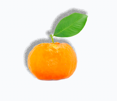
Set the Noise slider to 0.
At the bottom of the Drop Shadow box, you have the option to set your new drop shadow settings as Default. This is useful if you wish to create uniform drop shadows onto a few layers.
Or you have the option to reset all settings to Photoshop’s default drop shadow settings.
When you are happy with the qualities of the drop shadow, click OK in the top right-hand corner of the Drop Shadow Dialog Box.
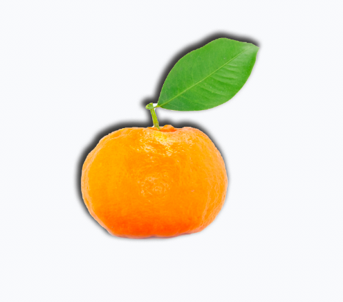
Now your subject will have a perfect realistic-looking drop shadow, defining it from its background.
Step 4 – Future Drop Shadow Edits
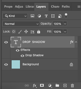
The Drop Shadow edits will be attached as an effect under your subject’s layer in the layer panel.
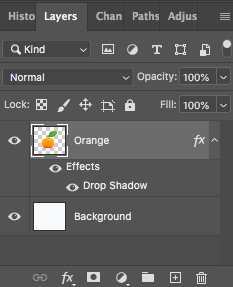
If you close the Drop Shadow effect box, all the drop shadow adjustments will be saved for you to easily access and adjust at any time during the editing process.
When you save your Photoshop file, the Drop shadow effect will be saved with your layer.
If you’re satisfied with your final edits, you can merge and blend all layers.
How to Add a Drop Shadow to Text in Photoshop
Step 1 – Type Text
The Layer Style Drop Shadow is a quick way to add uniform shadows to text and vector shapes.
To type text, access the Type tool in the toolbar to the left of your canvas workspace, or press T for the keyboard shortcut.
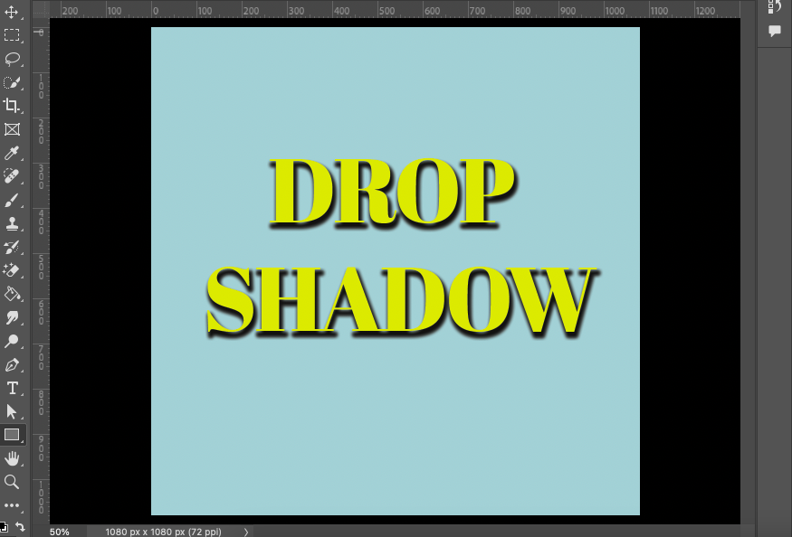
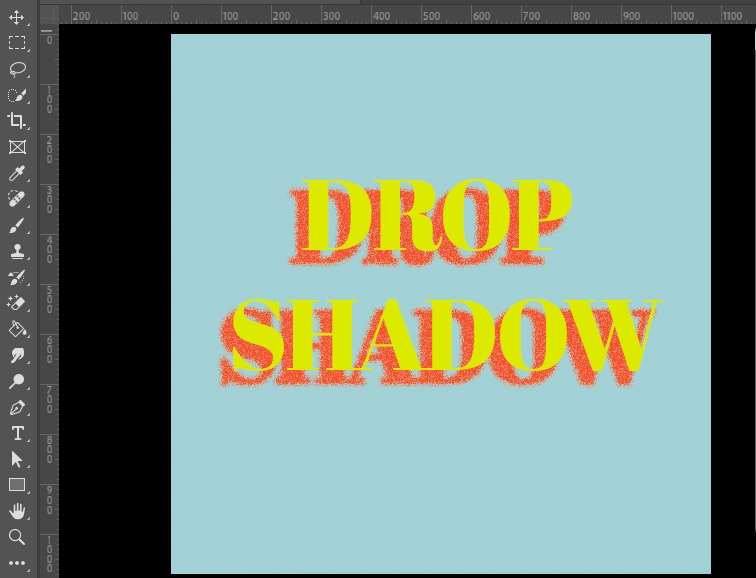
As you can see from the image below, the text doesn’t stand out well from its background.

When a shadow is added to the text, it will lift the text from its background and add dimension.
Step 2 – Open the Drop Shadow Tool
Once you’ve written text on your canvas, you will be ready to use the Drop Shadow tool.
The Drop Shadow tool is a layer style accessed via the Layer Style dialogue window.
To open the Drop Shadow dialogue box, head to the main menu bar and click on Layer > Layer Style.
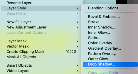
You will be presented with a drop-down menu of all the Layer Style options.
Select Drop Shadow, and the Drop Shadow dialogue window will open, with several options to structure your shadow.
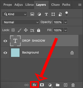
Another way to access the Drop Shadow tool is to click on the Layer Style icon (fx) at the bottom of the Layers panel.
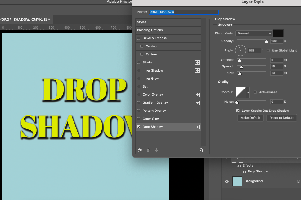
Now that we’ve opened the Drop Shadow tool, let’s run through its structural options to create a stand-out drop shadow for our text.
Option 1 – Color
The Drop Shadow tool offers different options to structure the text’s shadow.
You might not need to use all the options to set the specifics of your desired shadow, but in this tutorial, we’ll walk you through them all for future reference.
Beside the Blending Mode Slider is a square box of color. By default, it will be set to black.
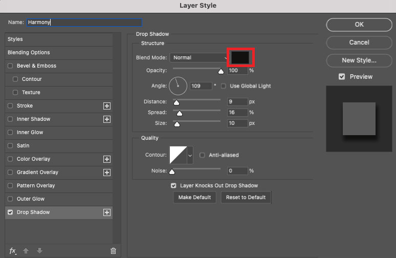
Click on this box, and the color picker window will open.
To select a color for your shadow, simply click on the vertical rainbow color slider to select a hue.
In the image below, you can see the hue selected is midway between red and pink.
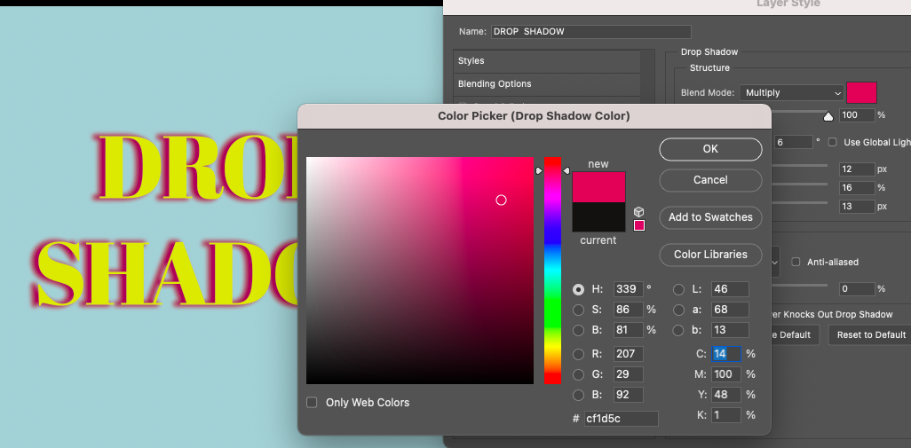
When you select a color, the box will fill with your selected hue.
Click in the box to set the lightness and saturation of the hue.
Alternatively, if you prefer, you can enter the color code in the box beside the # symbol at the bottom of the panel.
When you have selected the color, click OK. The color picker window will close, and your shadow’s color will be updated.
As a side note, I look forward to the day that Photoshop includes patterns as a shadow option. Not only will you be able to set a shadow as a block of color, but you could also set a patterned shadow. This would make for some interesting designs.
Option 2 – Preview
When creating a shadow, you might have the exact measurements of the drop shadow to enter or you could be winging it.
Either way, it’s good to see a visual of the drop shadow you create to see if it suits your design.
To the right of the Drop Shadow dialogue window, under OK, you will find the Drop Shadow’s preview option.
Tick the square beside Preview, and a preview of the shadow will be presented around the square, as you can see in the image below.
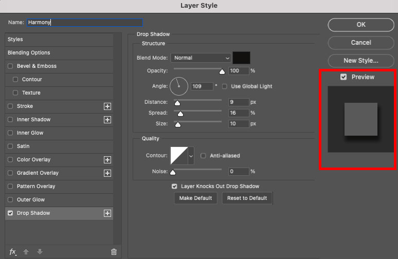
However, you can also see a live preview of the shadow as it is created in the canvas workspace.
To use the canvas workspace as your preview, simply click on the Drop Shadow dialogue window and drag it to the side of your workspace.
Personally, I prefer to use the canvas workspace for my preview. One reason is that the preview generated in the dialogue window does not have the capability to show colors or blending modes.
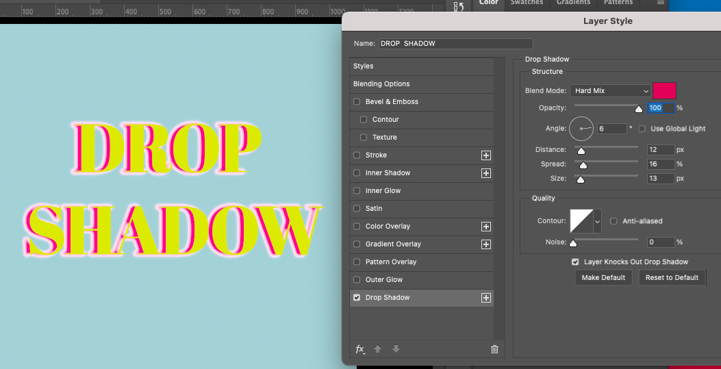
Option 3 – Blend Mode
To alter the blending mode of the shadow, click on the downward-facing arrow beside Blend Mode.
Once clicked, a drop-down menu will open, presenting you with the Blend Mode options.
Due to their properties, not all of the blending modes will affect the shadow, particularly if your shadow’s color is black.
Below is an example of the shadow when a Hard Mix blending mode is selected.
And here below is an example of the shadow when the Hue blending mode is selected.
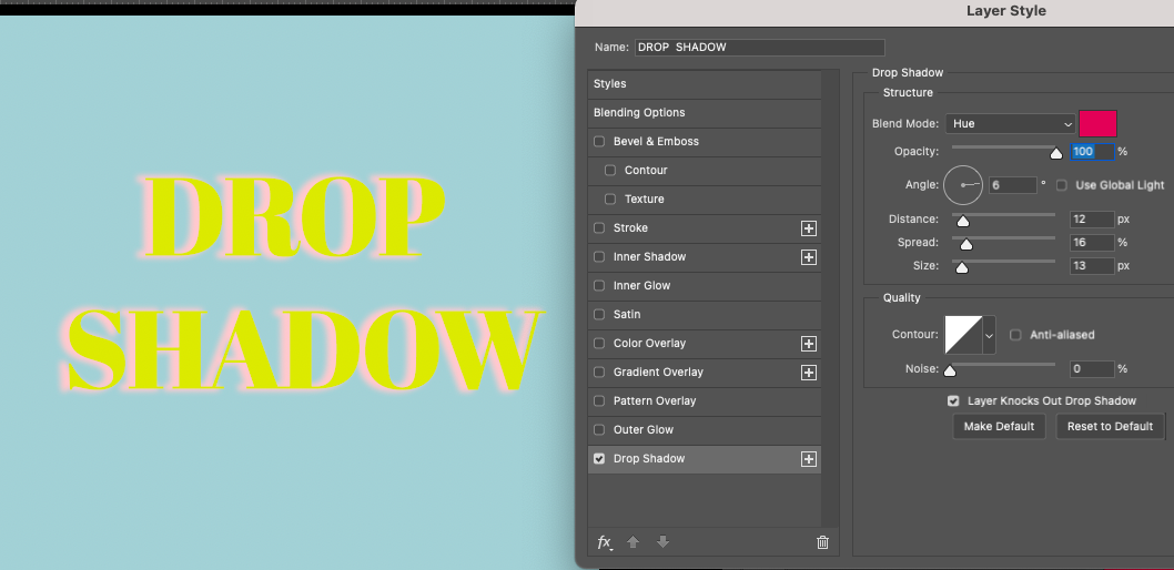
I would advise experimenting with the different blending modes to find one that suits your design.
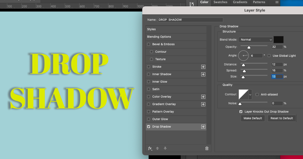
Option 4 – Opacity
You can use the slider beside Opacity to alter your shadow’s opacity.
Slide the slider to the left, and the shadow’s opacity will be decreased.
Alternatively, you can enter a value in the box beside the slider.
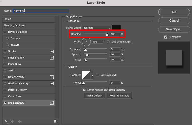
As you slide the slider to the left or right, the value in the box will update.
Decreasing the opacity of the shadow is a good way to soften a dark-colored shadow. This will help it blend more realistically with its background.
As you can see below, the text’s drop shadow is set to an opacity of 32%, and the shadow merges with the background.
In contrast, in the example below, the shadow’s opacity is 100%. As you can see, a stark black shadow dominates the design, distracting the viewer from the text.
Option 5 – Angle
Using the Drop Shadow tool, you’ll also be able to alter the angle of the shadow.
This is useful if you wish to simulate the shadow’s response to an apparent light source.
The shadow can be angled to drop away from the light in a realistic direction.
Setting the correct angle is also useful when you want all the angles in your design to be uniform.
Alternatively, it can be used to funk up your design or to play with various shadow angles to generate intrigue.
The line in the circle beside Angle demonstrates the direction in which the shadow will fall.
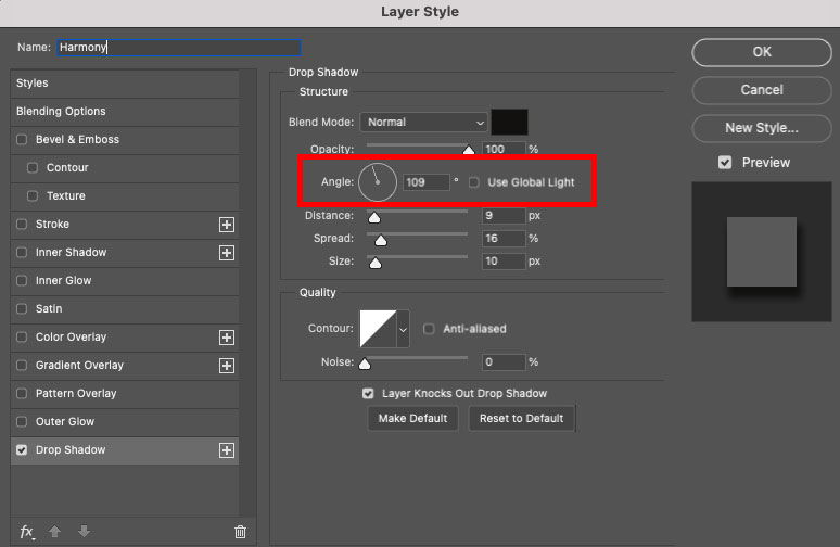
To adapt the angle, click on the Circle beside Angle and drag the line inside the circle to the position you want the angle of the shadow to be.
Alternatively, enter a value for the angle in the box beside the circle.
Your drop shadow will move in your canvas as you drag the line.
Release the cursor when you have achieved the desired direction for your shadow.
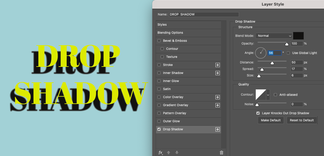
In the image below, the angle degree is set to generate a shadow that simulates a light coming from the top right of the canvas.
The line in the circle points up in the direction of where the light source would come from.
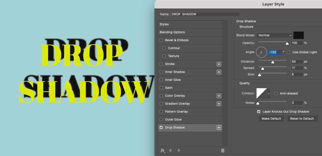
In the image below, the angle is set to simulate a light source that comes from the bottom left of the canvas.
The line in the circle beside Angle reflects this.
Besides the angle’s degree, you will find “Use Global Light.”
Tick the box beside Use Global Light, and the angle will be reset to Global Light.
Option 6 – Distance, Spread and Size
Below the Angle circle’s icon are three sliders to adapt the shadows: Distance, Spread, and Size.
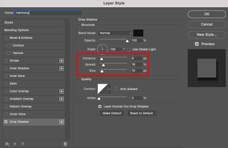
Using the Distance slider, you can slide the slider or enter a value in the box at the end of the slider to adapt the shadow’s distance from the text.
Slide the slider to the extreme right, and the shadow can even be removed from the text.
This generates the effect of the text floating above its background.

Slide the Distance slider in the opposite direction and the shadow will hug closely to the sides of the text.
Use the Spread slider to alter how much the shadow spreads.
When the spread is increased, the shadow will grow from its center.
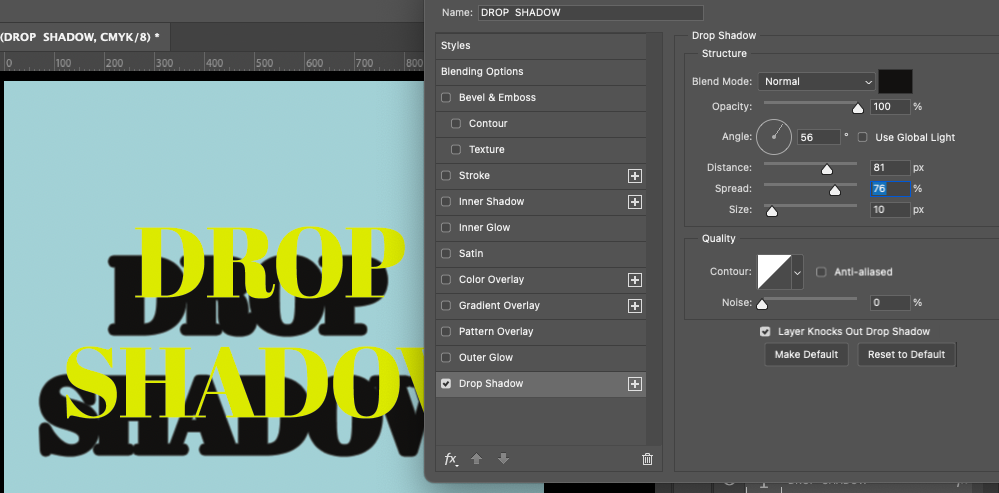
The last option of the three sliders is Size. If a shadow looks too thin, you can increase its size using this slider.
Slide the slider to the left to decrease the shadow’s size and to the right to increase it.
When a shadow is larger in size, it will generate the effect that the light source is close to the text.
When it’s thin, it generates the effect that the light source is distant.
You can also alter the size of the shadow for aesthetic purposes.
In the example below, the shadow’s size has been increased to the extent that it no longer appears to be a shadow. Instead, it appears to be an indistinguishable blob.
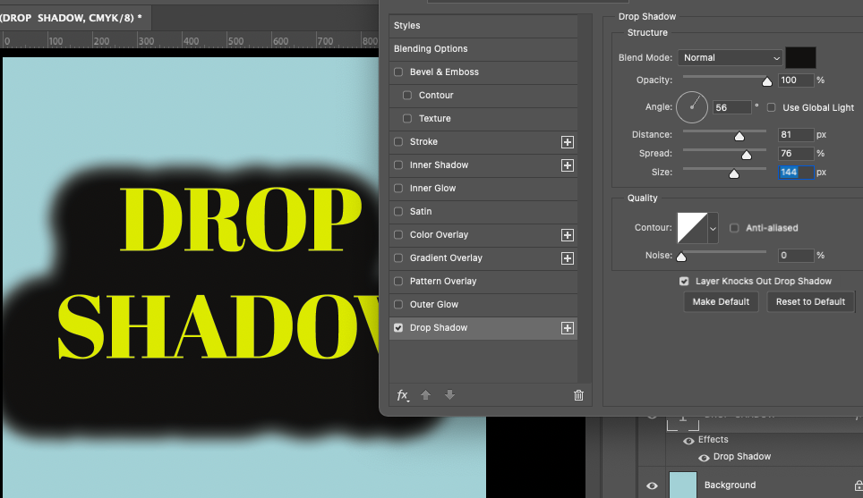
Luckily, Photoshop generates a preview as you slide, so you can ensure your shadow looks appealing before committing to it.
Option 7 – Contour
Below the three sliders, you will find the Drop Shadow’s Contour box.
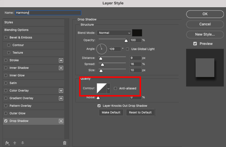
To alter the shadow contour, click on the square icon beside Contour or click on the dropdown arrow beside the square icon.
The Contour Editor window will open when you click on the square icon.
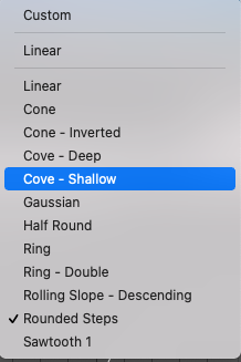
You can select a preset contour by clicking on the dropdown arrow beside Preset.
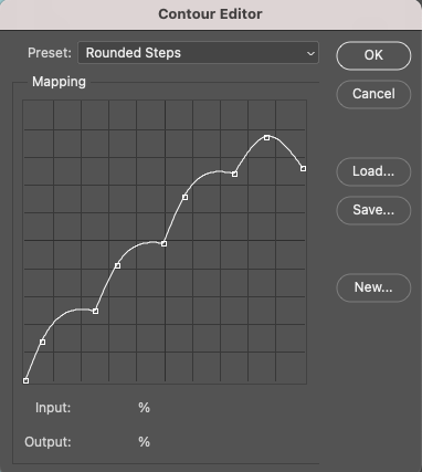
A drop-down menu will open, and you can pick from twelve different shadow contours.
These include Linear, Cone, Cove, Gaussian, Ring, Half Round, Rolling and Sawtooth.
Alternatively, you can use the mapping graph to create your own unique contour.
Click on the mapping graph to add anchor points to create the contour of the shadow.
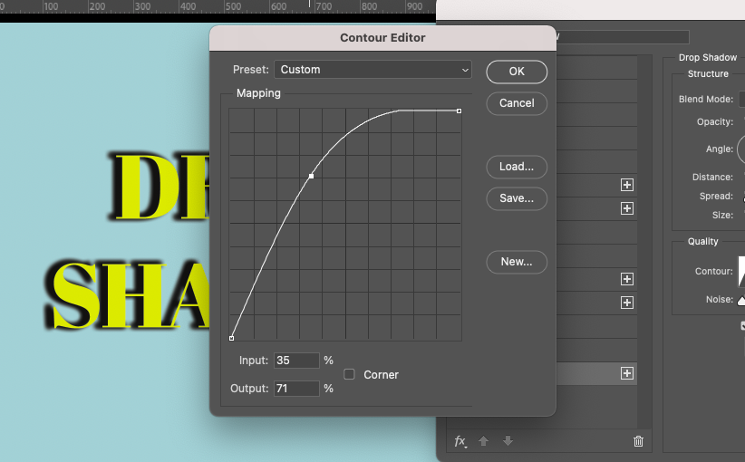
As you add anchor points, you will see the shadow in your preview window alter.
Another way to apply a contour to your shadow is to click on the drop-down arrow beside the square icon.
This opens a set of contours to choose from, presented as thumbnails.
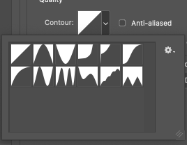
To apply one to your shadow, simply click on the thumbnail of your choice.
Although having the option to change the contour of the shadow can be useful, I find that it doesn’t always affect the shadow in the way I want and expect.
Option 8 – Noise
You can alter the fuzz or noise of the shadow by sliding the slider or by adding a value in the box at the end of the slider.
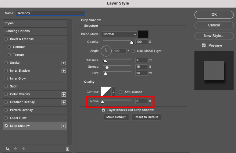
The further you slide the slider to the right, the more pixelated the shadow will become.
Unlike opacity or spread, adding noise will give your shadow a grainy look.
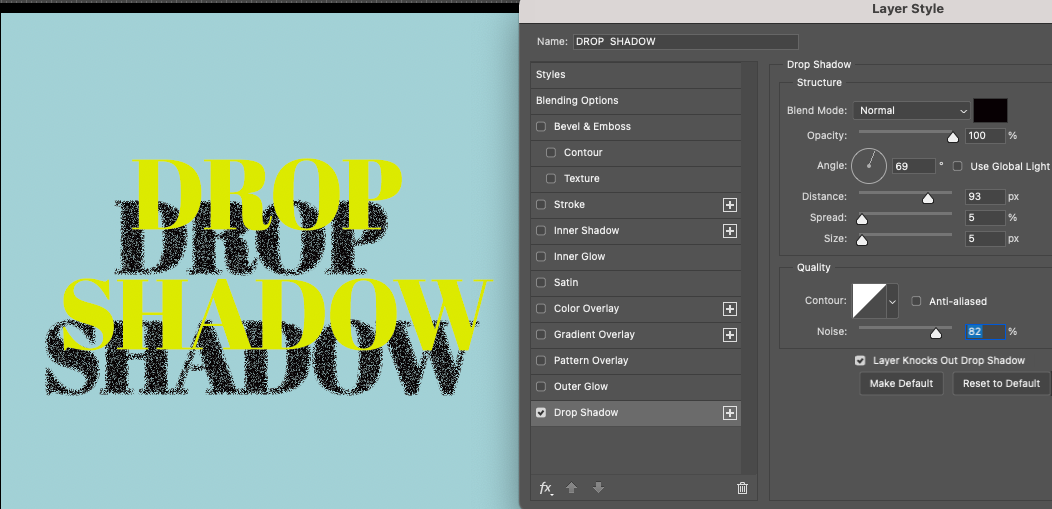
Experiment with the setting to find the amount of noise that works for your design objectives.
You might find that no noise works best for you or that increasing noise will add exactly the aesthetic your shadow needs.
Grain or noise can work well for designs that need added grit – for example, a punk rock music poster or a promotional piece for a mechanic.
The last option at the bottom of the Drop Shadow dialogue box will not affect the structure of the shadow but can be used to streamline your editing workflow.
Option 9 – Default Setting
If you have a lot of shadows to create and you wish to make them all uniform, click the “ Make Default” button.
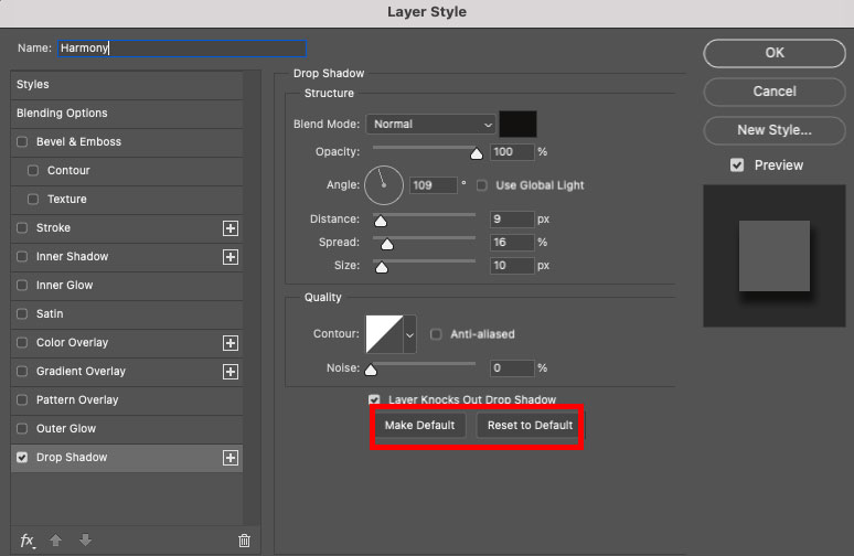
This will save all the current shadow settings in the Drop Shadow dialogue box as the default setting.
This means you will simply have to open the Drop Shadow dialogue box and click OK in the top right corner to add the settings to the next layer without the need to reenter the details.
This is a fantastic way to speed up your workflow when many designs require the same shadow.
Alternatively, if you wish to return the Drop Shadows dialogue window to default settings, click “Reset to Default.”
You can click this button at any stage of the process to wipe your shadows setting back to default.
Photoshop’s default setting for a Drop Shadow is Color: Black, Opacity: 35%, Angle: 90 degrees, Distance: 3 px, Spread: 0 %, Size: 7 px, Contour: Linear, and Noise: 0%.
Step 3 – Apply Drop Shadow
When you’re happy with the Drop Shadow you have created, you can apply it to your text.
Head to the top right of the Drop Shadow dialogue window and hit OK.
The Drop Shadow will be applied to your text or object, and an effect will be applied to its layer in the Layers panel.
This gives you easy access during the editing process to edit the shadow. Simply click on Drop Shadow under Effects in the Layers panel.
Once clicked, it will open the Drop Shadow dialogue window. Here, you will be able to adapt the shadow as you like.
Now, you have all you need to create drop shadows quickly and easily on text and objects.
Have fun creating wild and wonderful drop shadows.
What is the difference between drop shadow and inner shadow?
A drop shadow will appear behind or below a subject, whereas an inner shadow will be placed inside the subject.
A drop shadow is used to distinguish the subject from its backdrop.
It will make a transferred object look more realistic on its new background.
An inner shadow is placed on the inside of an object simply for artistic (not realistic) effect.
Do you want to learn more Photoshop tricks? Head to this Photoshop tutorial to learn how to Layer Masks in Photoshop.

Judyth is an experienced studio photographer and glass artist. When she isn’t Photoshopping comedians into the bellies of sharks, you can find her cooking delicious treats for her guests.

👋 WELCOME TO SHOTKIT!
🔥 Popular NOW:
