


Mastering Balance in Art: The Key to Harmonious Compositions
Explore the crucial role of balance in art, understanding how it harmonizes elements to create visually compelling and aesthetically pleasing compositions.
Learn | By India Mantle
Shotkit may earn a commission on affiliate links. Learn more.
Whether you’re a photographer, designer, or painter, you must understand the importance of balance in art.
Have you ever looked at one of your artworks and felt like something is quite off, but you couldn’t put your finger on it?
If that’s the case, your artwork probably lacked visual balance.
When your artwork lacks balance, it becomes messy and chaotic. The elements seem randomly arranged, making it hard for viewers to rest their eyes.
Don't worry; I’m here to help. This guide will help you understand the importance of balance in art.
By learning the basics of artistic balance, you can easily apply it and create art that leaves a lasting impression.
What Is Balance in Art?
Balance in art refers to how different composition elements are arranged to form a nice-looking artwork. It describes the arrangement of color, shape, textures, lines, empty spaces, and dark bits.
Imagine the seesaw we used to play on in the playground. When both sides are weighted equally, the seesaw stays balanced. Well, the principle of balance in art works the same way.
When the elements of an artwork are arranged right, it gives off a sense of equilibrium and harmony, which our eyes enjoy looking at because it feels like everything is in the right place.
Now, you’re probably thinking about symmetrical balance in which each half of an artwork is a mirror image of the other.
But guess what? Balance in art isn't just about symmetry.
Artists opt for creative ways to achieve balance; symmetry is only one of a few other ways. The equally weighted seesaw is a perfect example of symmetrical balance.
But we can achieve balance in our artworks in other ways. Let’s see how.
Types of Balance in Art
There are psychological reasons our eyes enjoy looking at balanced objects. Our eyes always seek balance, harmony, and stability in everything we see, and that's why we find symmetrical objects and faces more appealing.
In art and design, artists assign every element in an image with visual weight. That way, artists can come up with innovative ways to achieve balance and stability and make the images more appealing to the viewers’ eyes.
Let’s delve into the different types of balance in art and see how you can implement them in your artwork.
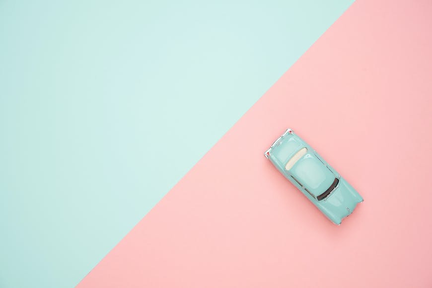
1. Symmetrical Balance
Credit: Pixabay
Symmetrical balance, also known as, formal balance, is a basic concept in art and design that’s all about mirroring or repeating elements.
Symmetrical balance aims to achieve equilibrium between elements across a center point. This center point can either be horizontal, vertical, or diagonal.
Imagine you’re looking at a picture, and when you draw a line down the middle, everything on both sides looks the same. That’s symmetrical balance.
The similarity between elements on both sides gives a satisfying sense of symmetry and balance. You can find endless examples of symmetrical compositions around you, that includes cars, clothes, furniture, the human body, and more.
Symmetrical balance has always been used in art, and it’s obvious in institutional architecture, such as buildings, libraries, and universities.
There are some slight variations of symmetrical balance, but all of them involve a sense of balance, harmony, and stability.
For example, inverted symmetry is achieved when one half of a picture is repeated on the other side of an imaginary line. Playing cards is a perfect example of inverted symmetry.
Approximate symmetry is another type of symmetrical balance that's more relaxed and versatile. The two halves of the design aren’t identical but have many similarities in shape, size, and color.
That way, these artworks give off the same balance and stability of symmetrical balance while adding variety and interest to the composition.
Despite the aesthetic appeal of balanced, mirror-imaged objects, symmetrical balance is too static and sometimes feels boring to viewers. That’s why other types of balance exist.
Examples of symmetrical balance in art:
- The Last Supper by Leonardo da Vinci
- Vega-Nor by Victor Vasarely
- Self-Portrait with Thorn Necklace and Hummingbird by Frida Kahlo
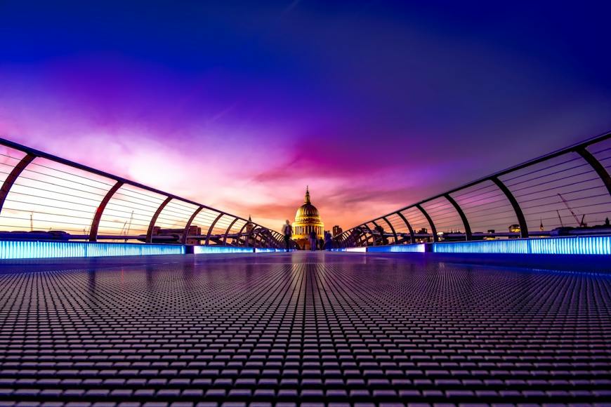
2. Asymmetrical Balance
Credit: Elkhan Ganiyev
As the name suggests, asymmetrical or informal balance is the type of visual balance where elements on both sides of an image aren’t identical but have the same visual weight.
In other words, both sides have unequal negative and positive shapes, but somehow the viewer stays engaged.
As you can expect, asymmetrical balance is way harder to achieve than symmetrical balance. However, there are various ways to achieve asymmetrical balance.
For example, you can balance multiple smaller items on one side with one large item on the other side. Similarly, you can balance a huge dark shape with several lighter figures on the other side, and so on.
The whole idea is to utilize a variety of design elements such as color, light, shape, position, and texture to achieve balance. Since there’s no limit to innovation and creativity, asymmetrical balance provides more room for visual variety.
You can create interesting and dynamic asymmetrical compositions to achieve this type of balance in your artwork without sacrificing the stability and balance we like in symmetrical balance.
Examples of asymmetrical balance in art:
- The Starry Night by Vincent van Gogh
- Cafe Terrace at Night by Vincent van Gogh
- Self Portrait by Anders Zorn
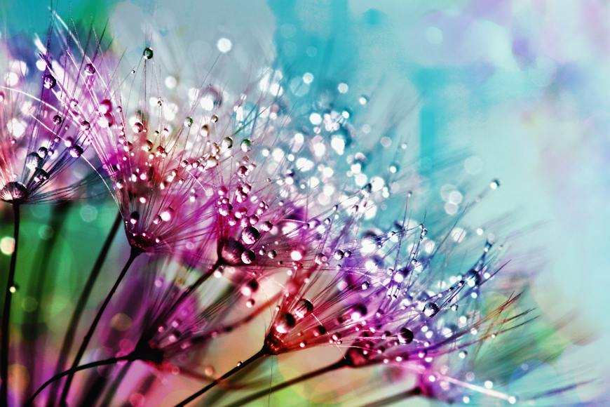
3. Radial Symmetry
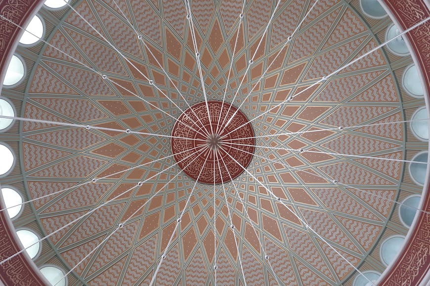
Credit: Timothy Huliselan
Radial symmetry is another type of balance in art inspired by nature. It involves arranging elements in an even matter around a central point, such as the inside of shells, rays of sunlight, flower petals, and water ripples.
Imagine a picture of a wheel. When you spin the design around the central point, it looks the same as any rotation point.
This radial balance forces the viewer’s eyes to focus on the focal point. Since the elements radiate equally from the center, they create a stable, balanced feel similar to symmetrical balance.
Radial symmetry isn’t only seen in nature; it's also obvious in sacred geometry and religious art.
Think of mandalas and rose windows, for example. What do they have in common?
The even arrangement of figures that all come from one central point. This perfectly describes radial symmetry.
That said, you can implement radial symmetry in your canvas by arranging the elements in a ring around a central point. That way, you draw the viewer’s eyes inward, creating a sense of harmony and cohesion.
Examples of radial balance in art:
- Vajrahumkara Mandala
- Charger of Charles II in the Boscobel Oak
4. Crystallographic Balance
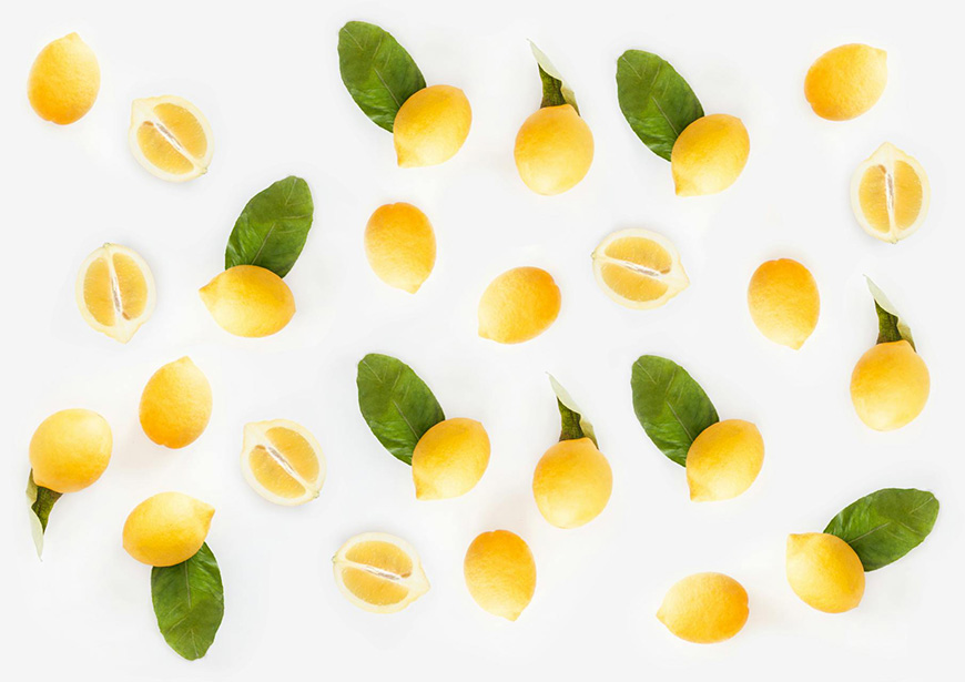
Credit: Dominika Roseclay
Crystallographic balance is an unusual type of artistic balance in which the visual elements are evenly dispersed throughout a composition.
But does this achieve symmetry? No, and that’s the point.
We’re not looking for a perfect symmetrical balance here. Instead, the balance is achieved by repeating elements of the same visual weight everywhere.
Imagine a mosaic or a grid structure. Can you locate a single focal point? You can’t, and that’s the purpose of crystallographic balance.
It aims to force the eyes to move around the entire composition without focusing on one specific element. The viewer then accepts the image as a stable whole, even though it consists of various elements.
Crystallographic balance is a versatile type of balance that gives you room to implement as many elements as you like in your artwork. Think of a crowd scene in an image or painting as an example.
Even though there are too many people, the eyes perceive them as one element, as they all have the same visual weight, direction, and color.
Examples of crystallographic balance in art:
- Flowers in a Wooden Vessel by Jan Brueghel the Elder
- Fall Rhythm: Number 30 by Jackson Pollack
How to Achieve Balance in Art
Creating balance in art is all about arranging the elements to evenly distribute visual weight across the composition.
Some guidelines serve as starting points for achieving balance in your art.
1. Color
Credit: Moose Photos
Colors have different characteristics that contribute to their different visual weights. For example, dark colors are considered heavy, and bright colors are visually light.
Additionally, intense warm colors are usually heavier than dull colors. The size of the figure also matters in achieving balance.
If you have a large figure that has a muted color, you can balance it with a smaller area of intense bright, intense color.
2. Size
Credit: Pixabay
Size is another crucial aspect of creating balance in artwork. Generally, larger elements seem heavier to the eye than smaller ones, assuming everything else is the same.
So, if you have two figures that are significantly different in size, you have to give the smaller object a little boost.
You can do this by adding a few elements or leaving plenty of negative space around it.
3. Texture
Credit: Anthony
Elements with a rough, complex texture tend to appear visually heavier than smooth figures. You can tweak the amount of texture and pattern of your elements to achieve balance in your piece of art.
4. Position
Credit: Olena Bohovyk
An artwork's arrangement of visual elements is somehow informed by our perception of weight and physics in the real world.
Figures closer to the center of the composition have less visual weight, while elements closer to the edges have more visual weight.
As an artist, you can use this concept to implement balance in your composition.
For instance, you can balance a large, heavy object in the center with several lighter elements around the edges of your composition.
Check out these 8 essential tools to help you succeed as a professional photographer.
Includes limited-time discounts.

As the General Manager of Shotkit, India Mantle brings with her a lifelong love for photography that she developed during her childhood, watching her father document their family moments with his Nikon EM. In her free time, you find her enjoying the awe-inspiring natural beauty of her home, Northern Rivers, Australia.
👋 WELCOME TO SHOTKIT!
🔥 Popular NOW:
