






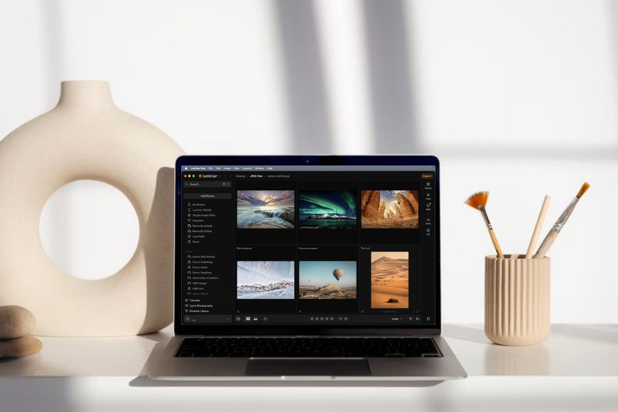
Luminar’s New Interface: What’s Changed?
Explore Luminar's new interface including what’s changed and where to find the tools you use most.
Luminar | Software | Paid Partnership | By Ana Mireles | Last Updated: September 25, 2026
Shotkit may earn a commission on affiliate links. Learn more.
The latest Luminar update brings a fresh look and a simpler way to navigate its many features.
While this is an improvement, no doubt, it might have you wondering: Where did everything go?
If you're getting used to the new layout, or you're simply new to Luminar and are finding your way around, this article is here to help.
Not only will I walk you through what's changed, but I'll also answer some common questions like where to find your presets or where the generative tools are.
I'll also tell you what's coming next, because this interface is just the beginning of a new and improved Luminar.
Luminar Has a New Look
The yearly Luminar upgrade is here, and this time it has a two-part rollout. The summer 2026 update is already here, and there are two changes you'll notice immediately.
First, the program is no longer called Luminar Neo. Now, it's simply called Luminar, as is the mobile app.
However, it's not just the name that changed; it also got an interface upgrade complete with performance gains and improved generative tools.
I'm sure you'll notice the more realistic generative results, faster masking, and so on, as you use Luminar.
So, I'll use this article to cover the most immediate, visual change: the new interface. While it's meant to be more intuitive, historical users might need a moment to find their way around.
This is where I can help.
New users can benefit from this article too, as it may not be an adjustment for you since you didn't know the previous version, but it can help as an introductory guide.
What's Changed in the New Luminar Interface
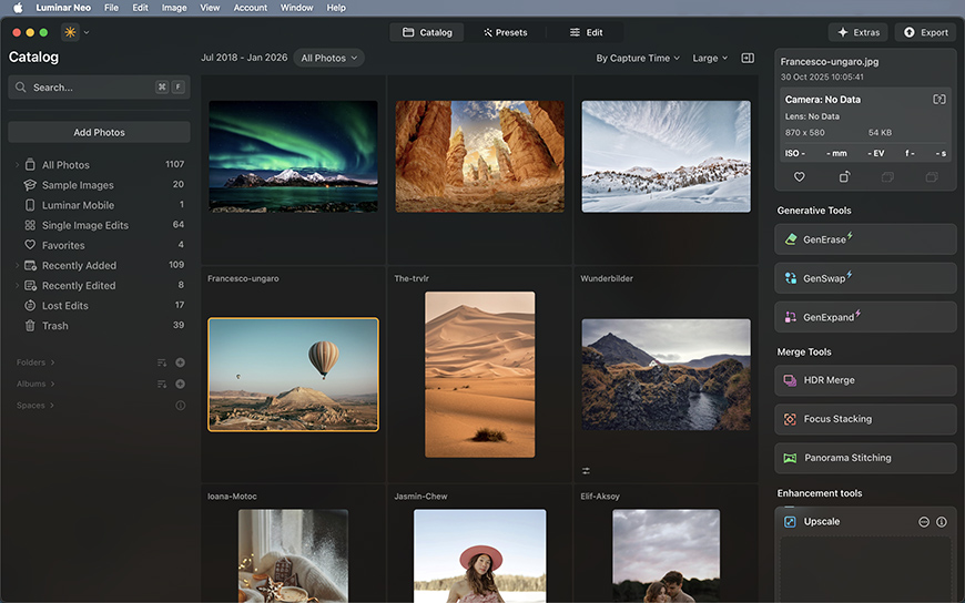

What Luminar Neo users need to know
If you've used Luminar before, the first thing you'll notice with the summer upgrade is that it looks different.
The interface has been reorganized so you can find what you need where you need it.
Don't worry, you don't need to learn Luminar from scratch. Let's take a closer look at what's changed and what it means for your workflow.
A Simpler, Cleaner Interface
One of the most noticeable changes is that the new interface reduces the visual clutter around your images.
On top of that, you won't have a menu to jump between workspaces, because everything is now condensed into one.
You'll also notice that panels on the right side are now collapsed into small icons. Plus, the metadata from the selected image now appears in the top right. Before, you had to go to a specific panel to see it.
A More Streamlined Workflow
The interface update isn't just about looks; it's also meant to make your editing experience easier and smoother.
Now, you won't have to move back and forth through different workspaces to finalize your images.
The idea is that you don't feel like you're navigating a collection of separate features, but that you can create a logical, streamlined workflow that works for you.
Of course, the best way to understand the changes is to see them. So, let's take a look at the new layout and where you'll find the tools you use most.
Finding Your Way Around the New Luminar
The main workspace
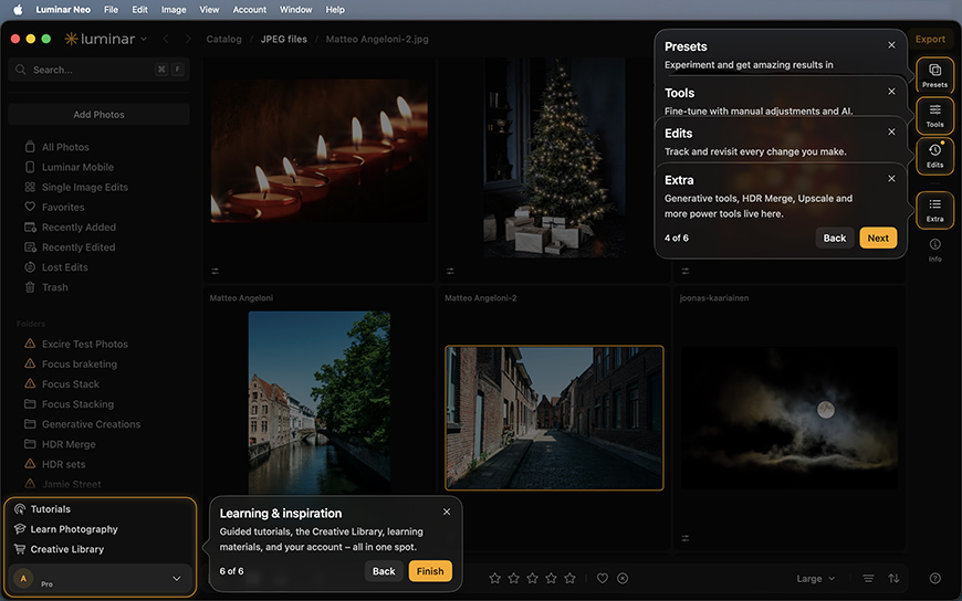
As you launch Luminar, it will open in the Catalog with your images displayed in a grid and a left-side panel with your folders and everything you need to navigate your files.
So far, nothing new. However, notice that there are no panels on the right side anymore. This maximizes space so you can see your images. Feel free to change the thumbnail size in the menu at the bottom.
Another thing you'll find missing is the top menu that allowed you to toggle between the Catalog, Presets, and Edit workspaces.
Now, everything is condensed into a single workspace, and you can access presets, editing tools, and generative tools via the new buttons on the right side of the screen.
To start editing a picture, simply double-click on it. This will not only enlarge the image so that it's the only one you'll see now, but it will also open the editing panels.
You'll still see the buttons on the far right. This lets you open the presets and generative tools.
The edit history is still there among those buttons. You can access it and use it as usual to modify or delete any edit you've done to the picture.
To go back and browse your other images, use the new breadcrumb trail at the top of the workspace to see where you are in your image library.
You can click on the previous levels to quickly move back through your folders, or click Catalog to go back to the beginning. Here, you'll find the left-side panel again to see all your folders, albums, and spaces.
Where to find your photos
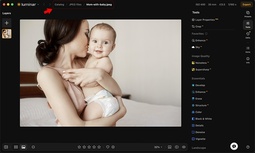
Without the top menu, you might be wondering how to go back to the Catalog to find other photos when you're already editing.
The new top navigation makes it easier to move between your images. Simply click on the folder you want, or directly on the Catalog.
In the Catalog section, everything looks pretty much as it did before. On the left, you'll find the panel for navigating your imports, folders, Spaces, albums, and more.
On the right, you'll see a grid with your images. You can also switch to a single-image view using the buttons at the bottom left.
Double-click an image to start editing. When you do, the left panel disappears. You're now back in the editing view, where you can use the breadcrumb trail to navigate back to the Catalog or the previous location.
Where did my editing tools go?
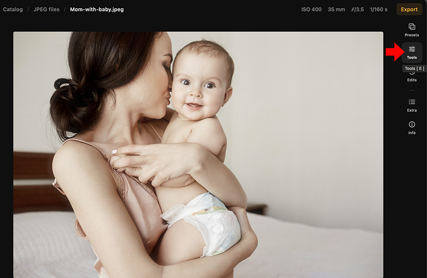
The first time you open Luminar after the summer update, you might feel a bit disoriented when you land in the Catalog and don't see an Editing tab at the top.
So, where are the editing tools now? Well, there are two ways to access them. The first one is simply to double-click on the image you want to edit.
This will automatically switch to the single-image view if you were in the grid view, and it will also expand the editing panels on the right.
The other way to do it is by clicking on the Tools button on the top right.
Pro tip: You can also press the letter E on your keyboard to open the Editing tools.
Nothing in the editing tools has changed. You'll find all the features as before, and all of them will still have the Masking option.
The one difference that isn't immediately obvious is that Masking uses 33% less RAM, which will improve the overall performance even if you have other apps running in the background.
As for the Edits option, where you can review and modify the edits you've made to a photo, you can now find it as a separate button called Edits.
This means that it's no longer a second tab on the Tools panel, but it works in the same way.
Where are the generative tools?
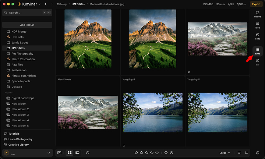
One of the first things you notice when you open the new Luminar is that the Generative tools, the Enhancement ones, HDR Merge, Focus Stacking, and Panorama Stitching are no longer there.
They used to be the first features you saw because they were on the right side of the Catalog and not in the Edit workspace. Now you won't see them there, and they weren't added to the Editing tools.
Don't panic, though; they're still part of Luminar. In fact, the generative tools have improved significantly, and they now deliver more realistic and accurate results.
To find them, simply go to the buttons on the right and find the one called Extras – it's underneath the Edits button.
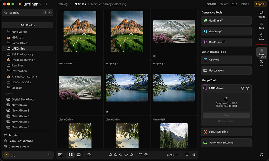
Simply click the Extras button to expand or collapse these tools. Keep them collapsed to declutter the screen while browsing the Catalog, and expand them only when you need them.
You'll find they're all there, and everything looks as it used to.
What happened to the presets?
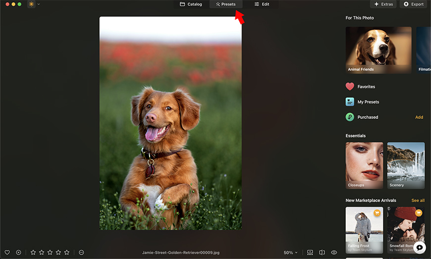
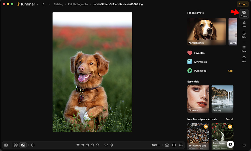
Luminar Presets are another part of the new layout that might throw you off at first. Since there's no longer a top menu because everything is on a single workspace, where are the presets?
Well, you guessed it. You'll find a Presets button on the right, next to Tools, Edits, and Extras. It's part of the new simplification that keeps everything in one place, so it's easy to find and supports a smooth workflow.
All the presets you've created and purchased will be there. So, there's nothing to worry about. Plus, preset previews are up to 40% faster.
What Hasn't Changed in the New Luminar?
With the new name and looks, it's easy to assume that Luminar itself has changed dramatically. But I assure you that the core editing experience remains familiar.
Your favorite editing tools are still there. The AI-powered features, the creative adjustments, presets, professional editing tools and other features you knew and loved in Luminar Neo remain an integral part of Luminar.
If you're coming from Luminar Neo, don't be surprised if your muscle memory sends you looking in the old places at first. However, it only takes a short time to get adjusted, as the new interface is more intuitive than the previous one.
And for those of you who are new to Luminar, I'm sure you'll find there's no steep learning curve, even if you're just starting in photo editing.
What's Coming Next for Luminar Users
As I said at the beginning of the article, Luminar's yearly update was a two-phase rollout. So, we can expect big things still coming in the fall of 2026.
The fall upgrade will bring a mix of new creative tools and workflow improvements, with some features available to all Luminar users and others included as part of the paid option for eligible users.
Among the features planned for all users, you'll find improved Masking, Presets, and Printing along with a new Export feature that adds options for watermarks and frames.
Eligible users will also get Atmosphere 2.0, which introduces Fog, and Crop 2.0, which allows composition variations. They also plan to improve the Enhance AI tool, add a new AI Assistant 2.0, and introduce a Web Editor.
Preorders are already available, so check out the prices and discounts on Luminar's official website.

Ana Mireles is a Mexican researcher that specializes in photography and communications for the arts and culture sector.
1 Comment
Leave a Comment
👋 WELCOME TO SHOTKIT!
🔥 Popular NOW:

Condensing everything into a single workspace reduces visual clutter, but having quick toggle shortcuts for those right-hand panels is especially helpful on smaller displays. When editing multiple photos in sequence, opening and collapsing tool panels with dedicated hotkeys saves significant pointer movement compared to clicking each icon individually.