


How to Use Color Saturation in Photography
Master the art of photography by understanding and effectively utilizing color saturation to enhance image vibrancy and evoke desired emotions.
Learn | By Judyth Satyn
Shotkit may earn a commission on affiliate links. Learn more.
This guide will explain how to use color saturation in photography.
When used correctly, color saturation is a powerful tool. It can be used to focus attention or enhance a mood.
Understanding the use of color and its saturation is an integral part of producing great photography.
Let’s first define saturation to learn more.
What Is Color Saturation?
Saturation is also called ‘intensity’ and ‘chroma.’ It refers to the dominance of pure hue in a color.
Color saturation is one of the three properties that make up a color.
The higher the saturation of a color, the more pure and the less grey the color is.
The saturation of a color affects how vivid it appears. As its brilliance decreases, the saturation decreases.
Lowering the saturation of a color makes it look dull and flat. Decreasing saturation has its creative uses in photography.
Pure primary colors red, blue, and yellow are fully saturated. They are considered to be the purest version of color.
What Causes Color Saturation?
The primary cause of increased or reduced saturation of a color is lighting.
A color is a color. Its fundamental properties can’t be changed.
For example, if we consider the color of a bright red wall depending on available light, the color saturation of the wall will appear to change.
This change of light from daylight to twilight affects how saturated the color appears.
In the brightest light, the red wall will be at its highest saturation.
In the twilight, the red color of the wall will have a decreased saturation.
At nighttime, it will be difficult to discern what color the wall is. No visible saturation will be evident, and it will appear completely grey.
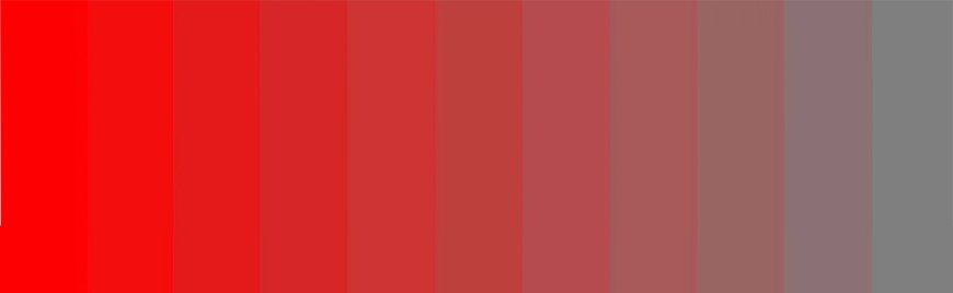
In the image below, the color red on the left side is at its most saturated.
The color on the right is red at its most desaturated.
Don’t confuse saturation with brightness. Brightness is changed by the amount of white added to a hue.
The available atmosphere between a viewer and a color will also affect the color’s saturation.
The more atmosphere between the viewer and the color, the less saturated it will appear.
In post-production, a color’s saturation can be altered using editing software.
What Is Hue Vs. Saturation Vs. Color?
Hue is the class of color. For example, if a color is blue, yellow, or blue.
Hue is demonstrated by a color wheel where the hues are distinct and isolated from each other.
Saturation refers to how intense the color is. If the color is vivid, it is high in saturation.
Low saturation colors will look dull and muted. The more desaturated the color is, the more difficult it becomes for people to recognize its hue.
Saturation ranges from full saturation at 100% to fully desaturated at 0%.
When a color is completely desaturated, it enters the greyscale and is devoid of its’ hue.
Color is a term that encapsulates all the elements of color.
The color of an object is defined by a combination of the three color properties.
These properties are hue, brightness, and saturation.
What Is the Difference Between Color Saturation and Vibrance?
Vibrance affects how white or black a color appears. It is similar to mixing a color with white or black paint.
The more white you mix into the color, the more white the color becomes. The more vibrant a color is, the more white it is.
Saturation refers to how intense or pure a color is. It is similar to shining a bright light on a color.
In advanced photo editing software, there is a vibrance and saturation slider.
When you use the vibrance slider, it will affect only the dull and cool colors. It will ignore saturated colors.
Vibrance is sometimes referred to as ‘Smart Saturation”. This is because the vibrance tool selectively increases the intensity of colors.
Vibrance affects only the dull tones of an image. Adding vibrance to the flat, muted colors to bring them to life.
Saturation affects the intensity of all colors, whether they are bright or dull.
Therefore when you slide the saturation slider, it will affect all the colors in the image.
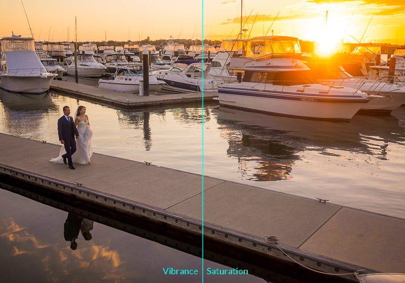
In the image below, the left-hand side has had its saturation increased, while on the left, the vibrance has been increased.
Credit Johan Eriksson
The vibrance slider is particularly useful if you don’t want to affect skin tones in an image.
When you boost skin tones, they can start to look grossly unreal.
What Is the Difference Between HSV and HSB/HSL?
HSV, HSB, and HSL are terms used to help us define and understand color.
The B and V in HSB and HSV stand for brightness and value. HSB and HSV represent the same color model.
HSL is a different model from HSB and HSV. HSL stands for hue, saturation, and lightness.
HSV and HSB demonstrate how color appears under changing light. Whereas HSL shows what color will be created from mixed paint.
In the HSL model, the color will be white when it is at maximum lightness. This is because it has the most white paint mixed in.
Whereas in the HSB model, the color will reach its purest color when it is at maximum brightness.
It will appear as a color would under bright light, rich, saturated, and vivid.
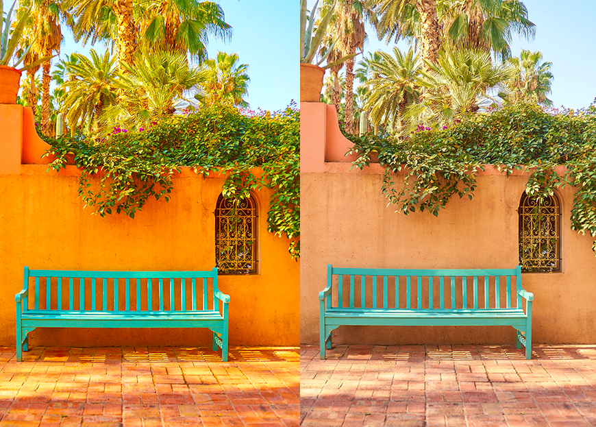
How Does Saturation Change the Mood of a Photo?
Increasing saturation makes colors pop with vibrance. High saturation has a similar effect to a bright light being turned on in a room.
It makes the photo spring to life. This is beneficial for creating different effects, such as a festive warm atmosphere.
High saturation vs low saturation image example | Credit: Daniel Lloyd
However, it can also be increased so much that it looks superficial and unreal.
Low saturation will make an image look moody and flat.
As you can see in the above, the saturated image gives the impression of festivity. Whereas the desaturated image creates a more somber atmosphere.
The atmospheric effect of desaturation is similar to a dully lit room or twilight. The colors look muted, and the mood created is calm, sad, or melancholy.
High saturation can simulate the feeling of warm sunshine. The liveliness of the scene is amped up, which generates a high-energy mood in the photo.
What Are Highly Saturated Colors Best For?
Hish saturated colors are used by advertisers and photographers to exaggerate a mood.
Advertisers use high saturation to amplify an image’s emotional message. They can create a mood of festivity. playfulness, or romance.
Warm tones, when highly saturated, can convey a range of happy feelings. They can also be used to convey youth or richness.
Vivid colors are eye-catching, making them useful for attracting the attention of viewers.
Product photographers use color saturation to make their products stand out.
A vivid color demands attention and ensures the product is noticed.
As you can see in the image below, the saturated orange would be more enticing to a customer than the unsaturated orange.
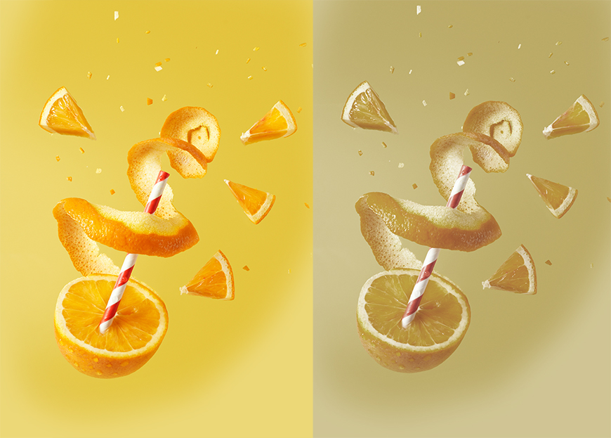
Credit: Tangerine Newt
Landscape and street photographers use the saturation effect to enhance a scene’s allure.
The color of deep blue skies is enhanced, and the lush tones of autumn leaves are amplified. Saturation makes the photo pop with vitality and life – see more examples of the use of teal and orange.
A highly saturated background can also be used to contrast an unsaturated flat item. This can be used to create interesting visual effects.
How Do You Change Color Saturation?
There are different ways to change the saturation of a color.
Camera settings can be changed to affect color saturation when the image is captured.
Saturation levels can be changed with the use of specialized camera lens filters.
In post-production, saturation levels can be altered using editing software.
In-Camera
You can change the color saturation of the image as you shoot by changing your camera settings.
To change color saturation in a Canon camera, head to the Picture Style setting. In Nikon cameras, head to the Picture Control Setting.
The options for color saturation are usually auto, portrait, vivid, landscape, or monochrome.
These are designed to capture the right saturation for a specific setting. However, they can also be used experimentally.
Credit: Frederico Bottos
Using Lens Filters
Another way to change color saturation when photographing is to attach a lens filter.
Use a polarizing filter, enhancing or intensifying filter to alter color saturation.
Polarizing filters are used to increase the color saturation of skies and landscapes.
They block one direction of UV light and are also used to reduce reflections and glare in photos.
Enhancing and intensifying filters are used by landscape photographers to increase the saturation of red tones.
They are particularly popular when fall begins, and autumnal colors are abundant.
During Post-Processing
Color saturation can be decreased or increased during post-processing. using photo editing software.
In Photoshop, click on Image > Adjustment > Hue Saturation.
For the keyboard shortcut, click Command (for Macs) or Ctrl (for Windows) plus U.
The adjustment dialogue window will pop open. Slide the saturation slider to either side to adjust the image’s saturation.
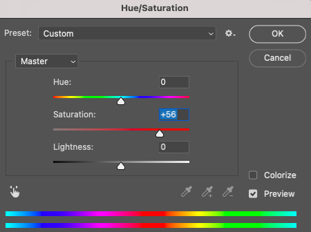
When you adjust saturation using the slider, all colors are equally affected.
To adjust the saturation of only one color, create a Hue/Saturation Adjustment Layer. Click on the hand icon in the top left of the dialogue window.
Then click on the color you wish to adjust in the canvas window. Photoshop will now only adjust the saturation of the chosen color.
In Lightroom, you can manipulate saturation using the saturation slider.
Slide the slider to the left or right to adjust the saturation of the image’s color.
Like Photoshop, Lightroom’s saturation sliders equally affect all the colors in the image.
Color Saturation Examples
Cuban towns are full of vivid and primary colors. The bright sunshine days make it perfect for capturing high-intensity colors.
Below is a highly saturated image of an imported Russian car in Cuba. Notice how the saturated colors pop with life.
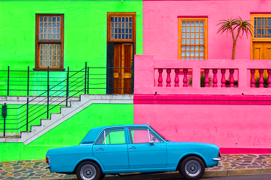
Credit: Leon Skrilec
Autumn is the time to take photos of leaves turning a rich red or yellow.
Below is an image of a forest in the fall with highly saturated colors.
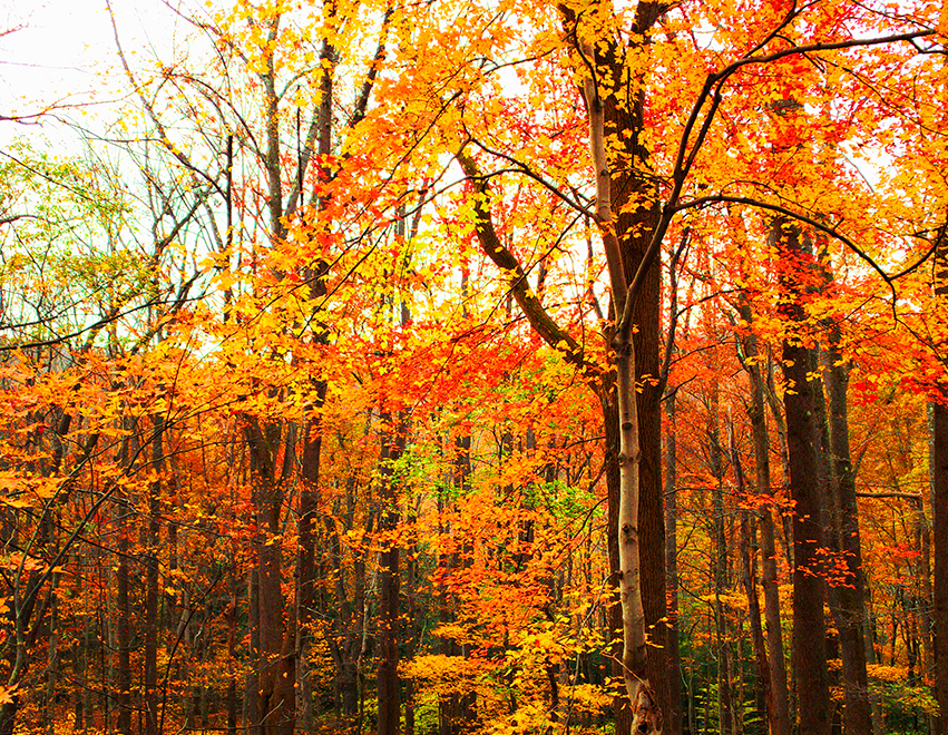
Credit: Meric Dagli
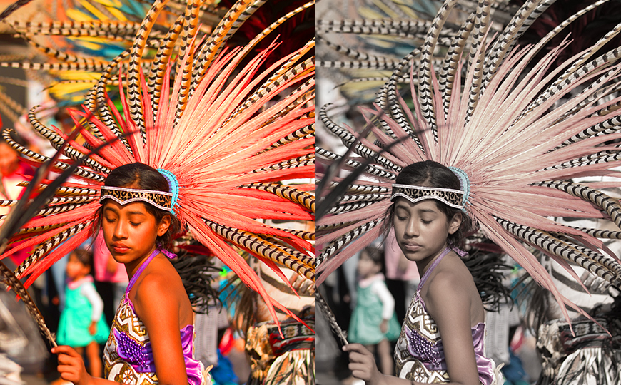
The image below shows the difference between a highly saturated and desaturated image.
When skin tones hit maximum saturation, they begin to look fake.
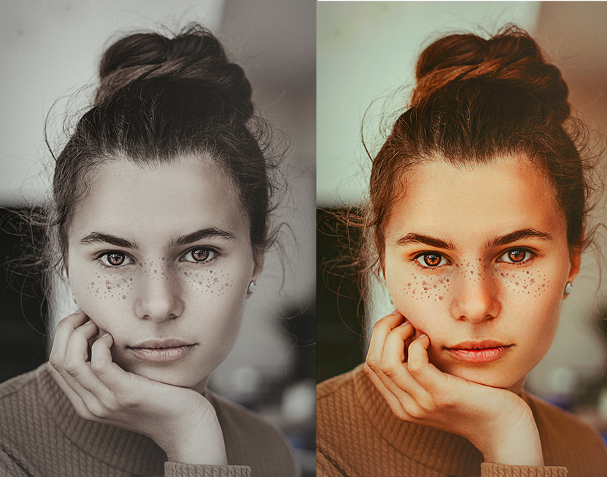
Credit: Houcine Ncib
The image below has muted desaturated colors. This gives the scene a melancholy mood.
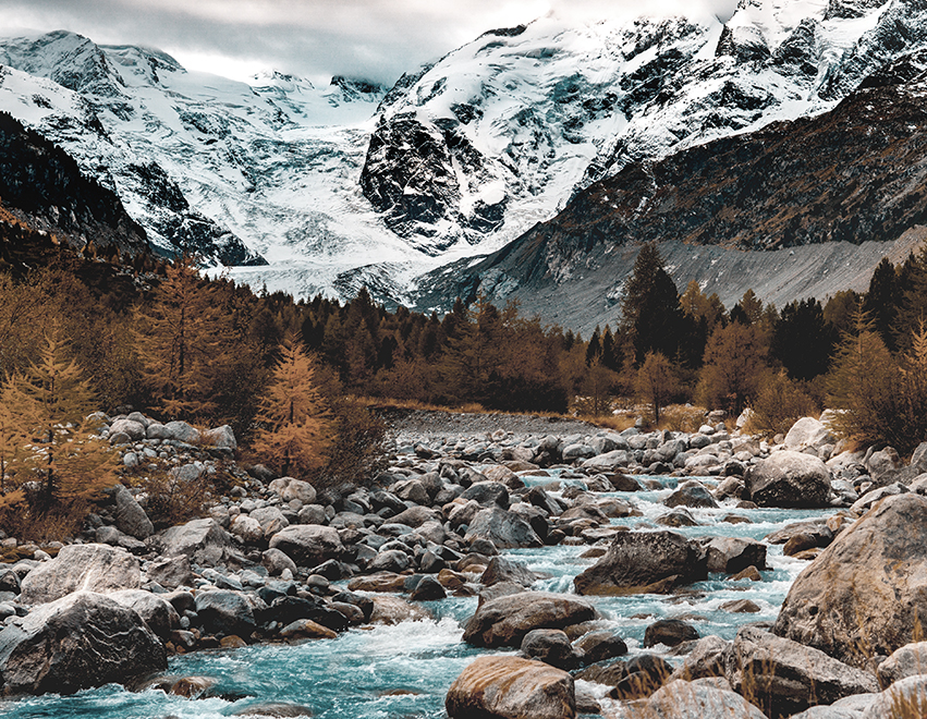
Credit: Micheal Grant
What Is the Difference Between Color Space and Color Saturation?
Color space is a mathematical color model which defines color by its RGB ratio.
In RGB terms, color is made up of percentages of red, green, and blue mixed together, as you can see in the image below.
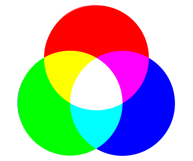
RGB is used predominantly for colors displayed in electronic systems, such as computers, TVs, and phones.
Saturation is not a color model but indicates the amount of pure color or the amount of pure grey in a color.
The more saturated a color is, the purer it is. Purity is equivalent to how it is seen in bright light.
A desaturated color represents how a pure color appears in decreasing amounts of light.
FAs About a Color’s Saturation
What determines the saturation of a color?
The saturation of a color is defined by its purity compared to the amount of grey or white.
The most saturated color is a color at its highest intensity.
A highly desaturated color is closer to pure gray. It will have barely any recognizable color pigment left.
What is 100% saturation color?
A 100% saturation color is when the color has no gray or white added.
Is higher color saturation better?
Neither higher nor lower saturation is better.
If a higher saturation color is better will depend entirely on the purpose of the project.
What color has the most saturation?
The most saturated of colors are the colors that are impossible to make more colored.
The three primary colors are considered to be the most saturated of all colors. Red, blue, and yellow.
What does HSV stand for?
HSV stands for hue, saturation, and value.
What Is the Difference Between HSV and HSB?
HSV and HSB are the same. They represent the same color model.
The only difference between HSV and HSB is the use of the word brightness instead of value.
Check out these 8 essential tools to help you succeed as a professional photographer.
Includes limited-time discounts.
Judyth is an experienced studio photographer and glass artist. When she isn’t Photoshopping comedians into the bellies of sharks, you can find her cooking delicious treats for her guests.

👋 WELCOME TO SHOTKIT!
🔥 Popular NOW:
