


How to Get The Teal and Orange Look (LUTs & Photos)
The teal and orange aesthetic is a popular filmmaking and photography technique used by professionals and amateurs alike. Learn how to add it to your creations.
Learn | By Jeff Collier
Shotkit may earn a commission on affiliate links. Learn more.
This guide to using the teal and orange aesthetic will help you create and apply the trendy teal and orange look that gives your photo or footage cinematic qualities.
If you want your photos and videos to stand out, add this teal and orange color palette to highlight significant aspects using color contrast.
Good news! You don’t need any sophisticated equipment or software. It’s perfectly doable using simple steps.
Follow the instructions in this article to create a homemade video and amazing photographs with professional quality.
What is the Teal and Orange Look?
The teal and orange scheme is a popular color grading technique that is used nowadays to alter photos and videos. It used to be one of Hollywood’s trade secrets but has gone public recently with the advent of technology.
It’s basically adding a teal and orange tone to your videos and photos. It entails bringing yellows or orange to the foreground and blues or teal to the background. That way, it adds contrast and depth to your images and video frames.
This technique is known by different names, such as the blockbuster look due to its high popularity in Hollywood. Amateurs also name it the Sam Kolder look after the Youtuber Sam Kolder, who applies it to all his travel videos.
Why Is Teal and Orange So Popular?
The teal and orange trend began when Stefan Sonnenfeld created this technique in 2003 to highlight some visual aspects in movies.
However, it has picked up since then to become a staple of color theory in films and photography.
Here are several reasons why these two colors in particular are so popular:
Creates Contrast
Credit: Lucas George Wendt
Teal and orange are complementary colors. They’re on the opposite sides of the color wheel, which makes them highly contrasting.
You can learn more about how to use the opposite of orange.
In addition, these two colors give the highest exposure, which gives great depth to your videos and photos.
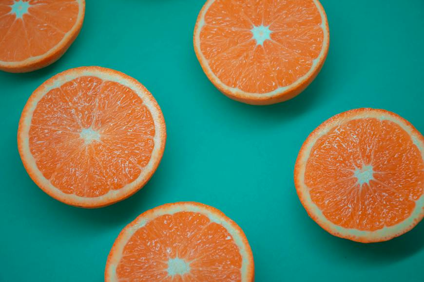
Highlights the Subject
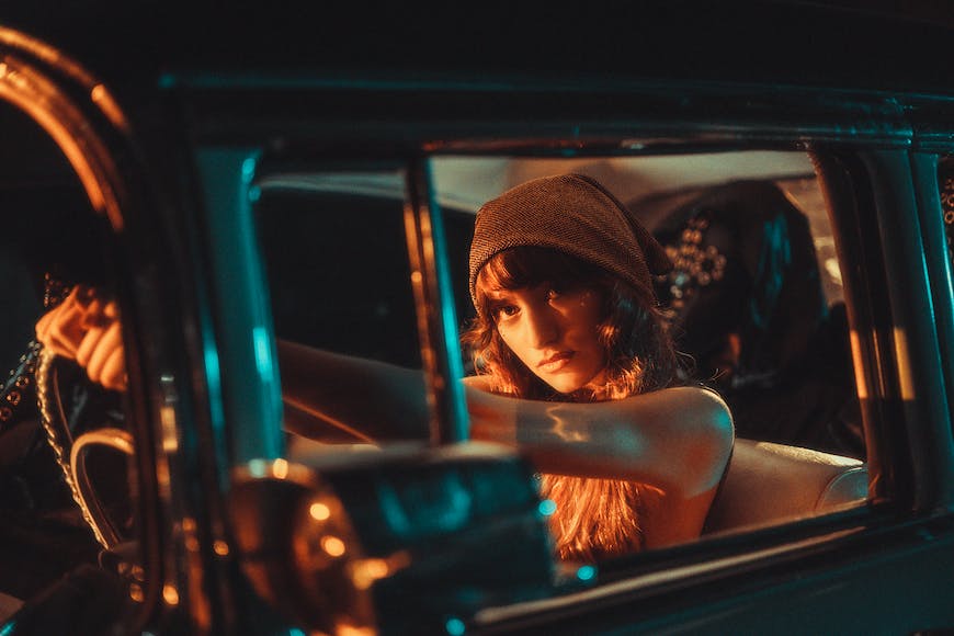
Credit: Wolrider Yurtseven
Teal replicates the tones of nature, from the sky to the ocean. On the other hand, human skin tones fall somewhere within the orange spectrum.
By bringing orange to the foreground, you highlight the human subject in the photos and videos.
That way, you help viewers focus on facial expressions or body movements, which is ideal for a nonverbal storytelling technique.
Replicates the Golden Hour
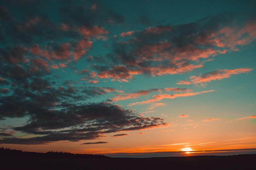
Credit: Irina Iriser
Most professional photographers and filmmakers prefer taking their shots during the golden hour. It’s the time when the orange sun sets into the blue horizon.
The orange and teal look allows them to create the same effect artificially. With this technology, you don’t have to set your photoshoots in a specific hour.
How to Add the Teal and Orange Effect
The orange and teal aesthetic employs several color palettes.
For instance, the orange effect may include burnt orange, deep orange, and retro orange.
On the other hand, the blue shades range from aqua to vibrant teal and deep blue.
You can create this teal and orange grading effect manually or by applying LUTs using various powerful tools, such as:
- Premiere Pro
- Davinci Resolve
- Final Cut Pro X
- Filmora
- Sony Vegas
- After Effects CC
- Photoshop
- Lightroom
Best Teal and Orange LUTs for Color Grading Video
LUTs or Lookup Tables are color filters or color grading presets that you can apply to your images and footings to add tone and color effects.
The most popular teal and orange lut is the M31. It can be added via various platforms, such as Filmora or Premiere Pro. Fortunately, you can download it for free within several bundles, including:
- Teal and Orange Lightroom Presets: This bundle is offered by Sparklestock, which is known for its variety of LUTs. It includes M31 among seven other LUTs.
- Navpreet Singh’s Teal and Orange LUTs: This rising artist offers well-packed LUTS, including the teal and orange bundle of eight variations of M31.
- Kevin Aryal Tutorial: This pack offers several LUTs, including the orange and teal LUT that contains six variants of M31.
- Davinci Resolve 18: This one enables you to apply various techniques and effects, including several variations of the M31 teal and orange LUTs.
- Filtrgate Free Cine LUTs V2: This is a source of many effects and LUTs, including the teal and orange LUT effect.
How to Use Teal and Orange LUTs in Movie Editing Software
Simple! All major movie editing software support LUTs. For instance, you can follow these steps in Premiere Pro, Davinci Resolve, or Final Cut Pro.
- Launch your movie editing software
- Import the video you wish to edit
- Go to the color grading or effect panel
- Navigate to the LUT adjustment options
- Apply the orange and teal look you’ve chosen
- Fine-tune every frame to achieve the best saturation and color contrast
How to Create a Customized Teal and Orange LUT
Great news! You can create your own LUT and customize a personal teal and orange look. That can give your images and videos a unique touch. Here’s how to do it:
- Choose a video or image with good exposure and well-balanced colors
- Adjust the colors by putting blues in the shadows and orange in the forefront using color grading plugins or software
- Save the edits as a LUT file
- Now, you can apply the custom-made LUT to any footage or image
How to Get the Teal and Orange Effect in Lightroom
Getting the teal and orange effect for your photographs is easy and doesn’t require paying a lot of money for pricy presets.
Here’s how to do it in Lightroom using a technique known as split toning:
Step One: Calibration
Here’s where you begin to create your orange and teal look. Follow these steps:
- Open the calibration panel in the Lightroom “Develop” module.
- Set the blue primary somewhere between 0 and -100 and the red primary between 0 and +50. This range allows you to create the exact contrast that suits your photos.
Step Two: The Basic Panel
This step builds upon the foundation you’ve set up in the previous step. It allows you to adjust the shadows, exposure, and highlights.
You’ll need to jump back and forth between the Tone and Presence sections in the panel. That way, you can add some vibrance in the first and saturation in the second.
There are no set values to use; you should rather adjust all the sliders until your photo reaches the effect you prefer. Every photograph has its own nature and color, so your adjustments will be different for each one.
Step Three: Color Grading
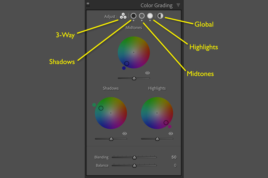
Split toning in Lightroom now falls under the Color Grading panel | Andy Day
This crucial step allows you to set hues for your shadows, midtones, and highlights separately. It has been introduced in Lightroom 10 to replace Tone Splitting.
To create the teal and orange look:
- Select orange for the highlights and blue or teal for the shadows.
- Lower the blending effect for further contrast between the shadows and the highlights.
- If you want to add a warm effect, move the balance slider towards the highlights.
Step Four: The Tone Curve
This is where you give your teal and orange look its final touches. Typically, this look calls for a more faded image. Here’s how you give your image the faded black effect in three easy steps:
- Open the Tone Curve panel.
- Press “click to edit point curve” in the bottom right corner. That helps you disable regional editing mode.
- Bring the black point to the top of the right side of the graph.
Step Five: HSL Panel
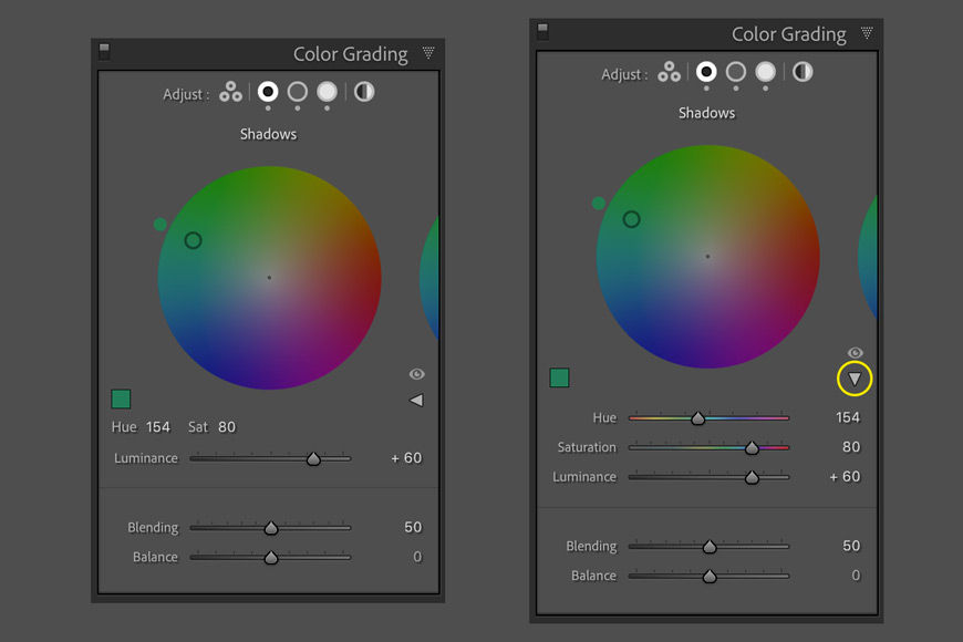
Click on the small triangle on the right to drop down the Hue and Saturation sliders | Andy Day
This is an optional step if you feel that your adjusted image has some unnatural hues. It allows you to tone down other colors to highlight only the orange and teal look.
Simply change the saturation of the different hues on the HSL panel to reach the final look you want for your image.
Step Six: Final Touches
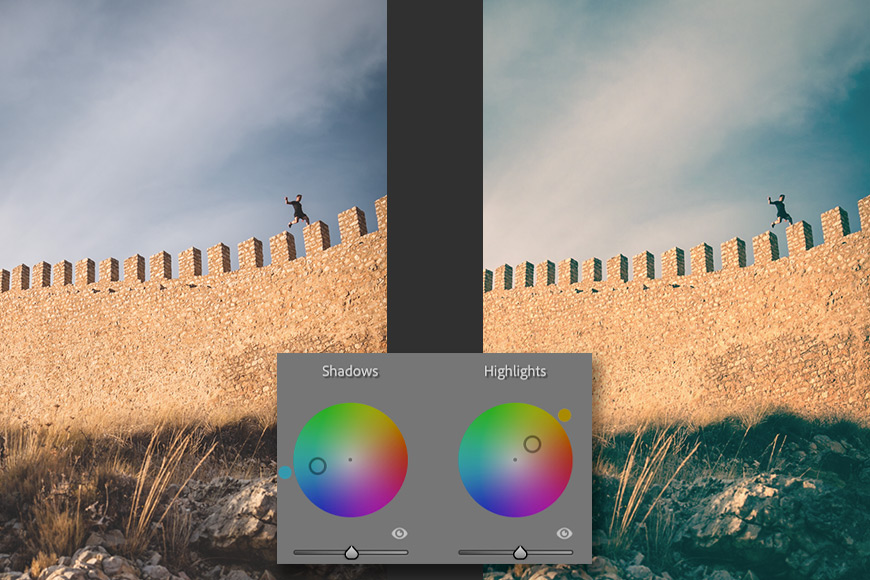
Adding teal to your shadows and orange to your highlights will give your images a cinematic feel | Andy Day
If you’re not yet completely satisfied with your teal and orange look, here are some places for more adjustments:
- Use the Vignettiing tool in the basic panel to lead the viewer’s eyes into the frame. This can be done by adjusting the sliders to reach your preferred look.
- Try sharpening your image by moving the value of the amount slider on the detail panel.
Check out these 8 essential tools to help you succeed as a professional photographer.
Includes limited-time discounts.
Jeff Collier is an experienced film photographer who enjoys experimenting with modern digital photography equipment, software and apps. He’s also an ex-world champion triathlete and avid cyclist, clocking hundreds of km each week in the beautiful Tweed Valley of northern NSW, Australia.
👋 WELCOME TO SHOTKIT!
🔥 Popular NOW:
