


How to Use Warm and Cool Colors in Photography & Lighting
Explore the dynamic use of warm and cool colors in photography and lighting to dramatically enhance the mood and composition of your images.
Learn | Lighting Guides | By Ana Mireles
Shotkit may earn a commission on affiliate links. Learn more.
Color is essential in photography for both technical and creative reasons. Some of the most used categories are warm and cool. Does that sound familiar?
You’ve probably read that landscape photography is best done during the golden hour because of its warm tones.
Maybe you’ve read about how color in photography changes the mood of an image. Or how you can adjust the white balance in the camera or during editing.
All of these things are related. In this article, I’ll show you how to choose the right light source to create warm and cool pictures, how to use this to convey your creative view, and much more.
Are you ready? Let’s get started!
Definition of Warm and Cool Colors in Photography
In photography, warm and cool colors may refer to the color of light (color temperature) or to color in the traditional sense – the color wheel, primary colors, and so on.
If you want to use colors in photography effectively, you need to understand both. So, let’s tackle each subject separately.
Understanding Color Temperature
Credit: Janko Ferlic
Color temperature has to do with the color of light. Every light source has a different color, and the Kelvin scale measures it.
The human eye – actually, the brain- automatically compensates for the color cast of different light sources, so we don’t notice it as much.
Cameras are different. They need to be told how to compensate for it, which is why any digital camera has white balance settings.
Of course, you can also adjust the color temperature in post-processing.
Back to the camera’s white balance: You can use one of the many presets – auto white balance, daylight, incandescent light, tungsten light, etc.
However, using a custom white balance is the most accurate option. This way, you can input the exact value in degrees Kelvin. Alternatively, you can set it with a color-checker or a grey card.
A light source with a small Kelvin degree has a yellow-orange color cast. This may be natural light like a sunset or artificial light like tungsten bulbs. These are considered warm.
Higher Kelvin degree values cast a blue light, which results in a cooler image. Most flashes and photographic lights are set to white light (around 5500K).
We have a full guide to understanding Kelvin in lighting, so give it a read if you want to go deeper on the topic.
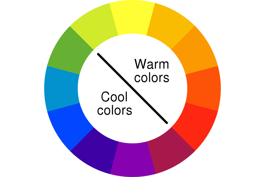
Warm and Cool Colors on the Color Wheel
Credit: Original by MaulucioniVectorization by Guypeter4 based off BYR color wheel.svg by Sakurambo, CC-BY-SA-4.0, via Wikimedia Commons
The color wheel is a graphic representation of color theory. It’s based on color mixing.
You start with the three primary colors and place them as if they were the points of a triangle. Then, you mix two of the primary colors to create secondary colors, which will go in between the primary ones.
Next, you mix a primary color with a secondary color to create tertiary colors. They should sit in between the two colors that form them. You can continue this process to achieve other colors.
If you draw a line splitting the wheel in half, you can separate it into cool and warm colors. Blue, green, and purple are cool, while yellow, orange, and red are warm.
- Read more about color theory for photographers.
Color Theory in Art vs Color Theory in Photography: Is There a Difference?
The color wheel is the fundamental difference between color theory in photography and how it’s applied in painting and drawing.
In digital photography, you constantly hear about RGB. That’s because digital cameras, monitors, and other displays let you choose the color mode.
RGB refers to the theory that sets red, green, and blue as the primary colors. Then, you have opposites: red-cyan, green-magenta, and blue-yellow.
This uses an additive color mode, which is the basis for color photography.
Instead, painters use a subtractive color model, which states that red, yellow, and blue are the primary colors (RYB). This changes the secondary and tertiary colors as well.
Both of them are correct – it’s simply that photography works with light, and the graphic arts work with pigments.
In photography, you can use either one when deciding the color palette of your props or outfits. However, you need to use RGB to work with light.
For example, if you have a green object, you can make it pop with a background featuring its RGB opposite (magenta) or RYB opposite (red).
Instead, to balance green in post-processing, you need to use magenta because if you use red, you’ll balance the cyan.
Examples of Warm and Cool Colors in Photography

Credit: Andrea Piacquadio
Color temperature helps us indicate the time of day. The light in the above photo indicates that it’s early morning, which makes sense given what we’re seeing in the picture – a woman waking up.
The warm colors also set a specific mood, giving us a sense of a cozy space. This, combined with her posing, lets us know that she had a good night’s sleep.

Credit: Cottonbro Studio
This photo, on the other hand, has blue light. This is a hint from the photographer to let us know that it’s happening during the night.
The cool tones also set a different mood compared to the previous image. In this case, we get the feeling that she is sad or worried – something is wrong. This matches the model’s attitude.
Credit: Osama Alzubaidi
Credit: Matt Hardy
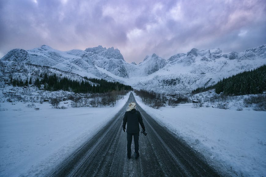
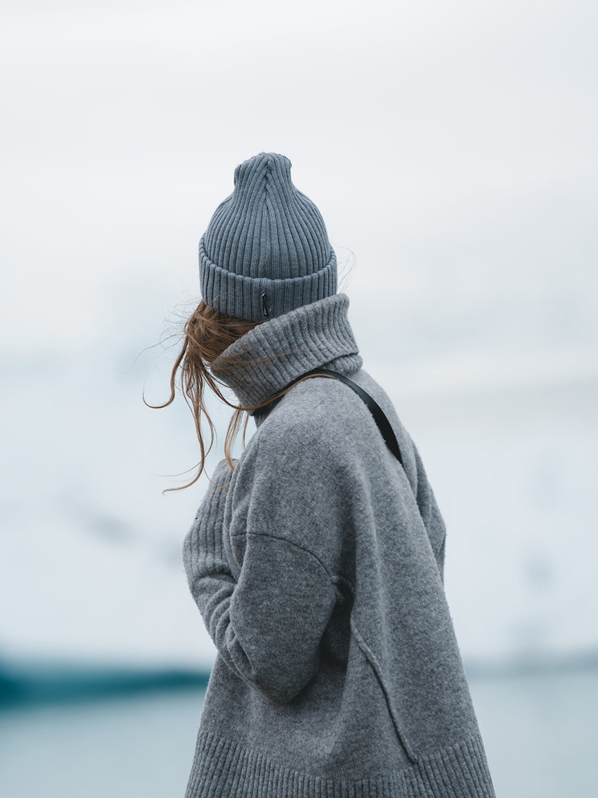
Cool tones are also associated with a cold temperature – as seen in the above two examples.
This is why you can use them to recreate this feeling in a more conceptual way. You can do this even if it’s inside a studio with artificial lights.
Let’s see an example:
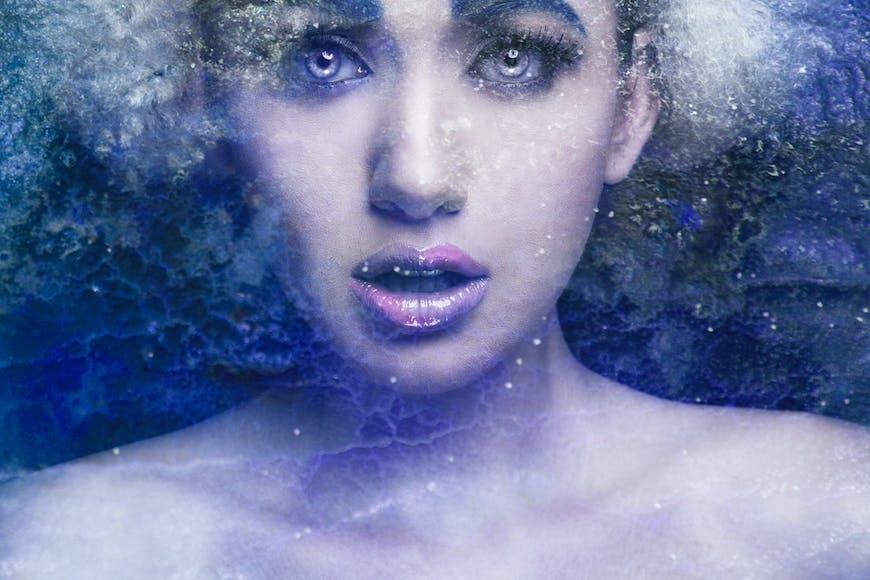
Credit: Imustbedead
Now, let’s move on to the warm tones.
Credit: Ray Bilcliff
Credit: Helena Lopes
Credit: Lumn
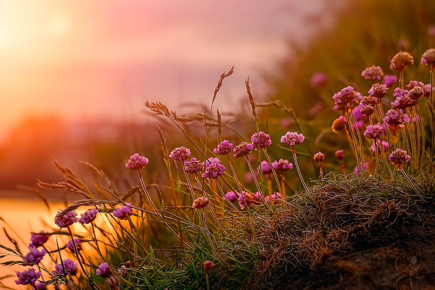
Warm tones are associated with the sun, summer, fire, etc. This is why they’re usually associated with hot temperatures, too.
Conceptually, we can also associate them with warm feelings. This is why most couples and family portraits are taken during the golden hour.
This is also used as a technique in advertising or interior photography. If you want to make a place look cozy and welcoming, take a photo with a warm color temperature.

Credit: Andrea Piacquadio
Why Is Color Temperature Important?
Credit: Anton Gofman
Color temperature is critical because it can influence how things look in your photographs. Depending on the color temperature of your light sources, it can even affect skin tones.
This is very important when photographing art or products when color accuracy is key.
Another reason why color temperature is important is because it’s helpful in storytelling. I’ll explain how you can use it to set the mood of a scene in the next section.
Using Warm and Cool Colors to Influence Mood
Cool and warm colors aren’t just an aesthetic choice. They can also tell you the time of day, for example, but most importantly, they help you set the mood.
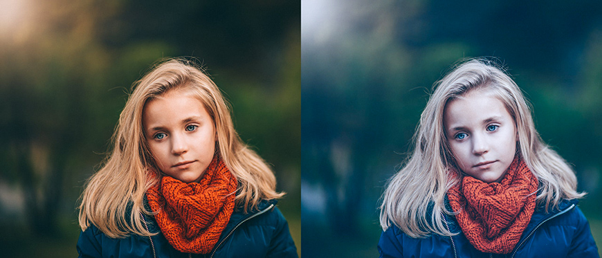
The same scene taken with two different color temperatures results in photos that make you feel differently – that communicate a different message.
Of course, you can enhance the effect with other elements, such as your subject’s pose or props that hint at parts of the story.

Credit: CDC (left) / RDNE Stock Project(right)
Look at the two pictures shown here. They’re both taken inside a hospital, and we don’t know the story behind either of them.
However, the photo with the baby makes me think that everything is going to be OK – even though the baby is crying. Maybe it’s just a vaccine or a medicine being administered that will make him better.
On the other hand, the picture with the two women doesn’t show any sort of crisis or pain, but it doesn’t make me hopeful.
This is just an example of how color is used in storytelling because we react to it in a certain way.
This is the psychology of color studies, and it’s used in everything from art to advertising to choosing our outfits every day.
Complementary Colors
Credit: Maria Mileta
Complementary colors are the ones that are opposite to each other on the color wheel. They are used to create compositions with visual appeal because they create a strong contrast.
Another way to use complementary colors is to do color grading in post-production. You can create contrast by adjusting one color in the shadows and its opposite in the highlights.
This can dramatically affect the final result, changing the mood of the scene.
As you saw in the color wheel above, warm colors are on one half and cool colors on the other.
This means that by using complementary colors, you’ll be mixing warm and cool colors in the same photo because they’re always opposite to each other.
- Read more about using complementary colors in photography.
Putting Warm and Cool Colors in a Single Image
Credit: Tomtookit
Using cool and warm colors in a single image is a strategy used by many photographers.
The contrasting colors make the image visually appealing – think about the warm lights of the city during the blue hour in a cityscape photograph.
You can also use this technique when you post-process a photo.
Do you remember the orange and teal filter that’s been so trendy on social media? Well, that combines a cool color (teal) and a warm color (orange).
Another way to use warm and cool colors is as an accent to make something pop inside the picture. Imagine a snowy landscape where a person wearing a red coat is walking – the viewer’s attention immediately goes to the red.
- Read about the differences between hue, shade, tone, and tint.
FAQs About Warm and Cool Colors in Photography
What colors can be both warm and cool?
Most colors have a cool and warm version, depending on which colors they’re mixed with. Even neutral colors can have cool or warm undertones. For example, different types of whites: Misty whites are cooler colors than creamy whites, which tend to be warmer.
How can you tell if a picture is cool or warm?
To identify whether a picture is warm or cool, you should look at the dominant colors of the scene. For example, sunset photos have an overall yellow-orange color that makes them warm even if there’s green on the palm trees and a blue beach ball.
What is color in photography?
Color in photography is the property of light that allows us to perceive different hues. However, colors can also be captured and reproduced in monochrome when taking photos in black and white.
What are the 3 warm and cool colors?
The three warm colors are yellow, orange, and red. The three cool colors are blue, green, and purple.
Check out these 8 essential tools to help you succeed as a professional photographer.
Includes limited-time discounts.

Ana Mireles is a Mexican researcher that specializes in photography and communications for the arts and culture sector.

👋 WELCOME TO SHOTKIT!
🔥 Popular NOW:
